Prior homilies or sermons of mine are occasionally downloaded by readers. Noticing this, I anticipate that some of those preparing to preach (or offer a reading) on an upcoming Sunday might benefit from the perspective I have taken regarding the Lectionary readings for a particular day. I am therefore offering (when I can) a prior text that I have used for the occasion. I will try to do this on Sunday evenings or Mondays believing that there might interest in these texts being made available. When I have one prepared, I will also offer an accompanying handout (in pdf format) in case these may also be helpful.
For this coming Sunday, Trinity Sunday, I offer the following.
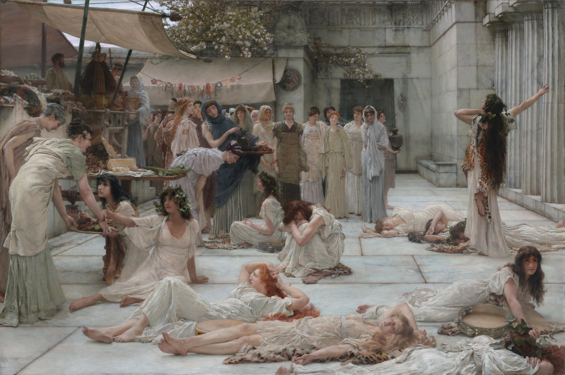
Lawrence Alma-Tadema (1836-1912), The Women of Amphissa, depicting female followers of Dionysus met by women of the city who have been more consistent in their practice of virtue
Watching video productions set in pre-twentieth century times, such as the 1995 Pride and Prejudice and the more recent series Victoria, viewers will notice how the word ‘virtue’ is often used narrowly to refer to something women are obliged to protect. This collapse of the wider meaning of the term, and its more specific association with sexual propriety, diminishes a concept which has very wide significance, especially in the history of moral theology or in Christian ethics.
The ancients and their successors teach us that virtue is a strength or capacity that we need to exercise, and which gains stature through our practice as a shaping dimension of a person’s character. And our tradition teaches us that character is a disposition to act in particular ways. Acts shape character, and character is displayed in acts.
Building on what we can discern about the narrowing of the concept of virtue in the Victorian period, we can be happy that the twentieth century became an era in which the broader meaning of virtue was gradually rediscovered in teaching and in writing, both in Catholic moral theology and in Protestant ethics. The writings of the Roman Catholic Peter Kreeft and the Protestant Stanley Hauerwas provide examples of the contemporary recovery of the importance of virtue for how to think about how to live.
In view of this recovery, it is helpful to think about two virtues in particular, sobriety and chastity. In popular thinking and often in conversation, sobriety for many has come to be equated with complete abstinence from alcohol, and chastity is usually understood to mean refraining from sexual relations. This specific diminishment of our understanding of sobriety and of chastity has had an unfortunate consequence – we think of sobriety as of principal concern for those who have had difficulty in not over-indulging in drinking, and chastity as a way of avoiding sexual activity. However, as virtues with a long history of reflection behind them, we will do well to recover the fuller significance of these two terms.
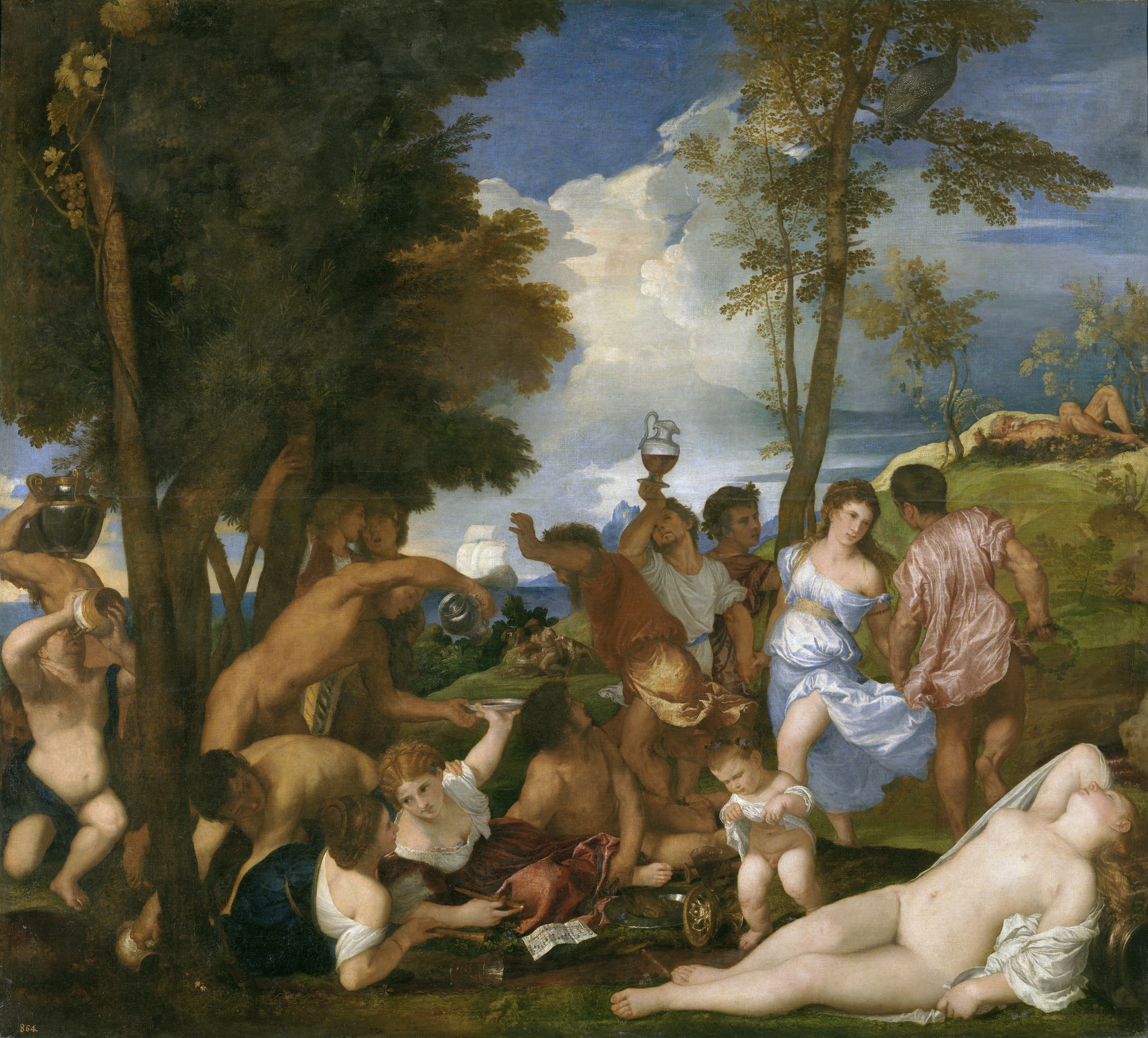
Titian (1488-1576), The Bacchanal of the Andrians, depicting the mythical Island of Andros where a stream flowed with wine
As a virtue, sobriety is best seen as the practice of respecting our bodily integrity and emotional equilibrium in our relationships with others, in both social circumstances and when alone. The appropriate and temperate consumption of alcohol, along with a general indifference rather than a preoccupation with its presence, in our homes or in festive gatherings with others, are features of the practice of the virtue of sobriety.
In a similar way, chastity is also best seen as involving the practice of respecting our bodily integrity and honor in our relationships with others, especially with regard to marriage. In traditional Christian thinking, chastity specifically refers to a respect for the marriage covenant, and more broadly to fidelity in committed relationships, as we seek to practice temperance regarding our sensual inclinations.
It may surprise many in this era to read that all people are called to practice the virtues of sobriety and chastity, as well as other often named virtues. Not all are called or feel the need to abstain from alcohol and/or from sexual relations. Those who do find it difficult to consume alcohol or engage in sexual activity within what we consider to be appropriate and healthy bounds then sometimes choose never to drink and to practice celibacy. We should therefore be cautious about equating sobriety with the more specific practice of abstinence from drinking, and chastity from being equated with celibacy.
For the delight we can find in various alcoholic drinks, and the mysterious wonder of human sexuality, are gifts of Creation. They are to be enjoyed while practicing the virtue of prudence along with those of sobriety and chastity. And our lives are the better for practicing virtue as we prepare for passing through the veil into the fullness of blessedness that awaits us.
Our common focus upon sobriety and chastity may reflect a pervasive aspect of life in society after the so-called ‘sexual revolution,’ or in what many call ‘post-Christian’ times. The unbounded consumption of alcohol and engagement in indiscriminate sexual relations seem to be an ever-present aspect of social life in North America and apparently in Western Europe, if not also across the world.
Classical Christian thought has identified four ‘natural’ virtues, prudence, justice, temperance, and fortitude, which are seen as natural capacities or strengths that can be developed through practice as a result of being born as a human being. Three additional virtues, seen as gifts of the Holy Spirit rather than as natural endowments of our common human nature, are then commended, both by Scripture and the broader Christian tradition. These are the more familiar virtues of Faith, Hope, and Charity (or agapic or other-oriented love). The identification of these seven virtues has not precluded the identification of further virtues – such as sobriety and chastity – which in one way or another manifest aspects of the seven formally named in the history of Christian ethics.
Our practice of any or all of the virtues, including sobriety and chastity, reflects a fundamentally positive choice to honor the integrity of our human embodiment and the communities in which we live, so that we might grow toward flourishing in fulfillment of our created and redeemed potential.
I write the above aware of how the virtue of temperance was in the nineteenth and twentieth centuries narrowed in social communication to become a term referring to total abstinence from alcohol and even its legal prohibition. One familiar example was the 1864 English naming of the Temperance River, the only stream that flows into the North Shore of Lake Superior without having a ‘bar’ (or sandbar) at its mouth. Though a common example, it reinforces why we should want to recover the fuller significance of the Virtues in our ethical and spiritual thinking.
Further note: Prudence is the virtue of practical reasoning
Prior homilies or sermons of mine are occasionally downloaded by readers. Noticing this, I anticipate that some of those preparing to preach (or offer a reading) on an upcoming Sunday might benefit from the perspective I have taken regarding the Lectionary readings for a particular day. I am therefore offering (when I can) a prior text that I have used for the occasion. I will try to do this on Sunday evenings or Mondays believing that there might interest in these texts being made available. When I have one prepared, I will also offer an accompanying handout (in pdf format) in case these may also be helpful.
For this coming Sunday, Pentecost Sunday, I offer the following.
The link for it is here. The link to the handout may be found further below.
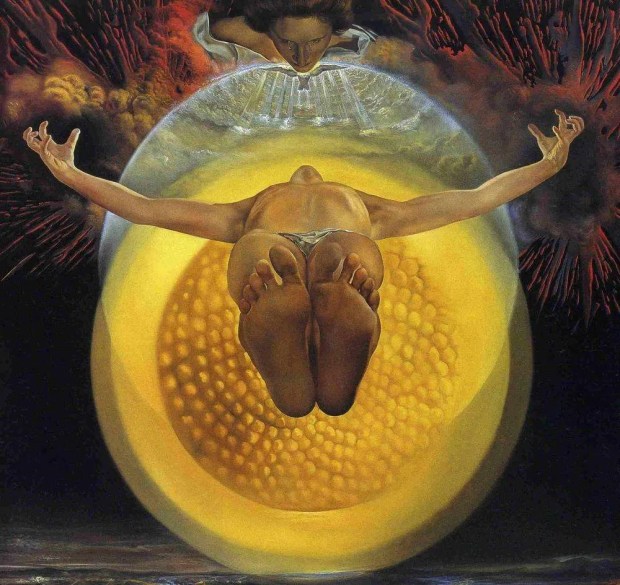
Salvadore Dali, The Ascension of Christ {Christ lifting in his embrace the whole of Creation to the Father, in the Holy Spirit}
Jesus ascended not so that he might withdraw from the world, making room as it were for the mission of the Holy Spirit. Instead, his Ascension marked his transition from being present at one time and in one place, to becoming present in all places, all the time. Before his death, there were countless places where he was not. After his Ascension, there is no place where he is not. From being with only some of those who lived during his earthly years, he is with all of us now. And from having a particular presence and context for his ministry, Jesus in his Ascension transitioned to a universal presence for his continuing mission, so “that he might fill all things,” even us.
The way that we envision the Ascension of Jesus is largely shaped by Luke’s Gospel, as well as by his book of Acts. As the Church’s liturgy observes and celebrates Luke’s presentation of this event, it occurs on the fortieth day after Easter Sunday, which always falls on a Thursday. With diminished weekday worship attendance in most churches, the feast of the Ascension is often observed on the following Sunday, on the Seventh Sunday of Easter. As Luke’s Gospel records the event,
“[Jesus] led [the disciples] out as far as Bethany, and lifting up his hands he blessed them. While he blessed them, he parted from them and was carried up into heaven. And they worshiped him and returned to Jerusalem with great joy, and were continually in the temple blessing God.”
In Acts, Luke presents a fuller account of
“… the day when he was taken up…, [when] he presented himself alive to them… [H]e said to them, ‘… you will receive power when the Holy Spirit has come upon you, and you will be my witnesses in Jerusalem and in all Judea and Samaria, and to the end of the earth.’ And when he had said these things, as they were looking on, he was lifted up, and a cloud took him out of their sight. And while they were gazing into heaven as he went, behold, two men stood by them in white robes, and said, ‘Men of Galilee, why do you stand looking into heaven? This Jesus, who was taken up from you into heaven, will come in the same way as you saw him go into heaven.'”
Giotto, The Ascension of Jesus
Giotto beautifully portrays Jesus’ Ascension in a fresco found within the Scrovegni Chapel (also known as the Arena Chapel) in Padua, Italy. Giotto’s approach to painting proved pivotal in the transition within Western art from dependence upon Eastern Christian iconographic imagery toward a greater realism and sensitivity to ‘ordinary’ human life in this world. Unlike medieval and eastern Christian icons, which tend to be absorbed with expressing dimensions of the eternal, Giotto portrays an actual event in the temporal lives of actual people. Nevertheless, Giotto’s Ascension is clearly also attentive and faithful to the supernatural elements of the Luke-Acts descriptions of Jesus’ Ascension.
It has been observed that in these modern times, among the most neglected aspects of traditional Christian doctrine is a proper understanding of Jesus’ Ascension. This may be due to a contemporary proclivity to read the New Testament as if its significance is primarily ethical, while shying away from engagement with the metaphysical and the supernatural elements of the Gospel narratives. Yet, though often overlooked within the spiritual reflections of many people in this modern era, we need to remember that Jesus’ atoning work was not limited to his offering himself for the life of the world in going to Golgotha. His Ascension and his Resurrection, just as his anticipation of the acknowledged presence and gift of the Holy Spirit, were all a part of his mission of atonement – opening our pathway to one-ness with God.
A collect from The Book of Common Prayer helps us appreciate why the Ascension of Jesus continues to be a major feast of Our Lord on the Church’s calendar:
“Almighty God, whose blessed Son our Savior Jesus Christ ascended far above all heavens that he might fill all things: Mercifully give us faith to perceive that, according to his promise, he abides with his Church on earth, even to the end of the ages; through Jesus Christ our Lord, who lives and reigns with you and the Holy Spirit, one God, in glory everlasting.” (BCP:226)
Just as at his Baptism, in the Ascension of Jesus, the veil between heaven and earth, between the spiritual and the material, between God and us, is pierced and set aside.
Alleluia. Christ is Risen and Ascended! And in the Holy Spirit he is present everywhere and in all who might welcome him into our lives.
Note: this post is adapted from one I have shared previously. We honor our Lords Ascension this week, as we do throughout our days, especially when we speak of it together in the Apostles Creed, in daily Morning and Evening Prayer as well as in the renewal of our Baptismal Covenant, and when we recite the Nicene Creed during the Eucharist. For He is risen, ascended, and continues to be glorified through our prayers.
On Monday of this week, I offered a sample homily for this coming Sunday, Easter 7 A, and an accompanying handout based on themes in the reading from John’s Gospel. I will offer here another sample handout based more directly on Ascension themes related to the above post.
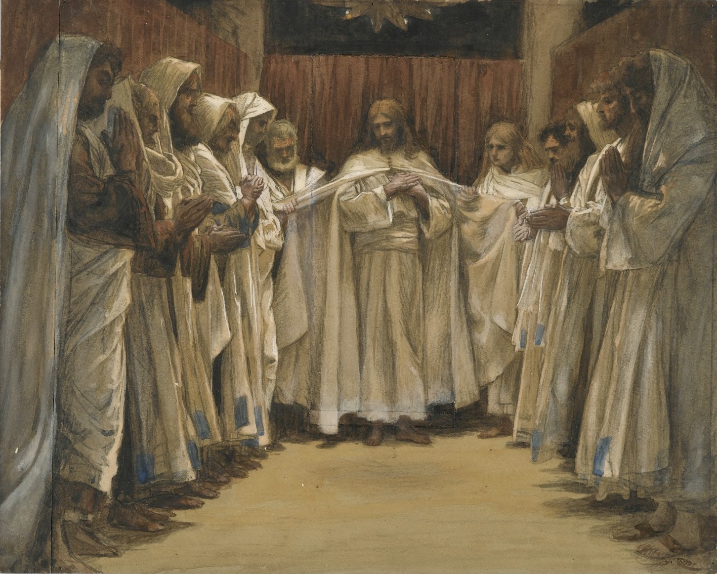
James Tissot, The Last Discourse of Our Lord Jesus Christ
Prior homilies or sermons of mine are occasionally downloaded by readers. Noticing this, I anticipate that some of those preparing to preach (or offer a reading) on an upcoming Sunday might benefit from the perspective I have taken regarding the Lectionary readings for a particular day. I am therefore offering (when I can) a prior text that I have used for the occasion. I will try to do this on Sunday evenings or Mondays believing that there might interest in these texts being made available. When I have one prepared, I will also offer an accompanying handout (in pdf format) in case these may also be helpful.
For this coming Sunday, Easter 7 in Lectionary year A, I offer the following. I will offer Ascension-related reflections in my Wednesday post for this week.
The link for it is here. The link to the handout may be found further below.
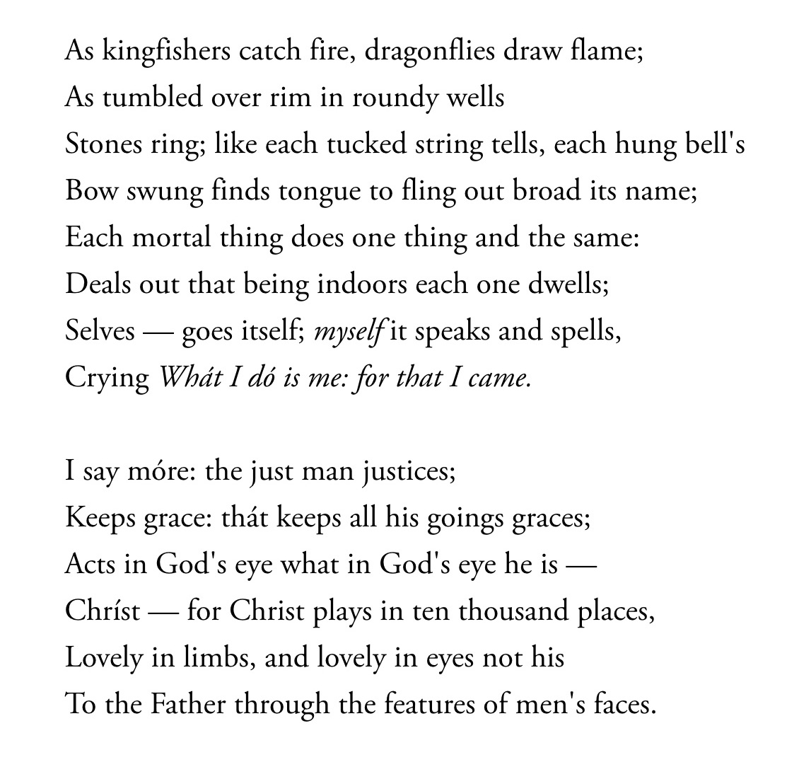
A Kingfisher, a brightly colored fish-eating bird with a large head, a dagger-like bill, which dives to catch prey
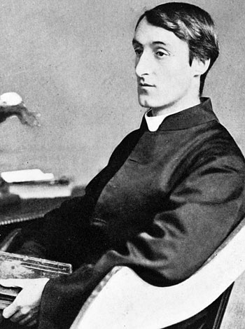
One of my favorite poems was written by the English poet and Jesuit priest, Gerard Manley Hopkins (1844-1889), from whom I have received inspiration in my continuing desire to glorify God by helping others perceive and give thanks for beauty. The poem from which I have borrowed my title for this post, provides a wondrous example of his gifts at work. I quote his poem here in full:
Hopkins’ Kingfisher poem, which is known by its first line
Reading poetry with insight does not come naturally to me, though I much appreciate the art form. As many others do, when approaching a poem like Hopkins’ “As Kingfishers catch fire,” I rely upon essays written by interpreters trained in literature. Since poems involve verbal communication, it may be that sharing insight about a poem with words is a more fruitful endeavor as compared with attempting the same regarding a painting. Yet, I believe that – as with most art forms – we can best express the things that have caught our attention and stirred our spirit in the paintings and poems that have stayed with us. Here are some aspects of Hopkins’ Kingfisher poem that continue to draw me in when I read its lines and speak its words aloud.
In this poem, Gerard Manley Hopkins displays what I consider to be an essentially “Catholic” sensibility when reflecting upon the world and our place within it. Here, his suggestion of the inner relationship and yet the difference between God’s mission in Creation and in Redemption, stands out to me, as does the continuity that may be perceived between the two. Order, purpose, meaning, and – yes – beauty, are to be found in God’s handiwork. The patterns we discern in nature attest to God’s intentions for us and for all other things touched by God’s ‘hands’ and by ours, and so we are reminded to look within ourselves for the same kind of purpose.
In discerning something of God’s purposes for us, we act in accord with what we observe and come to know. We are created to be just and so we choose to act justly. And we are created and then blessed further with God’s grace to be instruments of the same beautiful love. Risen Jesus, who comes to be with us, and then in us, manifests his divine role, inhabits our being, and brings new life to where it was not. In us, among the myriads upon myriads of those who see his beauty, who say, “Yes.”
Gerard Manly Hopkins as a JesuitA kingfisher – metaphorically – ‘catching fire’Diving for a catch
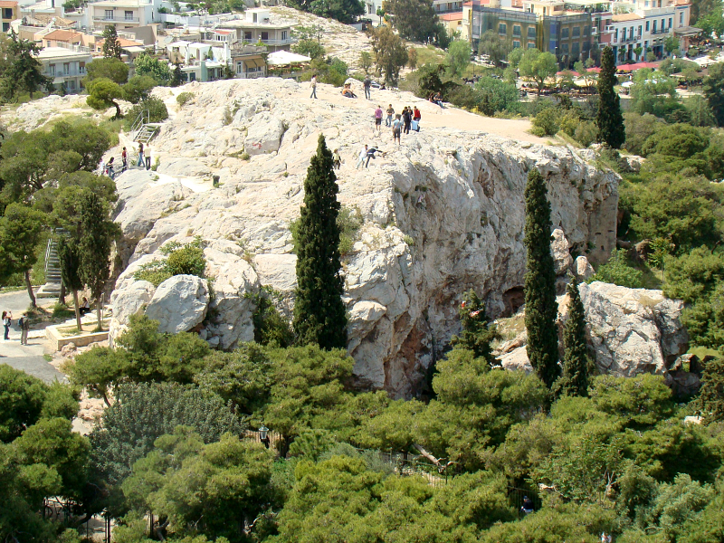
The Areopagus Hill, in Athens adjacent to the Acropolis, where Paul met with the questioning Athenians
Prior homilies or sermons of mine are occasionally downloaded by readers. Noticing this, I anticipate that some of those preparing to preach (or offer a reading) on an upcoming Sunday might benefit from the perspective I have taken regarding the Lectionary readings for a particular day. I am therefore offering (when I can) a prior text that I have used for the occasion. I will try to do this on Sunday evenings or Mondays believing that there might interest in these texts being made available. When I have one prepared, I will also offer an accompanying handout (in pdf format) in case these may also be helpful.
For this coming Sunday, Easter 6 in Lectionary year A, I offer the following.
The link for it is here. The link to the handout may be found further below.
Anglican artists, writers, and musicians, have found deep spiritual significance in our encouter with beauty in the natural world, and they have left us with abundant examples of beauty in the places and things of worship. Our liturgies have been shaped by faithful people who, echoing the Psalmist, have sought to glorify “the fair beauty of the Lord.” It is therefore somewhat surprising to notice the relative paucity of references to beauty in The Book of Common Prayer, though the concept is interwoven in its many texts. In subtle and in sometimes hidden ways, beauty nevertheless functions as a significant concept in our prayers.
For Anglicans, The Book of Common Prayer [hereafter as BCP] functions as a resourcefor our prayers. And, in time and through practice, it becomes the sourceof our prayers, especially in the way that it is founded upon, and leads back into the Holy Scriptures. We are open to individually-crafted voluntary prayers offered for specific occasions. Yet, in our experience, these ‘unscripted’ prayers characteristically also become formulaic and repetitive in content as well as in phrasing, just our BCP prayers are sometimes said to be. As Anglicans, we find that – like practices handed down over generations – prayers shaped by communities also become ‘hallowed by time.’
Further, we hold in common a premise upon which Anglican Christians have typically relied. We often find our basic doctrine expressedin our prayers, though we do not usually look to our prayers to find nor to establish our doctrine. For it would be contrary to the spirit of this approach if we were to conclude that, by simply changing our prayers, we would then change our doctrine. Therefore, in the same spirit, the phrases that I cite here from the BCP are authoritative because they are true, rather than true as a result of coming from what we consider to be an authoritative source.
From the BCP, we are reminded about many things concerning Beauty, among them that:
⁃ Beauty is an attribute of God ⁃ God’s beauty is manifest in God’s handiwork in Creation, and therefore {by implication} manifest also in us, and between us ⁃ Creation is permeated with God’s beauty and grace, which is a reflection of God’s goodness as well as of divine truth, God’s own nature and a characteristic attribute of God’s creative activity ⁃ When we behold the beauty with which God has imbued Creation, we rejoice and experience joy as we encounter the presence of God’s love for the world and for us ⁃ Having this encounter, we perceive how God has given us work to do in truth and beauty and for the common good
Goodness, Beauty, and Truth, are attributes of God’s being and nature. How do we know this? We see the reflection, even the manifestation, of these transcendentals in the things that are created and here for us to behold and encounter. When we encounter these transcendentals in the things that are made, we encounter these attributes of God, not merely the residue of God’s action. And in so doing, we experience peaceful joy. This joy in us is our experience of God’s love for God’s work, the fruit of God’s creativity.
We often experience a disconnect between ourselves and our work, between who we are and how we act. With God, there is no such disconnect. God’s being and activity are indivisible, even if we distinguish them in our reflection. For at least in traditional Christian doctrine, God is all good, all knowing, and all powerful, dwelling outside of time, but acts and is fully present within it.
In our reflection therefore, God’s work of Creation and God’s work of Redemption may and should be distinguished but not confused nor separated. The principal reason for this is our recognition of the fallen state of Creation and of our human nature within it, to which God’s loving work of Redemption has been addressed.
As I previously reflected, in both Creation and in Redemption, God has formed and shaped the world and its inhabitants so that the world through God’s Creation is good and beautiful, and also a repository for what is true. Through Redemption, God embraces and transforms fallen Creation in such a way so that all that is amenable to fulfillment and completion in Christ may come to be so, and those things that are not amenable to the same have no future in Christ. Along with Truth and Goodness, Beauty plays a principal role in this ongoing process.
A Collect from The Book of Common Prayer
As a portion of Psalm 90 can be translated, “Let the beauty of the Lord our God be upon us, and prosper us for the work of our hands!” And in Psalm 96, we find: “Sing to the Lord a new song; sing to the Lord, all the earth… Honor and majesty are before him; strength and beauty are in his sanctuary.” And so, by divine grace, may these attributes of God and of the Risen Lord be present in our midst, and within us.
For reference, and as background material for the above, I include here some specific sources in the BCP for what I have shared:
In the BCP section, Prayers and Thanksgivings [BCP:814], Prayers for the World, from the Collect, For Joy in God’s Creation [BCP:814], we are reminded that: ⁃ Our Heavenly Father has filled the world with beauty ⁃ We ask God to open our eyes so that we can then behold God’s gracious in all of God’s works ⁃ So that, by rejoicing in God’s whole creation, we may learn to serve God with gladness, for Jesus’ sake, through whom all things were made ⁃ In other words, we find this implied sequence of ideas: —> God has filled the world with beauty -> God opens our eyes -> we behold God’s gracious hand in God’s works -> thereby we rejoice in God’s whole creation -> in the process, we learn to serve God with gladness
From the Collect for “The Transfiguration” [BCP:243], we are reminded that ⁃ We ask God to grant that we might be delivered from the disquietude of this world, so that we may by faith hold the King in his beauty, who with the Father and the Holy Spirit lives and reigns, one God, world without end
From the Collects for “Various Occasions,” the Collect for Vocation in Daily Work” [BCP:251], we are reminded that ⁃ Almighty God, our Heavenly Father, declares his glory and shows forth his handiwork in the heavens and in earth ⁃ We ask God to deliver us in our various occupations from serving ourselves alone, so that we may do the work God has given us to do in truth and beauty and for the common good
From the liturgy for “The Dedication and Consecration of a Church” [BCP:567ff], we are reminded that ⁃ We give God thanks for the gifts of God’s people, and for the work of many hands, which have beautified places and furnished them for the celebration of God’s holy mysteries ⁃ We ask God to accept and bless all that we have done, and to grant that in these earthly things we may behold the order and beauty of things heavenly ⁃ Through Jesus Christ our Lord
From the “A Litany of Thanksgiving for a Church” [BCP:578, from within the above liturgy], we are reminded that ⁃ we thank God whom we worship [here] in the beauty of holiness
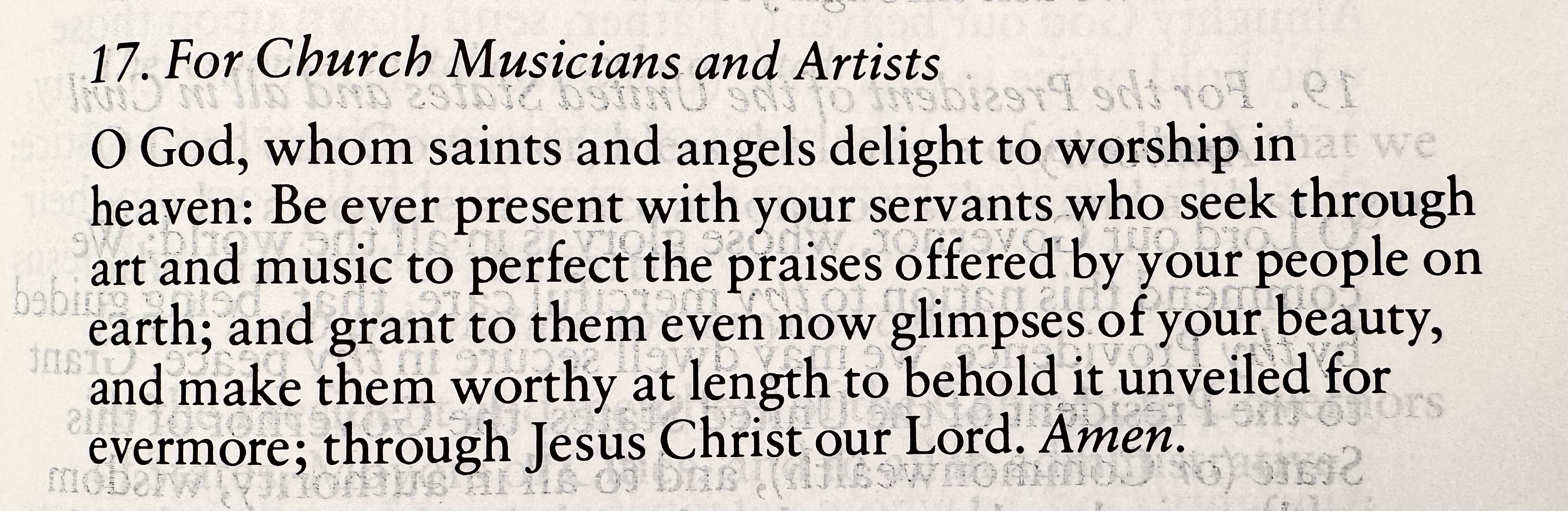
In the BCP section, Prayers and Thanksgivings [BCP:814], Prayers for the Church, from the Collect, “ForChurch Musicians and Artists,” we are reminded that ⁃ Saints and angels delight to worship God in heaven ⁃ We ask God to be ever present with his servants who seek through art and music to perfect the praises offered by God’s people on earth ⁃ And, to grant to them even now glimpses of God’s beauty and make them worthy at length to behold it unveiled for evermore ⁃ Through Jesus Christ our Lord ⁃ {and thus that God’s beauty is unveiled to those faithful who have gone before us to the other side}
In the BCP section, Thanksgivings [BCP:836ff], by “A General Thanksgiving” [BCP:836], we are reminded that ⁃ we thank God for the splendor of the whole creation, and for the beauty of this world ⁃ {and} for the wonder of life, and ⁃ for the mystery of love
In the same section, by “A Litany of Thanksgiving,” we are reminded that ⁃ we “give thanks to God our Father for all his gifts so freely bestowed upon us” ⁃ {and} for the beauty and wonder of God’s creation, in earth and sky and sea
Among the “Thanksgivings for National Life” [BCP:838ff, by the Thanksgiving “For the Nation,” we are reminded that ⁃ we thank almighty God for the natural majesty and beauty of this land, which restore us though we often destroy them
From among the “Thanksgivings for the Natural Order” [BCP:840ff], by the Thanksgiving “For the Beauty of the Earth,” we are reminded that ⁃ We give our most gracious God thanks for the beauty of earth and sky and sea; for the richness of mountains, plains, and rivers; for the songs of birds and the loveliness of flowers ⁃ That we praise God for these good gifts, and pray that we may safeguard them for our posterity ⁃ we ask God to grate that we may continue to grow in our grateful enjoyment of God’s abundant creation, to the honor and glory of God’s name
Note: I have retained and employed the pronouns and grammatical style employed by the 1979 Book of Common Prayer, which continues to be our primary and most widely shared reference point for theological expression and beliefs. Our beliefs are founded upon Scripture, which always provides the standard for a community that believes that prayer both reflects and shapes belief. And the Scripture that we “read, mark, learn, and inwardly digest” is the Scripture that has been received and confirmed by the believing community of the wider Church through the centuries. Different Christian communities of course prefer differing translations of the Bible. Here, for Anglicans, Scripture is authoritative as we are guided by an ancient maxim attributed to St. Vincent of Lérin: What has always been believed by everyone, everywhere. Very little, it may seem, wholly fulfills the requirements of this maxim. Yet, what comes closest to fulfilling it is therefore most authoritative for us.
Prior homilies or sermons of mine are occasionally downloaded by readers. Noticing this, I anticipate that some of those preparing to preach (or offer a reading) on an upcoming Sunday might benefit from the perspective I have taken regarding the Lectionary readings for a particular day. I am therefore offering (when I can) a prior text that I have used for the occasion. I will try to do this on Sunday evenings or Mondays believing that there might interest in these texts being made available. When I have one prepared, I will also offer an accompanying handout (in pdf format) in case these may also be helpful.
For this coming Sunday, Easter 5 in Lectionary year A, I offer the following.
The link for it is here. The link to the handout may be found further below.
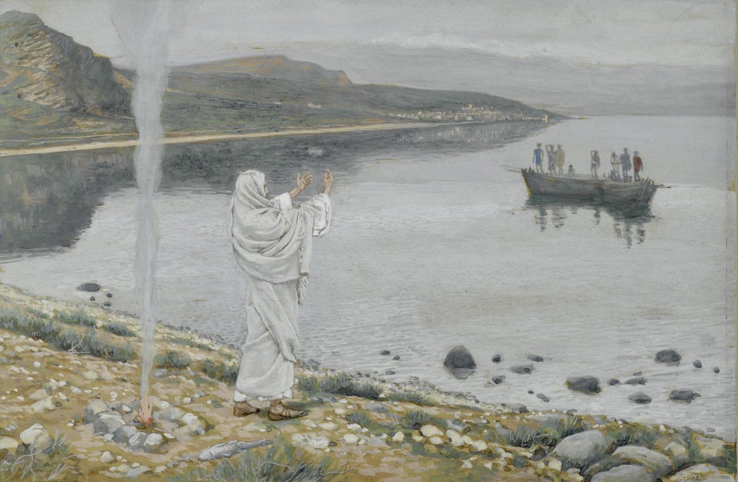
James Tissot, Christ Appears on the Shore of Lake Tiberius
“To thine own self be true.” This familiar adage is now known to many people through their experience with 12-Step Recovery programs. Yet the phrase is traced back to its appearance in a play by Shakespeare, and hearkens back to a simple statement attributed to Plato from the pre-Christian Classical period, “Know thyself.” One way to understand being true to ourselves involves living toward spiritual wellness and in an ethical manner. If these pursuits are of value to us, we may be open to receiving counsel about how we can be truthful, and good in our conduct, even if we are not comfortable with the degree of our adherence to these ideals. But to be beautiful?
Here, modern translations of the New Testament may provide a benefit to our thinking about questions like these. In our contemporary sensitivity to employing gender-neutral and inclusive language, sayings from the lips of Jesus or in the Letters of Paul are often cast in plural language. The potential benefit to us may lie in the encouragement we can receive to think in corporate or in community-minded terms.
We often need to remind ourselves to think about our lives with a wider frame of reference, for we are so much more than individuals with only chosen or willed connections and relationships with others. We will be truer to the message of Jesus and the teaching of the New Testament when we are equally attentive to our membership in the Body of Christ, the Church, within the Communion of Saints. Our baptismal identity is shaped fundamentally not by what we do, but by our grace-enabled incorporation within the community of the Risen Lord.
In other words, we can learn to receive and follow gladly the advice that we be true to ourselves when we do so as members of the Body of Christ. We can then see ourselves in more expansive terms than those based merely upon our physical birth identity as unique individuals, our social status, or upon our achievements.
One way to understand Jesus’ use of the mysterious phrase, the Son of Man, is to see this title in terms of the transformed personhood we apprehend in the Risen Lord. As such, he embodies for us the ‘true’ and fully redeemed human person and therefore the full goodness of human being. If so, the Risen Christ also embodies for us the fully realized beauty of both created and also redeemed human personhood. In him we find our new baptismal identity in communion fellowship with one another, which is the distinctive characteristic of participation in the Risen Body of Christ. We are, in Christ, people living together into the beauty of his Resurrection.
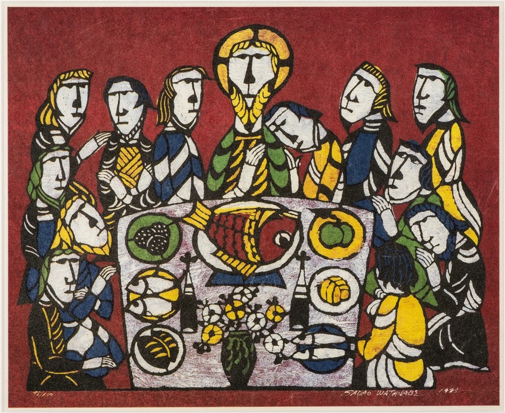
James Tissot, Meal of Our Lord and the Apostles
Here is the challenge that arises with disciplining ourselves to think in these corporate and communal terms. In the culture in which we live and raise our children and grandchildren, beauty for us is most commonly thought of in visible, physiological terms. Perhaps encouraged by the advertising and media to which we are contstantly subjected, we pursue pharmaceutical products, health and exercise regimens, and even plastic surgery. We do so in search of achieving outward beauty of a kind communicated to us by others as a goal we need to seek.
We then lose sight of inward beauty, the beauty we can attain as persons who mature, become wiser, and more generous in our viewpoints. I have previously written about Sister Wendy Beckett, who I have described as one of the most beautiful persons I have come to know through my reading and media viewing. Outwardly, it must be admitted, Sister Wendy was not the kind of person whose countenance would be featured on magazine covers as an exemplar of physical beauty. Our view of what it means to be fully human is diminished if we do not also see how she, over her long years of life as a solitary devoted to prayer, became one whose face and physical presence radiated the beauty of the Risen Lord.
In this Eastertide, we hear stories from the Gospels that are echoed in passages from Acts of the appearances of the Risen Jesus, returning to his first followers. He came into their presence, encouraging and strengthening them for mission as witnesses to his realization of God’s hopes and plans for all people, for we all are God’s beloved. By grace, we are among those who have been embraced by this mission, as are those who have yet to hear and receive the hope of the Gospel. Too quickly, we assume that in the lives of hearers and readers of these stories the appropriate fruit of these appearances will be manifest primarily in truthful speaking and admirable conduct. As a result, we neglect to imagine how these stories also encourage us to embody the Beauty of the Risen Lord.
“He is Risen! The Lord is Risen, indeed!” These are wonderful phrases for us to repeat, and take to heart in this season of the Great Fifty Days. We can find in these words their intended corollary: For us who are baptised, ‘we arerisen’! We are risen, indeed, and called to live into the Way, the Truth, and the beautiful Life into which the Risen Lord has invited all people. And he has made this possible for all who might be open to receiving this wonder-filled message.