The Japanese architect, Kengo Kuma, has designed a beautiful contemporary context for a display of traditional Japanese craftsmanship in woodworking. You can find it in a coffee shop at a Starbucks location in Fukuoaka, on Kyushu Island in southern Japan. Specifying the use of the art of Kiguma, the Japanese art of assembling pieces of wood through precise cuts and fittings, but employing no nails or screws, Kuma has created an aesthetically pleasing destination for those who appreciate fine architecture as well as espresso.
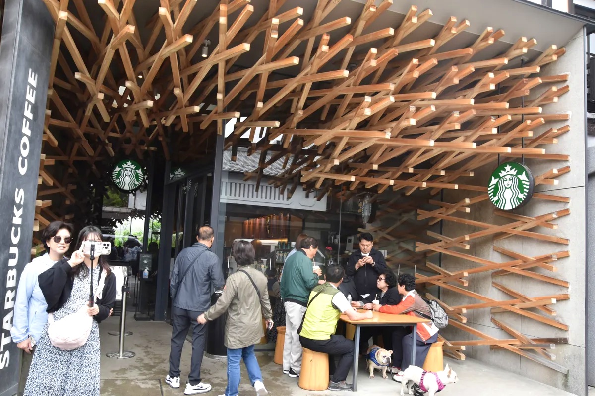
Evident in many locations associated with its brand, Starbucks focuses upon providing thoughtfully designed contexts for enjoying their products, whether in self-standing stores or in airport and grocery store kiosks. In this particular case, the choice to engage the services of a design-savvy modern architect, and his willingness to undertake this comparatively small project, speak well to the sensitivities of both Kuma and the corporation.
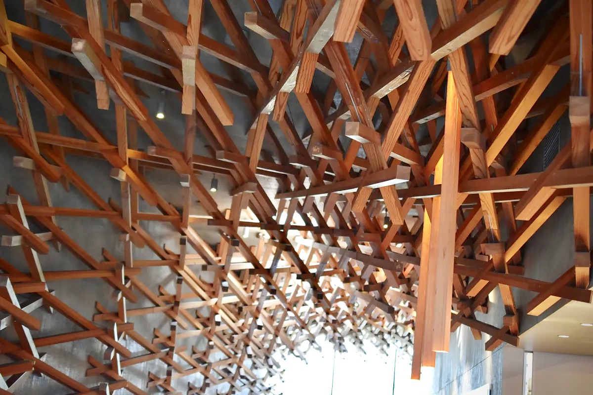
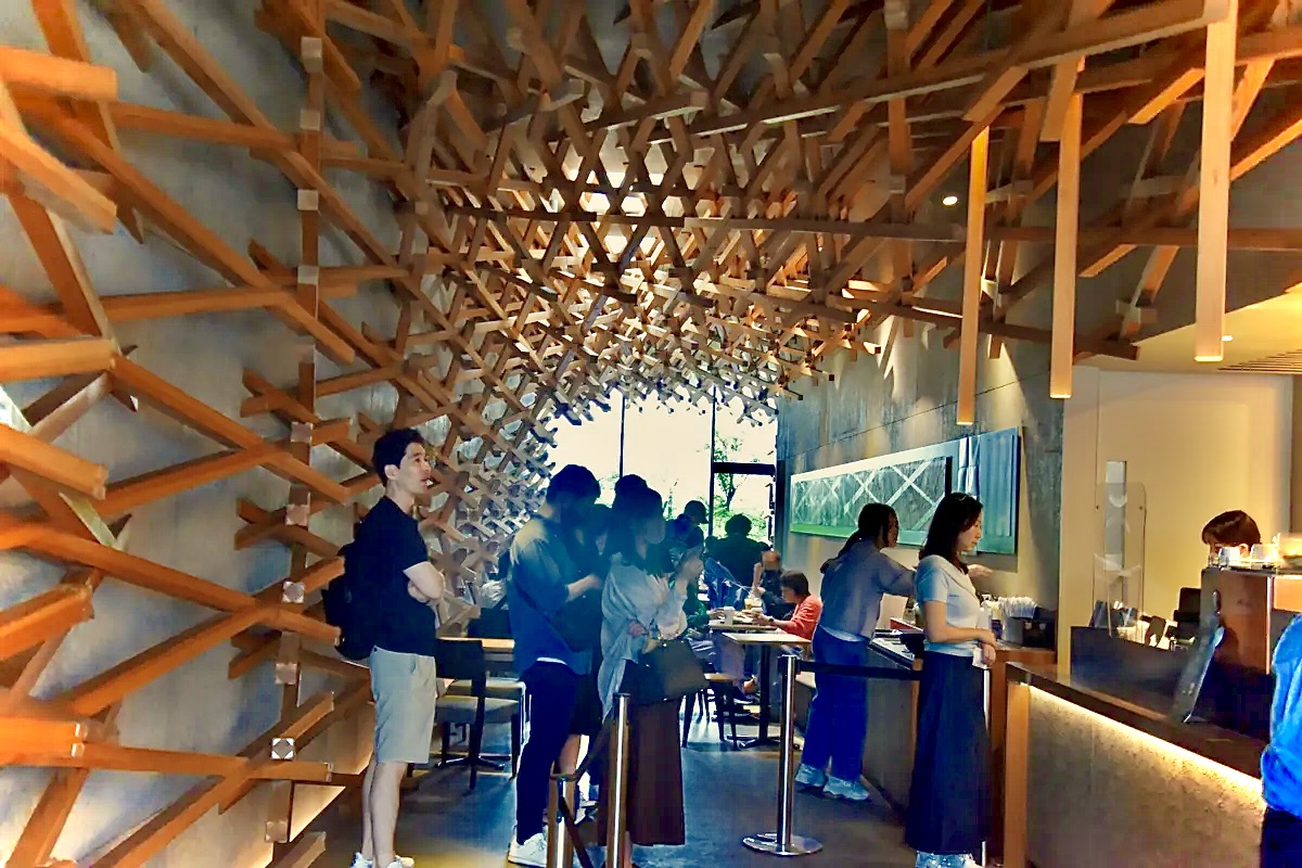
Kuma’s plan for the interior of this space, complex in appearance, features what looks like a standard series of pieces of cherry wood that measure about six feet in length and of 2″ by 2″ dimensions. Employing these relatively light and small pieces of wood in a way that resembles modern tensile structures, the architect has produced an environment that hovers over and around customers, drawing them in to the interior. The spatial atmosphere he has attained is simultaneously conducive to imaginative reflection and yet also quiet contemplation. Perfect, in my mind, for enjoying a coffee break, while visiting the many historic attractions in this part of Japan.
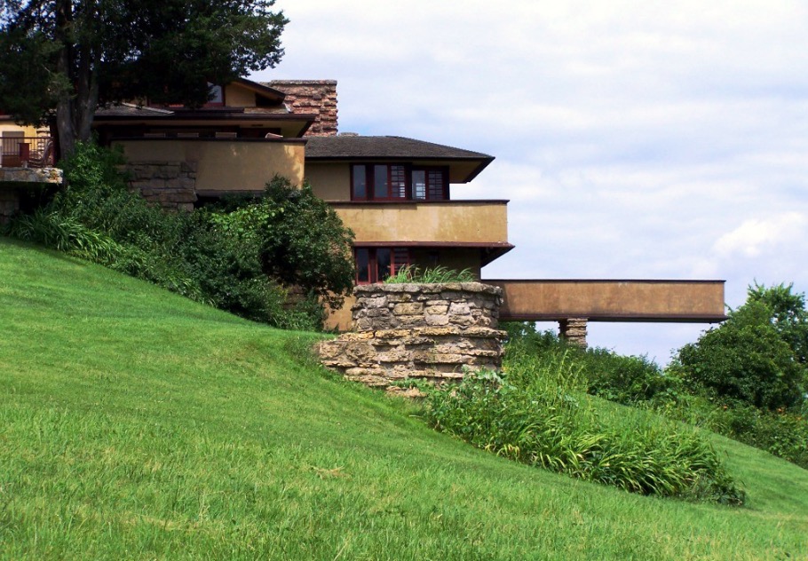
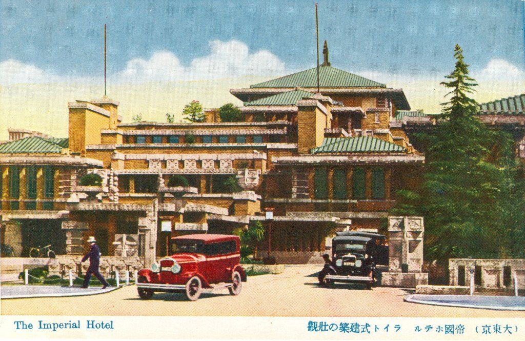
I am intrigued by what I have learned about Kengo Kuma’s design principles, articulated in his book, Anti-Object: The Dissolution and Disintegration of Architecture, positive ideas from his studies that he seeks to be exemplified in his own buildings and their spaces. His primary university eduction in Architecture was at Tokyo University, but he studied for a year at Columbia University, and has taught for short periods at two other American universities. Given his formation and his approach to design, I am inclined to think that he has found a sympathetic parallel to his world view in the lifelong architectural principles of Frank Lloyd Wright, who made seven trips to Japan and who lived there for three years while designing his Imperial Hotel for a location near the Imperial Palace in Tokyo.
One observer has summed up Kuma’ approach in Anti-Object in this way: Kuma “critiques the Western architectural tradition of the isolated ‘object’ building, advocating instead for a more integrated, ‘weaker’ architecture that dissolves into its environment. Kuma argues against buildings that stand apart as self-centered monuments, proposing an alternative approach that uses natural light, materials, and context to create immersive, experiential spaces, drawing inspiration from Japanese traditions…”
Our American urban landscapes are filled with ‘object architecture’ of the kind with which Kuma has taken issue. Familiar examples might include the building style featured in the recent film, The Brutalist, and as is arguably represented by the new Presidential Center tower on the south side of downtown Chicago, which given its significant cost could have provided a beautiful addition to the city’s skyline. By contrast, Kuma contends for the goal of harmony with a building’s context, without either slavish imitation of neighboring buildings nor the opposite, a statement-seeking rejection of the style of surrounding structures and their physical environment.
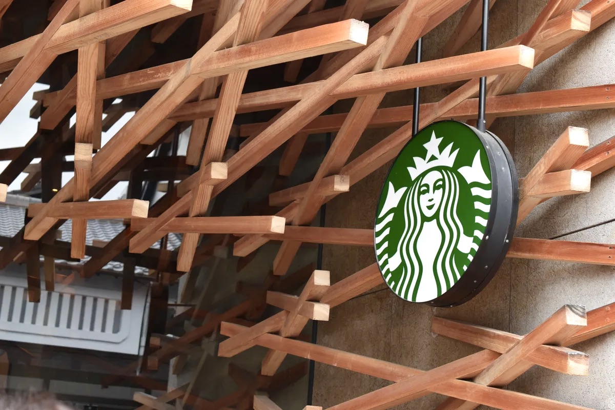
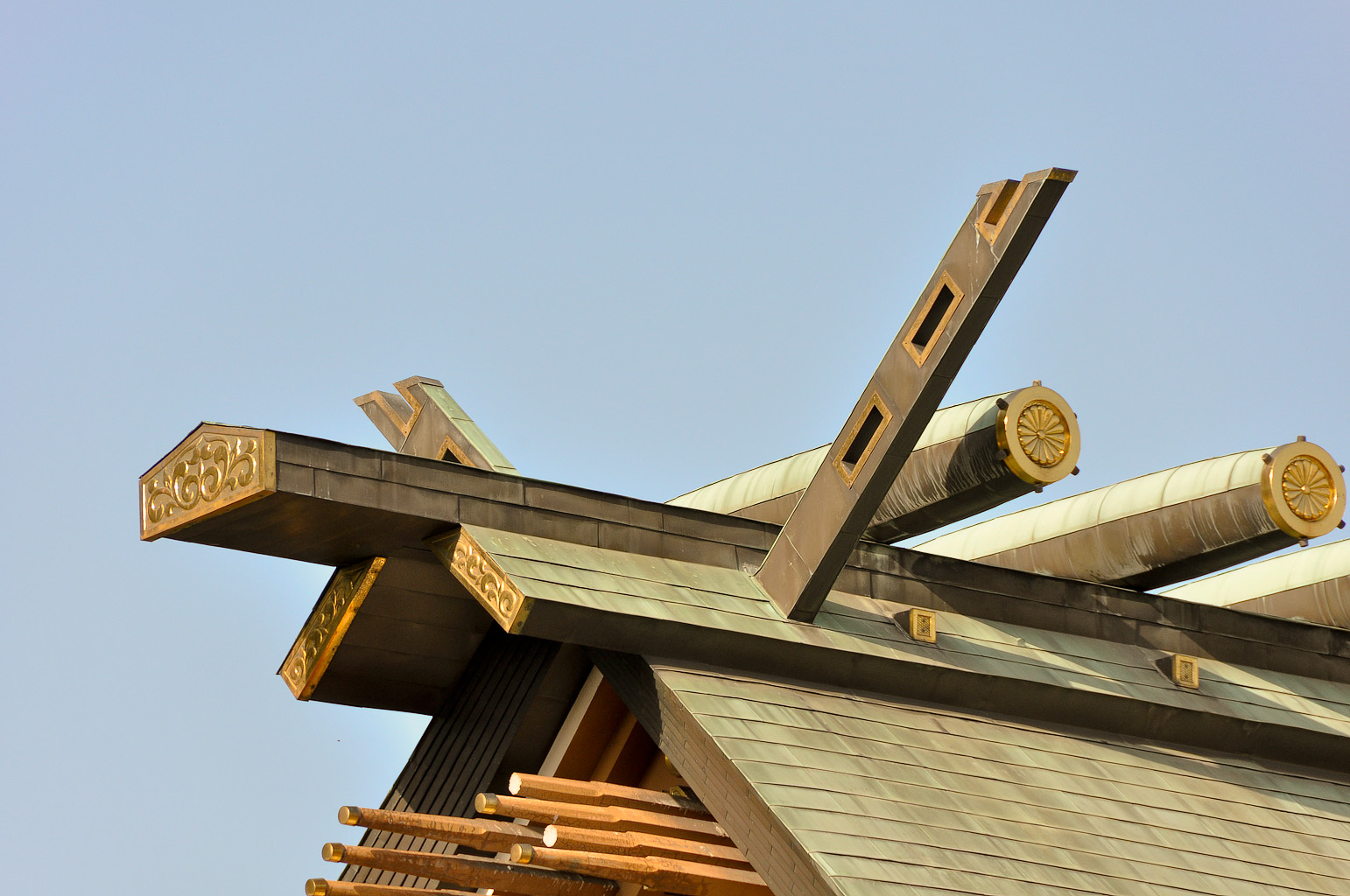
A notable element of Kuma’s design for the interior structure of this coffee shop can be seen in the way that the wooden struts extend outward from their crossing points (visible in the photo above). Visitors to Japan might recognize how this feature of Kuma’s project echoes what are called chigi, the crossed roof ends of Shinto shrines, seen all over Japan. Note the affinity between the way that Kuma has employed the cherry wood components of his design, and the chigi as well as the extended wooden rods used in the following example of a traditional Japanese Shinto shrine:
Having discovered the architectural work and ideas of Kengo Kuma, I look forward to learning more about his other buildings, among them the remarkable Victoria and Albert Museum in Dundee, Scotland, which I hope to feature in a future post.