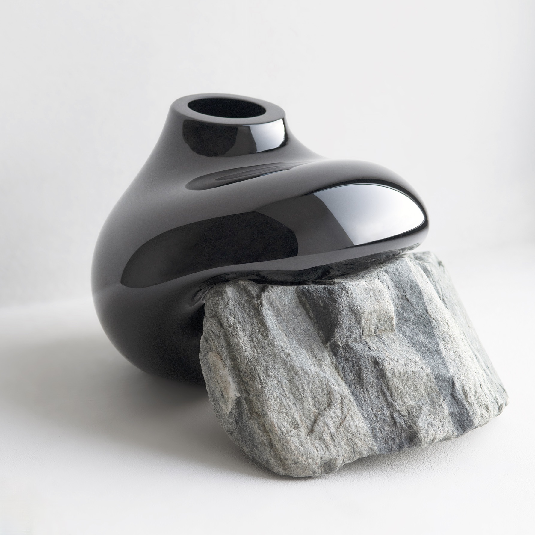
Recently, I observed my middle son moving a black plastic pond module around in a small space in his New Orleans courtyard. As he moved the container that would soon have fish in it, he tried situating the vessel in various ways, in relation to a tree, a fence, some potted plants, and an existing low stone wall. He is not a student or practitioner of feng shui, but I believe I was seeing some of those principles at work in his decision-making.
Western readers may have heard of feng shui, the Asian philosophical approach to discerning the unseen forces that affect objects and their balance in nature. It gives attention to the metaphysical or non-material energies thought to be at work upon or within the world around us. We might say that this approach provides a Tao of seeing, or a natural way of perceiving within and around surface phenomena to the underlying dynamisms that are believed to affect what happens in nature.
This notion that there are unseen forces at work in the world is an idea that is receiving something of a revival in Western Christian spirituality. This is noticeable when people refer to a concept attributable to the Celtic tradition, in which it has become common to refer to “thin places. “ These are places where the veil between the material and the ethereal or the heavenly seems temporarily dissolved. Another parallel here between East and West may lie in the quest within Christian spirituality for the goal of harmony and balance between people and the created world.
However, my reflections here constitute an aesthetic rather than a philosophical or historical inquiry. I am interested in the dynamics of movement we perceive in the circumstances that we encounter, and less in the metaphysical forces or energies that may be present within them. At the outset, however, I want acknowledge how a nuanced Asian approach can be an authentic route toward a culturally-informed appreciation of the phenomena we encounter, especially from a historically Asian perspective.
As we look at paintings in the context of Western culture, one factor we discern assesses composition and attends to the way our seeing is drawn from one part of a larger image to another. This dynamic is often an artist-intended aspect of an overall composition. Sight lines in garden design and arrangement provide another example, as does the architectural arrangement of space in buildings.
Attention given by Western designers to feng shui is sometimes criticized as being a superficial application of historically and philosophically nuanced ideas. But I want to give credit to ways in which our sensitivity toward perceiving movement and direction is a genuine factor that is available for analysis and articulation. We notice this when we encounter both two dimensional compositions as well as three dimensional spaces and the objects we find in them. We can always come to know more about what we see. Because what we see is something that is there, not simply what we believe, or are disposed or inclined to see.

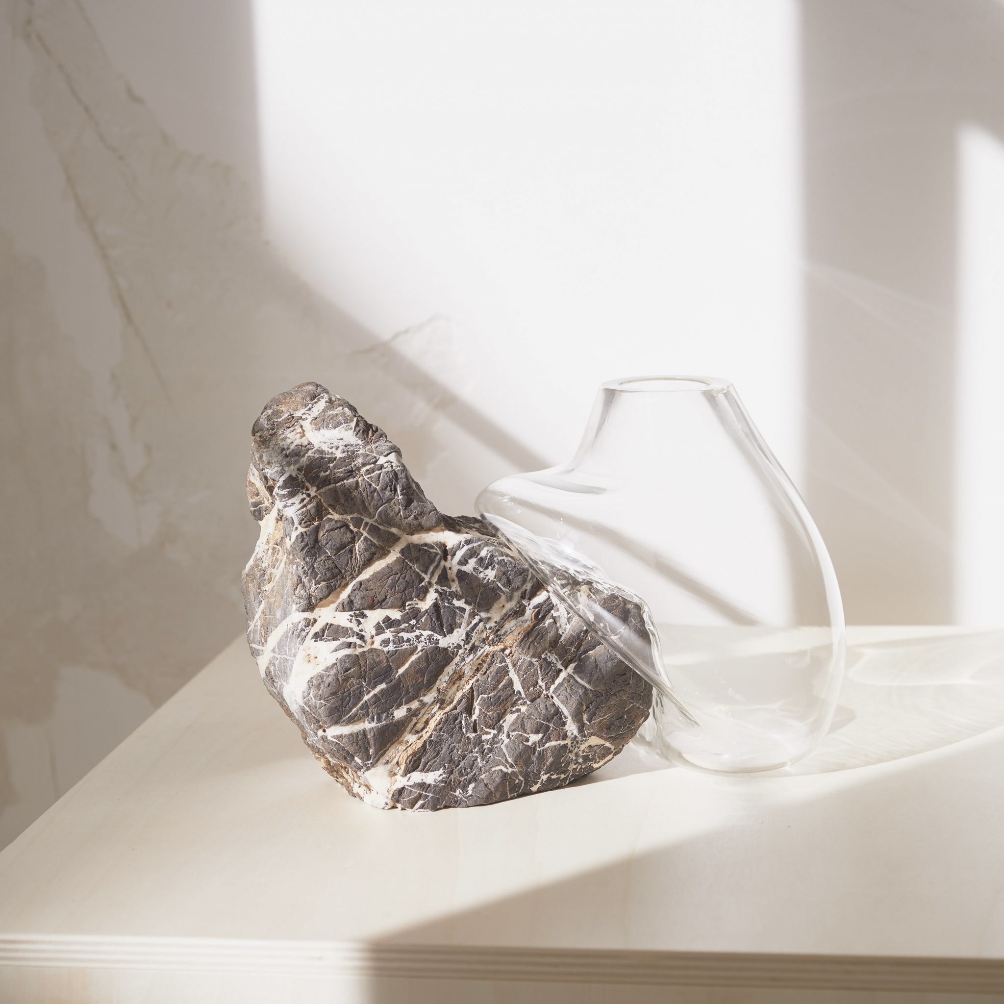
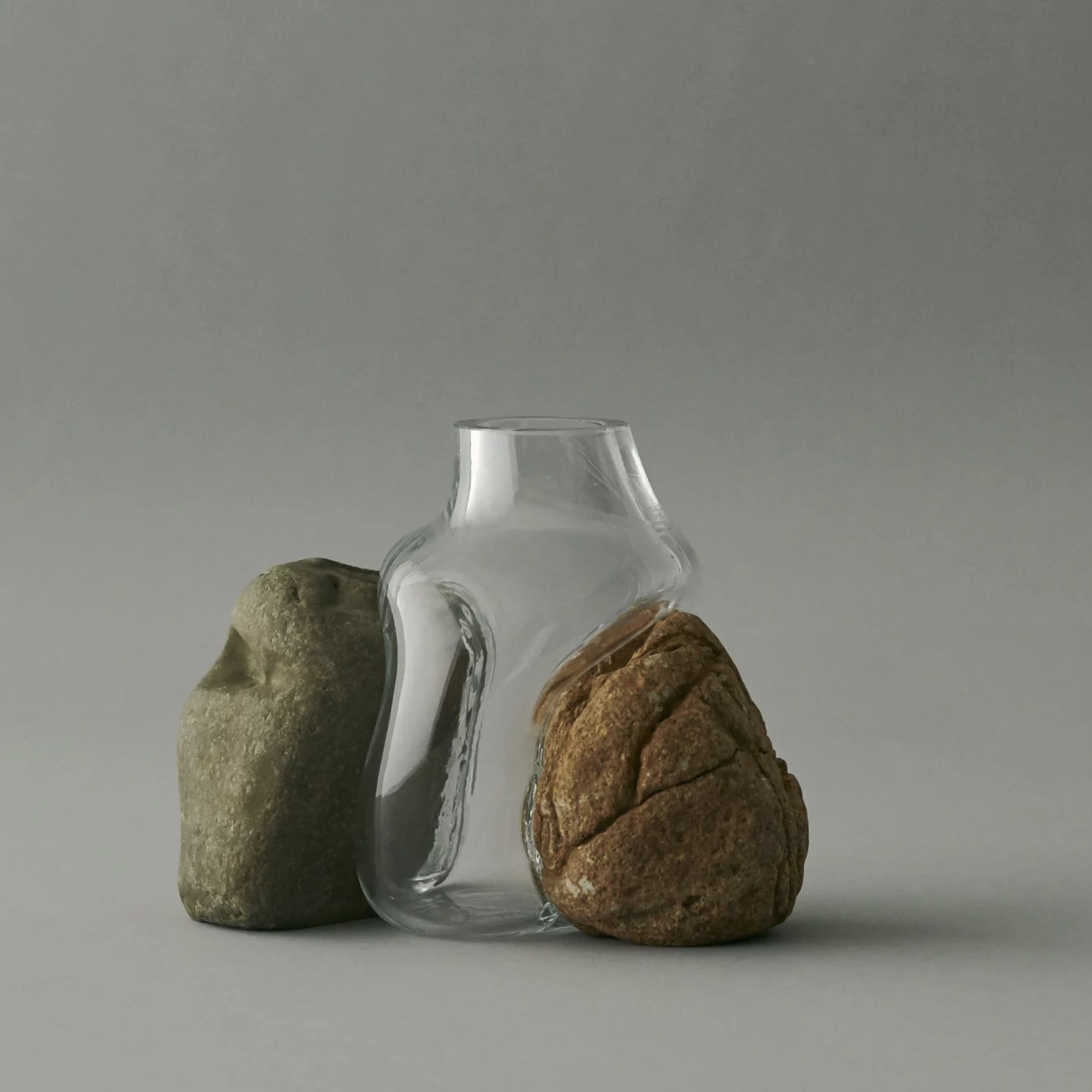
Motion, balance between forces, spatial arrangement of objects, and the dynamic relationships that are visible because they exist between and among these variables, continue to grab my interest. Contrasts between colors and textures, as well as between sizes and shapes, play a significant role. Additionally, the perceived difference between what is natural and things that are humanly fashioned is equally significant, as is our perception of the criteria for what constitutes that which we consider to be natural. These are among the factors that help account for our sensitivity towards and interest in these many observable variables, and our common quest for purpose and meaning in the contexts where we find ourselves.

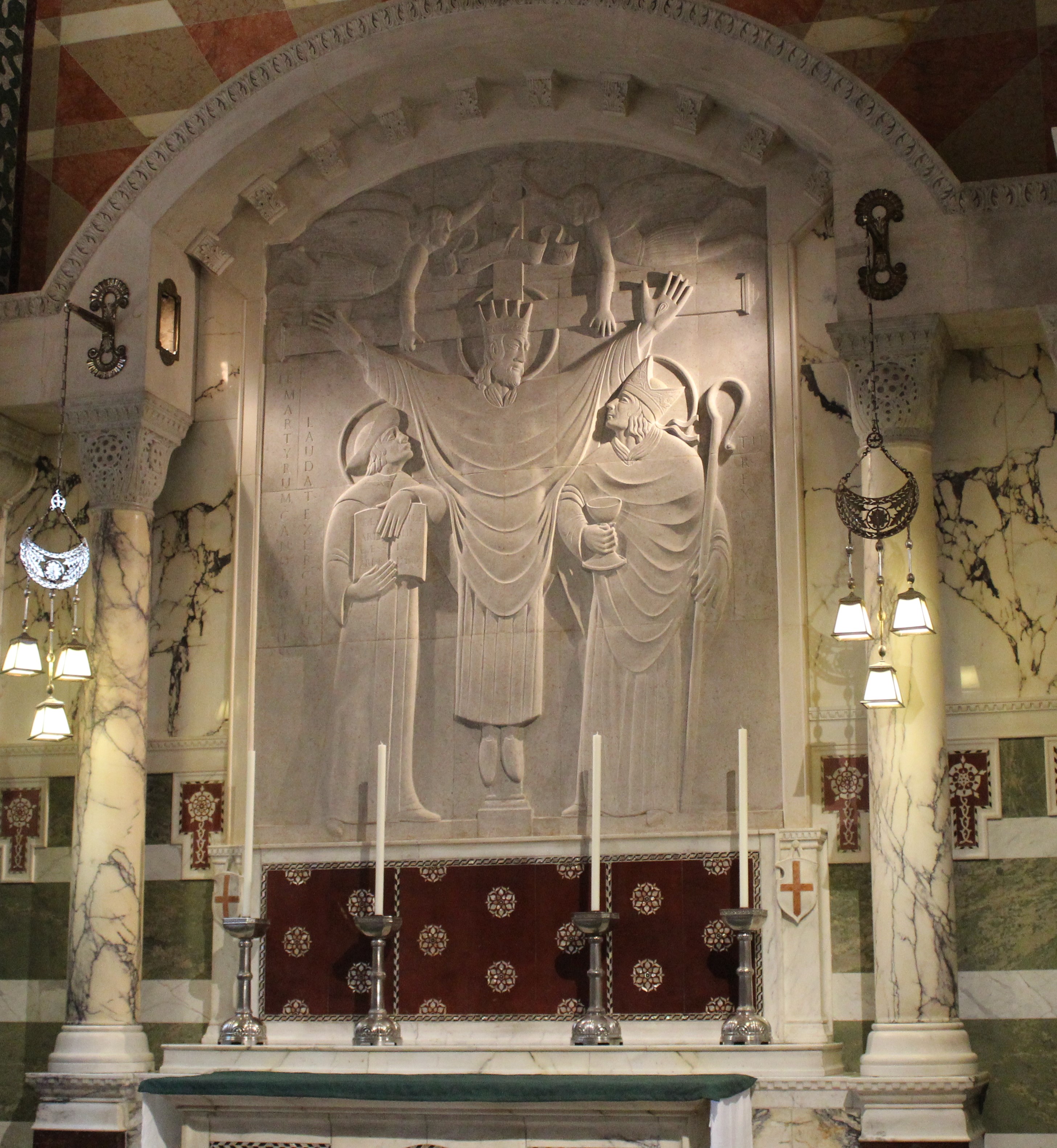
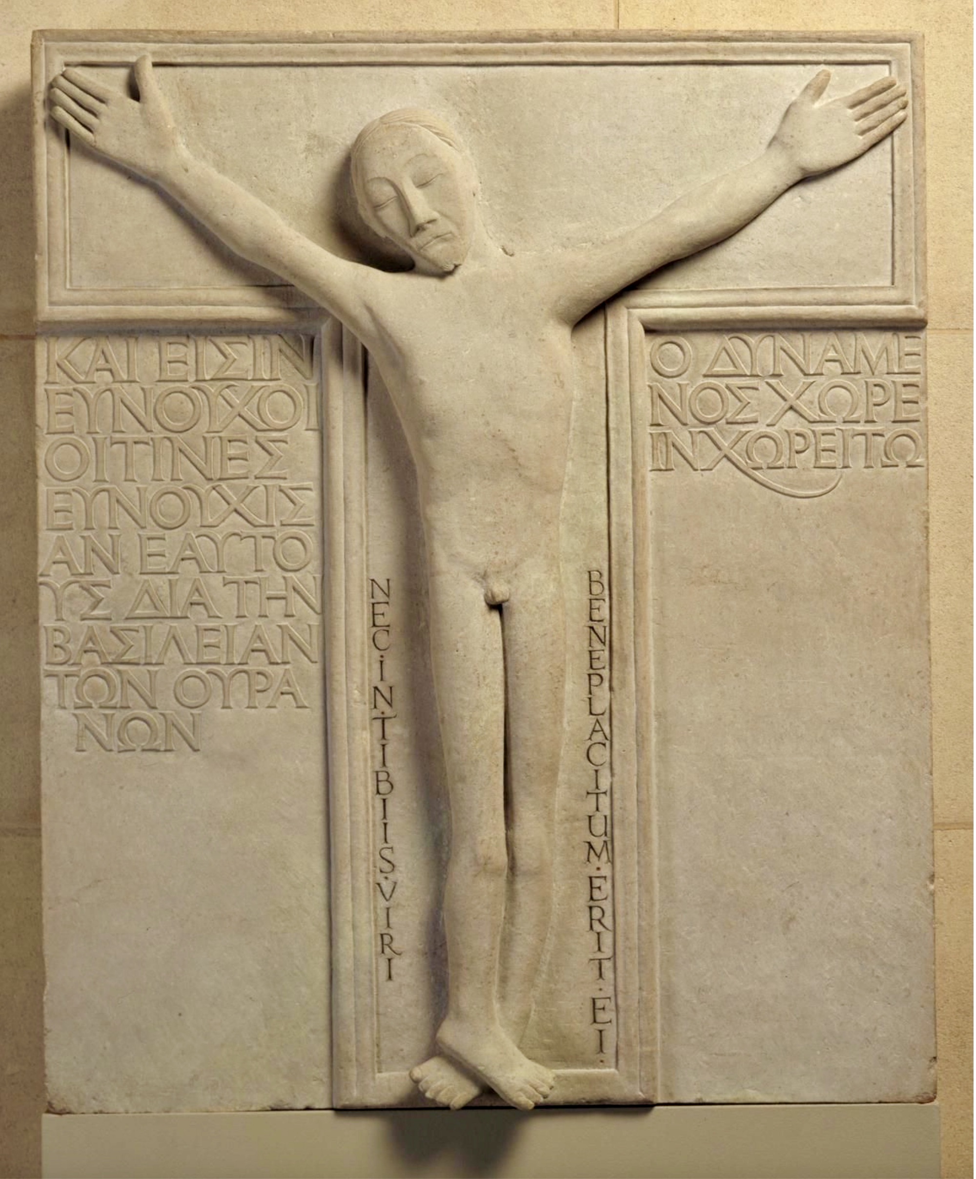
Painters, sculptors, and architects, seriously consider these factors within visual and spatial compositions. The painter, Wassily Kandinsky, and the architect, Frank Lloyd Wright, provide two examples of those who also perceived a spiritual dimension within their creative work.
If so, we – as caring lay observers of the world and of the things and places among which we find ourselves – should give deference to this evident fact. For we can all be thoughtful, as people often are inclined to be, about what we see, touch, and experience when we interact with visual phenomena.
I find myself increasingly sensitive to these aspects of our appreciation for Beauty, and endeavor to be more mindful about them. I am intrigued by possible parallels that may exist between Eastern metaphysical interpretations of visual phenomena and more familiar approaches to what we see that are shaped by Western aesthetics. Especially as these familiar approaches are described and developed within our artistic and architectural best practices.