A stunning Belgian racing pigeon, sold for $1.9 million
My title for this post may appear ironic or implausible. Yet, there is a long history of careful stewardship of homing pigeons by pigeon fliers and ‘fanciers.’ They breed beautiful, graceful, and powerful birds. Some racing birds are capable of flying a thousand miles, mysteriously finding their way back to their nests at speeds between 60 and 100 miles an hour! Most homing pigeons are not quite in that league.

I first became intrigued with the idea of having a small flock of homing pigeons when I was a Boy Scout in middle school, in Japan. A fellow troop member had a flock of some 20 to 30 birds. I went over to his house after school and watched him release them from his roof-edge loft. Then he would scatter bird seed on the roof and enter the loft, a signal to the birds that ‘dinner time’ had arrived.

Multicolored homing or racing pigeons in a Texas loft
His loft, as my later and smaller ground-level pigeon coop would be, was constructed of parts of old wooden shipping crates, then quite common in port cities like Yokohama. Those crates provided solid structural starting points, generally weather resistant, and adaptable to various pigeon loft configurations. What was left to be found was some mesh screen, some wood with which to fashion a simple door, and a set of dangling vertical rods (the formal name for which I have forgotten) which, resting against a wooden ledge, would allow the pigeons to return to the coop while passing through them, but not able to exit again.

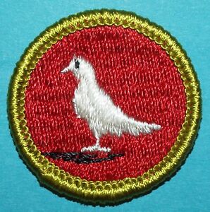
A homing pigeon resembling one of the first in my small flock (note the leg band)
My first two birds, received from my friend, had distinct colorings different from common city pigeons. The female had a tan color and the male’s feathers were an overall charcoal gray and black. With them, I raised several more pigeons having beautiful darker brown feathers with white stripes. This was while the adult birds acclimated themselves to their new circumstances, and gained a new homing point for their flights. If I recall correctly, it takes at least a few months for this to happen.
It seems significant that the Gospels record the Holy Spirit descending upon Jesus at his baptism, as being like a dove (a pigeon relative) rather than – as some might have imagined or hoped – like a falcon or an eagle. Doves and pigeons, the latter offered on the occasion of the infant Jesus’ presentation in the Temple, are symbols of peace, while avian raptors more often figure in war and or civil power-related imagery.
Over the couple of years I kept pigeons, I may have had as many as 8 or 10 in my small coop, some of which I purchased from local Japanese fanciers. I particularly prized the white birds, and saved up paper-route money to buy them. Once, I bought a beautiful one without having a proper transport case with me, and carried it home through the Yokohama streets. After my journey of a mile or two, almost near home, the pigeon in my hands and held in the proper way, suddenly startled me and flew off to its former home!

I never raced my pigeons, though that is a common hobby for those who raise homing pigeons. Transporting the pigeons by vehicle (in vented carry boxes) to an assigned location, they are then released at a particular time, and clocked regarding the speed of their return to their home lofts. How homing pigeons are able to do this is not yet fully understood, though it is thought to involve magnetoreception, a sensitivity to the Earth’s magnetic field.
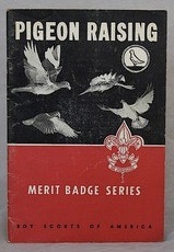
My time with my pigeons came to both a happy and a sad end. I was examined and proud to receive the pigeon raising merit badge from the Boy Scouts.
And then one morning, some months after this, I went to check on my pigeons before school. I was devastated to find that a cat had gotten in during the night, and I had lost my beloved birds.
As you might imagine, from time to time I muse about having a small flock of these amazing and faithful birds once again.