Peter Kreeft has written an illuminating essay on the use of indirect communication by CS Lewis and Walker Percy. In it, and in a humorous recording of its content, he explores how both Lewis and Percy present the predicament of the modern person. We live as upside-down persons. And we are not among the first people in history to suspect this. (See St. Augustine, d. 430 AD)
As a way into the heart of his theme, Kreeft invites us to consider a hypothetical challenge posed to a child: take four common objects and sort them into two boxes. The four items are a baseball, a basketball, a baseball bat, and a basketball net. The two most obvious solutions to this challenge, based on the categories of being and doing, nicely set up a thought experiment that Kreeft intends for his audience to engage. He invites us to sort the following four things into two (undefined) categories: Religion, Science, Magic, and Technology. Try it.
In taking up this simple quiz question, we discover one way that our contemporary thinking habits depart from those of our ancient forebears. Our common assumption that science and technology are sister fields, reliably distinguished by their empirical methodology from both religion and magic, reflects a misunderstanding. For what we may overlook in this supposition of an affinity between science and technology, as well as between the second pair of terms, is how our categorization of these four terms demonstates our understanding of what we consider to be real. And the key variable governing our typical way of sorting these four conceptual categories centers less on what is ‘real,’ and more on the significance of how we conceptualize our encounter with ‘reality.’
A theme that has surfaced from time time in this space, and which plays a large role in structuring my understanding of Beauty, rests upon my appreciation for the distinction between the meaning of the words ‘objective’ and ‘subjective.’ I credit my graduate research in ethics and moral theology for raising my awareness of what these terms can and do mean. With regard to Beauty, and more broadly about what is real versus what is presently actual in our awareness of things, ‘objective’ best refers to the objects of perception, and ‘subjective’ in a corollary way best refers to the subject of perception (I.e., to me, the observer, the knower).

Kreeft makes the case that both CS Lewis and Walker Percy shared a conceptual understanding with many philosophers and writers from the pre-modern era. In making the point, Kreeft quotes what he says are the three most illuminating sentences he has ever read about our civilization:
“There is something which unites magic and applied science [i.e., technology] while separating both from the “wisdom” of earlier ages. For the wise men of old, the cardinal problem had been how to conform the soul to reality, and the solution had been knowledge, self-discipline, and virtue. For magic and applied science alike, the problem is how to subdue reality to the wishes of men: the solution is a technique.”
And if we have not guessed where Kreeft is headed with all this, he puts the matter succinctly: “Technology is more like magic than like science.” It follows that he commends thinking of religion as being like science by also involving a search for what is real and true, even if differing in its methodology and content.
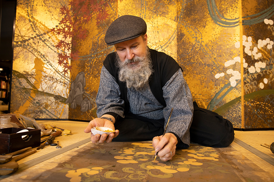
A challenge related to Kreeft’s theme, regarding how we approach beauty, faces us as modern people. It stems from how – through the influence of our culture – we are inclined to think of art and architecture as being more akin to magic and technology, than to science and religion. For we tend to assume that artists and architects manipulate materials and space to stimulate certain responses from those who interact with their work. And, of course, they do. But is this all that these crafters of beautiful things accomplish? Are they not also among those who seek and make available to others instantiations of what is real, and more particularly of the beauty that is there for us also to perceive and come to know? I believe that they are.
Artists and architects approach the world in a way that has an affinity with those who work in religion and science, while what they do may seem to be like the work of those who ‘practice’ technology or magic. For like all genuine seekers of Truth, Goodness, and Beauty, scientists (especially theoretical physicists) as well as religionists include dedicated persons who want to know these real aspects of the world that may be apprehended by those who look for them.
I continue to learn by reflecting on these themes.
Note: Kreeft develops at greater length than I have scope here to address the significance of these and related distinctions. He does this in his essay, “Walker Percy’s Lost in the Cosmos: The Abolition of Man in Late Night Comedy Format.” I commend an entertaining recording of Kreeft’s presentation of the essay’s content, which can be found on his website (by clicking this link).