The School of Athens, and The Disputation of the Holy Sacrament, by Raphael
Prompted by an article by William Least Heat-Moon, I reflect once again on two interrelated frescoes by Raphael. On his sometime-ago trip to the Yucatan, Least Heat-Moon was accompanied by his Mayan translator, Berto. There, the author encountered a destroyed Mayan temple. Regarding the temple’s relation to a later Christian cathedral occupying the same site, he quotes his translator.
“Many stones come from a Mayan temple that was long ago on this hill,” [said Berto, who] regretted this destruction. Yet to him, the broken stones imparted an additional dimension to the church because ancient Mayas usually did not destroy an earlier structure, instead building over it to layer meaning and power.
What an insight regarding contrast and continuity.
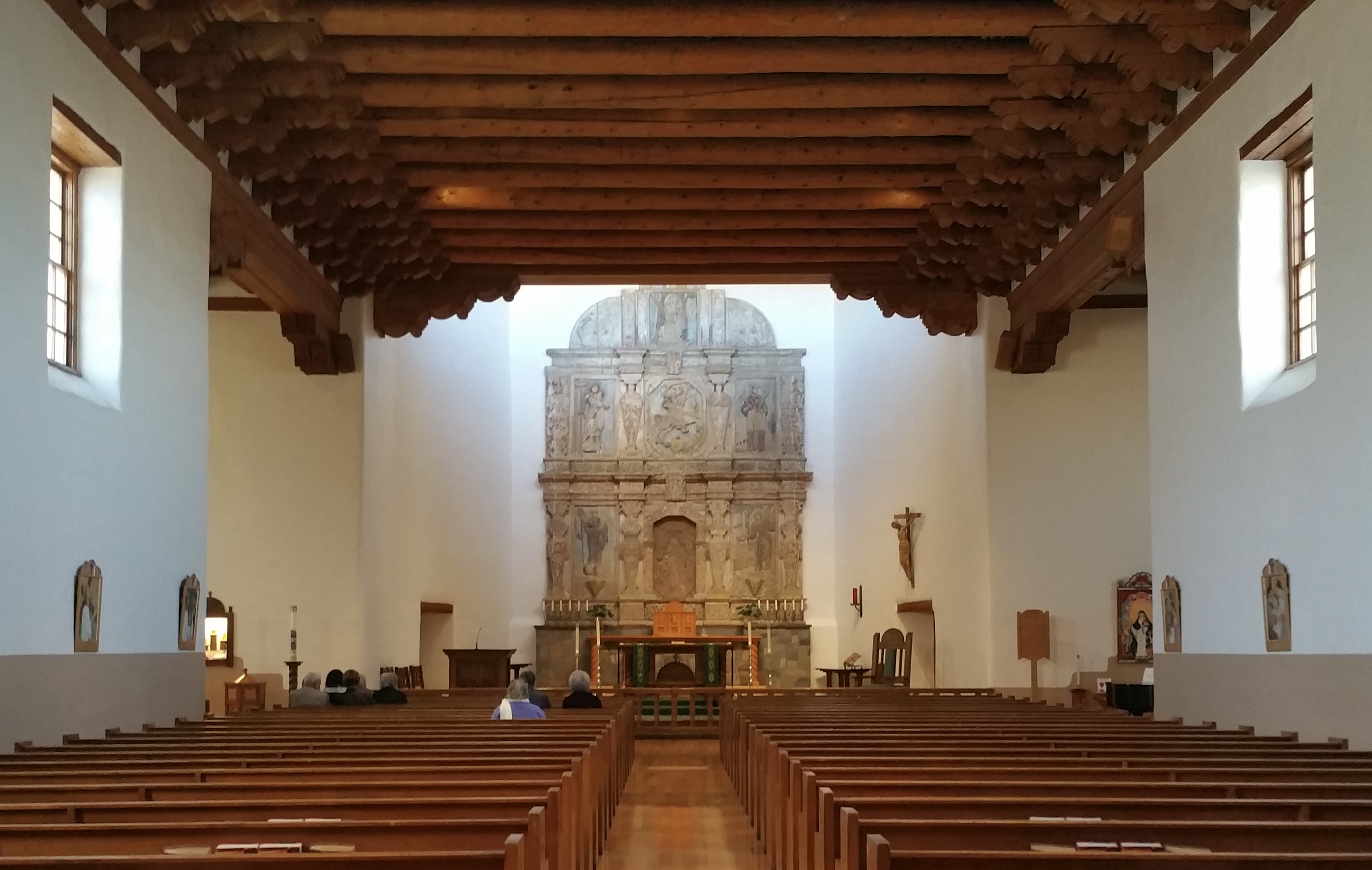
With that in mind, consider how visitors entering the Vatican Raphael room do so facing the fresco in the lower of the two images above. They behold a painting depicting an altar in a church space, surrounded by the Holy Trinity and famous saints and biblical figures. Turning around in that same space, visitors see the fresco in the upper image. It depicts great persons from the classical world, with Plato and Aristotle in the middle. Tour guides typically present these two paintings, which face each other, in terms of the contrast between them, saying things like: “Here, on this wall, we have the best minds of the pagan world. But, on the opposite wall, we see great saints of the Bible and the Church.”
We can look at these two interrelated paintings in another way. We might also see the continuity between them, even if the content of the two paintings seems rather different. For example, notice how the two frescos are composed with the same elements: similar colors and textures; the same arch over each image; and that the two spaces in which the figures walk or sit may be in the same building. And how the perspective or vanishing point in each painting mirrors that of the other.
Further, visitors who enter this room walk forward in the same direction as do Plato and Aristotle, who therefore share company with their contemporary pilgrims. Together, they and their later newcomers walk forward, approaching an altar surrounded by many saints! As a result, Raphael’s two paintings provide a splendid reflection on the theme of continuity.
Perceiving points of continuity between pre-Christian cultures and central themes in Scripture and in Western Christian theology has historically been more typical of the broader Catholic tradition, which includes not only Roman Catholics but also Anglican as well as some Reformed theologians, poets, and hymn writers. A contrasting parallel is provided by a historic tendency among many Protestant writers, preachers, and theologians, who have stressed a discontinuity not only between a Christian and a pagan view of the world, but often a perceived antithesis between them. This may caution us about making an ‘either/or‘ of what some may perceive as being a ‘both-and.’
Some who commend Celtic spirituality offer a compelling observation about Christian holy places in Ireland. Celtic crosses can often be found in or among pre-Christian places of worship. To the extent that this is so, we discern an openness to perceiving continuity. That is, a continuity between a place previously associated with a pre-Christian form of religion, and a later Christian willingness to pray and worship at the same location. Here, we should note a significant distinction.
Continuity does not imply sameness nor equivalence. There may be similar elements between what was before and what may come after. Such similarities do not obviate the potential newness and difference of what arrives later. Yes, the ‘new’ may bring change by covering over and even by replacing what came before, an approach typically characterizing contrast and discontinuity. Yet, the ‘new’ may bring change positively, by building upon what came before while also including and transforming it. No finer example of this exists than the Pantheon in Rome, also known as Basilica of St. Mary and the Martyrs.
All this has implications not only for the Christian transformation of places but also for how we view the baptismal transformation of people.
The images above are of two of Raphael’s paintings, traditionally titled The School of Athens, and The Disputation of the Holy Sacrament. My prior blog post on these paintings may be found here: https://towardbeauty.org/2019/09/28/the-beauty-of-contrast-and-continuity/ . That post is based on my homily for Sunday, September 22, 2019, which can be accessed by clicking here.