Drawing and Design

A Church by Errol Barron in Gulfport

St Peter’s by the Sea, Gulfport, MS, designed by Errol Barron

Errol Barron’s work as an artist may be familiar to readers of this website based on some of his evocative New Orleans water color paintings previously featured here. His paintings of that city as well as of Tulane University, where he has taught for many years, provide strong indications that he is more than a skilled painter and draftsman, but also a trained architect. He has taught generations of architectural students at Tulane, and he has practiced his profession to great effect not only in this region but also overseas, with some houses of his located in Greece. Given Barron’s evident sensitivity to historical architecture and design features characteristic of this region, I was surprised to learn about a notable but unexpected feature of his resume. He worked for seven years with Paul Rudolph, architect of the well-known and oft-criticized Boston Government Services Center and a partial inspiration for the movie, The Brutalist.

St Peter’s by the Sea, interior

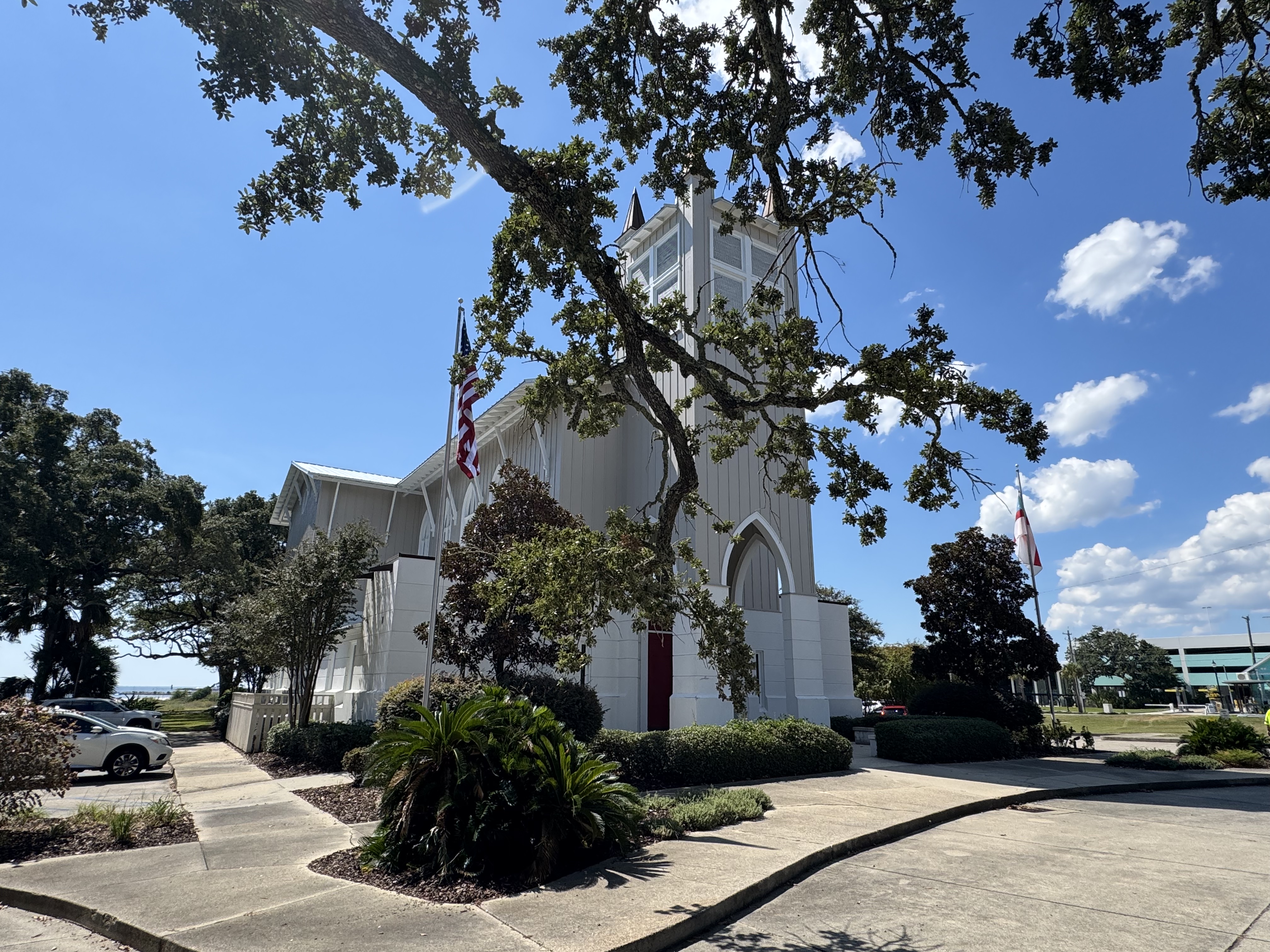
I was recently delighted to discover the Episcopal church in Gulfport, Mississippi, St. Peter’s by the Sea, and that Errol Barron was its architect. It is a gem of a church, and a very successful design that incorporates traditional ecclesiastical elements associated with European Gothic churches along with features reflecting contemporary liturgical renewal. I have heard people refer to this style of church building as Carpenter Gothic, and as Southern Gothic, and the labels seem to fit well. The worship space exudes an appreciation for traditional forms while harmoniously blending them with a contemporary focus upon light, color, and the greater participation of worshippers in flowing open spaces.

The main altar with the ornamental rood screen

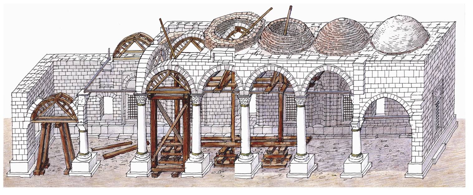
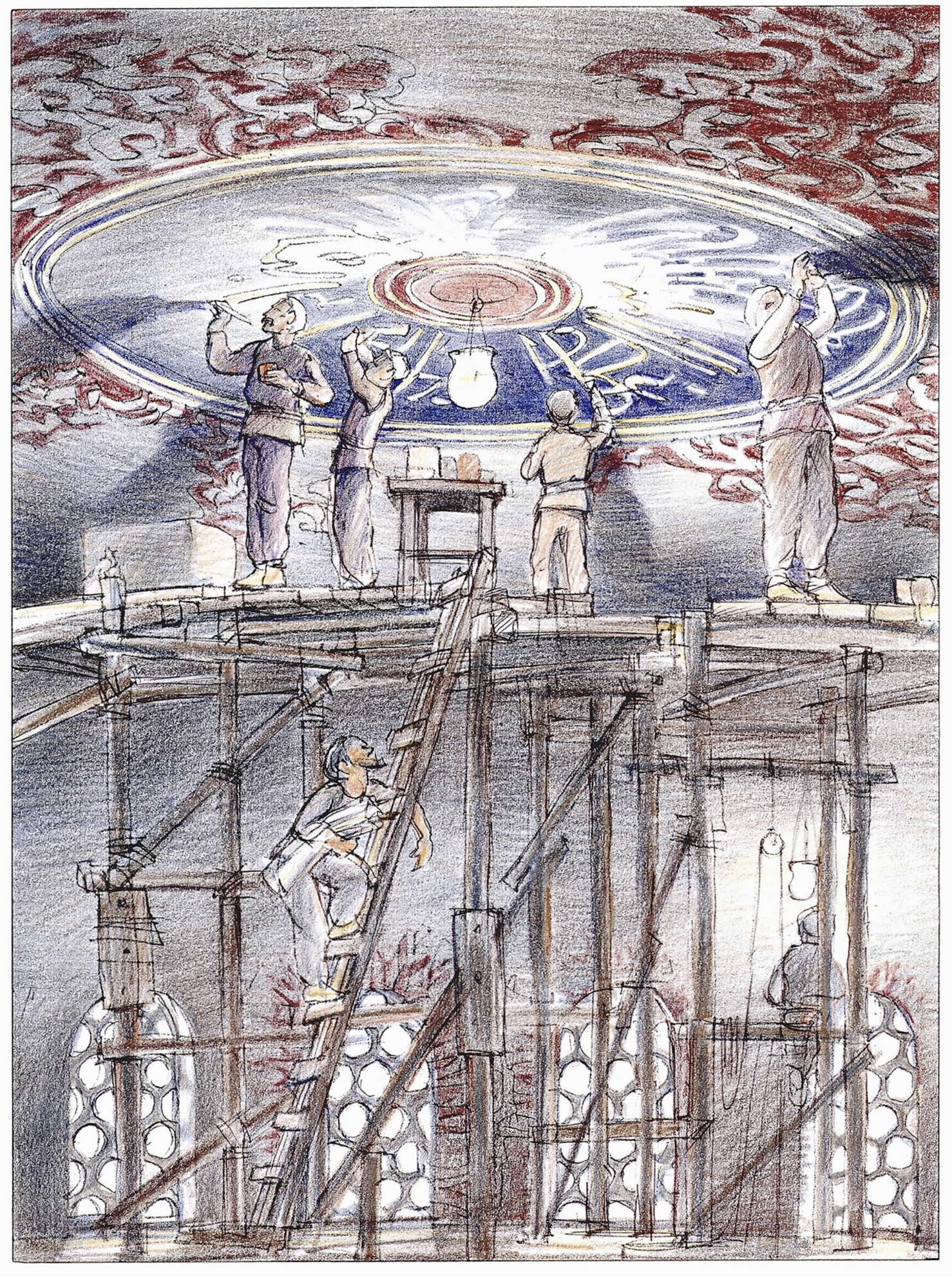
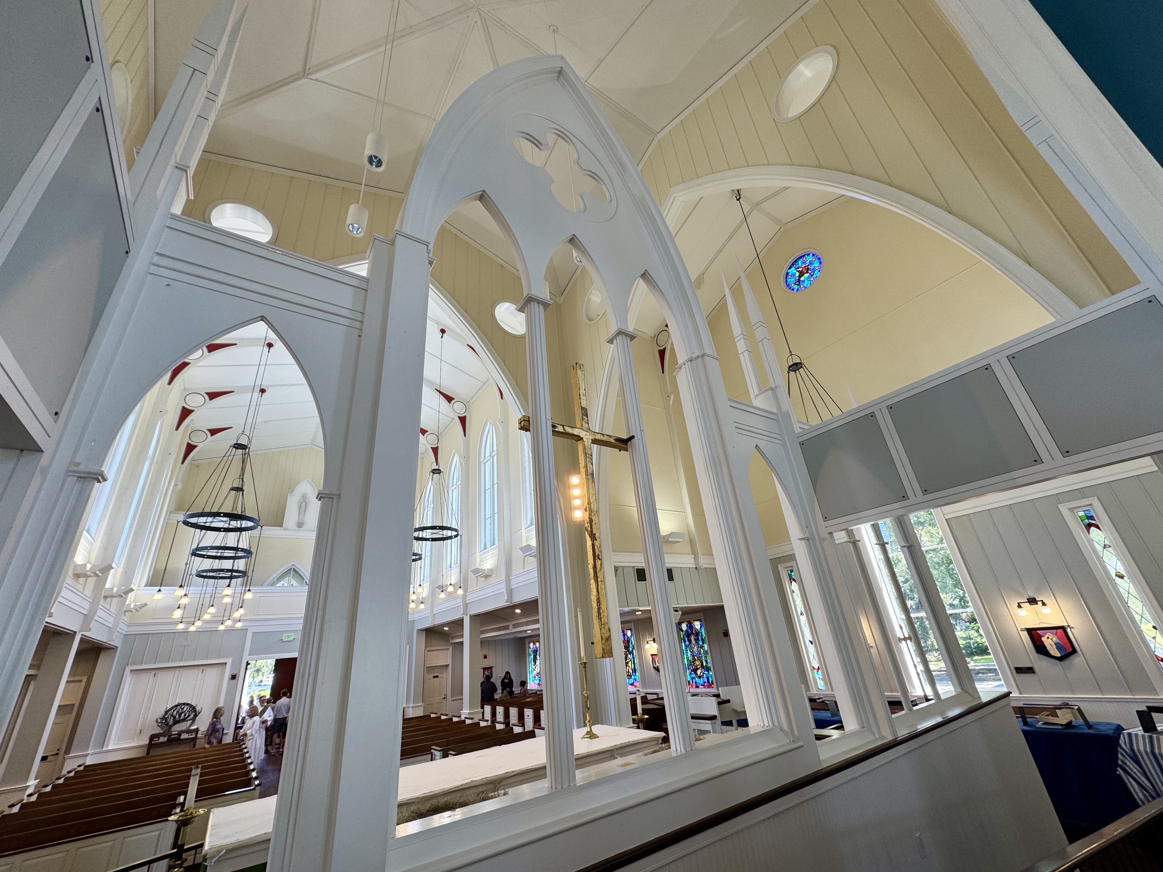
Visitors to the Washington National Cathedral, and similar churches of Gothic-revival style, may recognize the particular heritage that stands behind the floor plan of St Peter by the Sea. At the National Cathedral, and in its medieval forebears (such as London’s Westminster Abbey), an arched stone ‘rood screen’ separates the chancel and choir (beyond the screen) from the nave where the congregation is seated. When, in the 1960’s, the liturgical renewal movement began to influence changes in the worship arrangements of these buildings, a new main altar was often then placed in the nave, on the congregation’s side of the rood screen. Smaller gatherings for weekday services could still occur in the choir side of that screen, while Sunday gatherings for the principal Eucharist would be celebrated in the nave, with the clergy, altar, and liturgical action proximate and visible to the congregation.

A view of the ceiling and woodwork above the choir

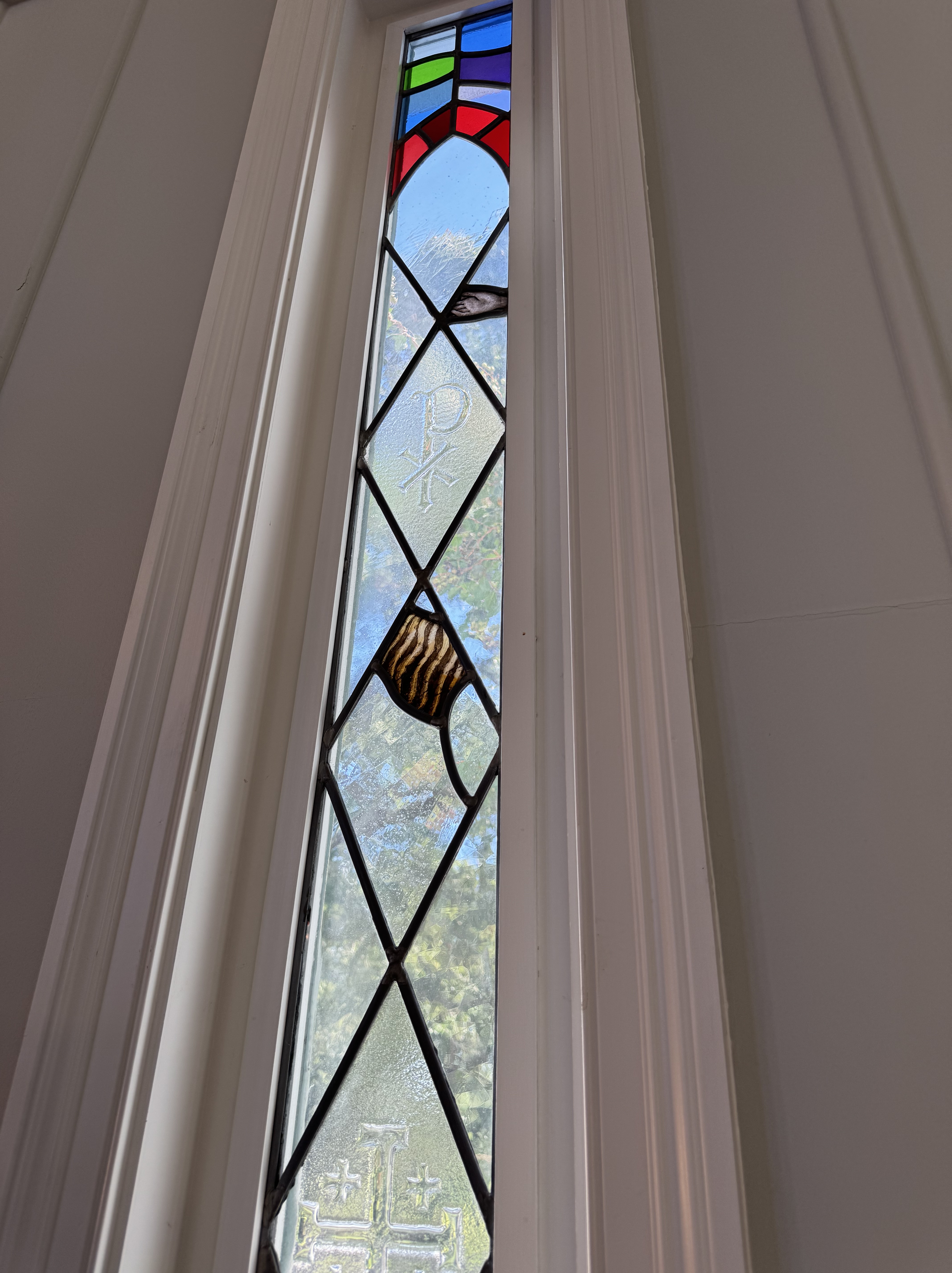
Though St Peter’s by the Sea is a comparatively recent building, its design reflects something of the historical sequence described above. Instead of an imposing stone rood screen, shielding the chancel and choir spaces beyond, Barron has designed an ornamental arched screen of light-colored wood that suggests rather than imposes separate areas within the overall space. This allows the evocative blue canopy of the ceiling over the chancel to draw one’s eyes forward, toward the visible clear windows at the liturgical ‘east end’ of that space behind the chapel altar, facing the seashore.

Further, the notably narrow, even sharp-looking, wooden ‘spires’ protruding above where the choir chairs are placed enhance the upward sense of lift in the nave, complemented by the radiant cream and white color scheme above where the congregation sits. Light pours in through clear windows above, while delicately fashioned and dangling wrought iron fixtures provide supplemental illumination for evening services and in poor weather.

A view toward the nave from the choir, through the rood screen

On the Sunday of my recent visit, I was told that the congregation numbered about 145, and I estimate that the nave would comfortably seat about 200 people, though it could probably accommodate more. With the Gothic-inspired longitudinal floorplan, evident when one approaches the exterior of the building, a visitor might expect a rather narrow and linear worship space. Such an initial impression of the likely effect of the interior spatial arrangement is overcome by a number of subtle but effective design choices made by the architect and those who worked with him.

Accompanying the verticality of the large open area above the center of the nave are the seating areas adjoining the side aisles, taking the places of side chapels found in many medieval Gothic churches. The relatively low height of the box pews enhances the sense of horizontal width created by these adjacent seating areas, which provide relatively unobstructed views of the altar and lecterns. I also found the acoustics within the worship space to be well-suited for music as well as for public reading and speaking.

I am drawn to the ethos of historical churches; I am enthused by many examples of modern architecture; and I appreciate the fruits of the liturgical renewal movement. In my experience, a successful blend of these three things is not always found in contemporary buildings designed for worship and intended for the enhancement of congregational life. In his design for St. Peter’s by the Sea, in Gulfport, Mississippi, and in his supervision of its restoration after Hurricane Katrina, Errol Barron has achieved just such of a desirable synthesis.

A representative side window incorporating stained glass window fragments recovered after Hurricane Katrina

A Tao of Seeing: Reflections Inspired by Feng Shui

Michael Pollan’s writer’s hut, intentionally situated by a boulder on the brow of a hill

Recently, I observed my middle son moving a black plastic pond module around in a small space in his New Orleans courtyard. As he moved the container that would soon have fish in it, he tried situating the vessel in various ways, in relation to a tree, a fence, some potted plants, and an existing low stone wall. He is not a student or practitioner of feng shui, but I believe I was seeing some of those principles at work in his decision-making.

Western readers may have heard of feng shui, the Asian philosophical approach to discerning the unseen forces that affect objects and their balance in nature. It gives attention to the metaphysical or non-material energies thought to be at work upon or within the world around us. We might say that this approach provides a Tao of seeing, or a natural way of perceiving within and around surface phenomena to the underlying dynamisms that are believed to affect what happens in nature.

This notion that there are unseen forces at work in the world is an idea that is receiving something of a revival in Western Christian spirituality. This is noticeable when people refer to a concept attributable to the Celtic tradition, in which it has become common to refer to “thin places. “ These are places where the veil between the material and the ethereal or the heavenly seems temporarily dissolved. Another parallel here between East and West may lie in the quest within Christian spirituality for the goal of harmony and balance between people and the created world.

However, my reflections here constitute an aesthetic rather than a philosophical or historical inquiry. I am interested in the dynamics of movement we perceive in the circumstances that we encounter, and less in the metaphysical forces or energies that may be present within them. At the outset, however, I want acknowledge how a nuanced Asian approach can be an authentic route toward a culturally-informed appreciation of the phenomena we encounter, especially from a historically Asian perspective.

As we look at paintings in the context of Western culture, one factor we discern assesses composition and attends to the way our seeing is drawn from one part of a larger image to another. This dynamic is often an artist-intended aspect of an overall composition. Sight lines in garden design and arrangement provide another example, as does the architectural arrangement of space in buildings.

Attention given by Western designers to feng shui is sometimes criticized as being a superficial application of historically and philosophically nuanced ideas. But I want to give credit to ways in which our sensitivity toward perceiving movement and direction is a genuine factor that is available for analysis and articulation. We notice this when we encounter both two dimensional compositions as well as three dimensional spaces and the objects we find in them. We can always come to know more about what we see.  Because what we see is something that is there, not simply what we believe, or are disposed or inclined to see.

An Asian garden said to be designed according to feng shui principles

Motion, balance between forces, spatial arrangement of objects, and the dynamic relationships that are visible because they exist between and among these variables, continue to grab my interest. Contrasts between colors and textures, as well as between sizes and shapes, play a significant role.  Additionally, the perceived difference between what is natural and things that are humanly fashioned is equally significant, as is our perception of the criteria for what constitutes that which we consider to be natural. These are among the factors that help account for our sensitivity towards and interest in these many observable variables, and our common quest for purpose and meaning in the contexts where we find ourselves.

Motions and balance as we find these factors in Wassily Kandinsky’s painting, Several Circles

Painters, sculptors, and architects, seriously consider these factors within visual and spatial compositions. The painter, Wassily Kandinsky, and the architect, Frank Lloyd Wright, provide two examples of those who also perceived a spiritual dimension within their creative work.

If so, we –  as caring lay observers of the world and of the things and places among which we find ourselves – should give deference to this evident fact. For we can all be thoughtful, as people often are inclined to be, about what we see, touch, and experience when we interact with visual phenomena.

I find myself increasingly sensitive to these aspects of our appreciation for Beauty, and endeavor to be more mindful about them. I am intrigued by possible parallels that may exist between Eastern metaphysical interpretations of visual phenomena and more familiar approaches to what we see that are shaped by Western aesthetics. Especially as these familiar approaches are described and developed within our artistic and architectural best practices.

Calder’s La Grande Vitesse

If reading this by email, please tap the title at the top to open your browser for the best experience. Then, clicking individual pictures will reveal higher resolution images.


This past weekend, with the temperature in the lower twenties and lake-effect snow in the air, I had a chance to revisit a favorite sculpture, Calder’s La Grande Vitesse. Sitting on a plaza in downtown Grand Rapids, MI, the sculpture is notable for being the product of the first award granted by the National Endowment for the Arts for a work of public art, with the project dedicated in 1969. It is a stirring example of Calder’s large scale ‘stabiles,’ as distinguished from his better-known mobiles. La Grande Vitesse may be his most successful work in the stabile category, a grouping which comprises several monumental compositions of welded and bolted sections of steel, often painted in Calder’s favorite vibrant and warm bright red.

Because it is lyrical and engaging, La Grande Vitesse has the pronounced effect of drawing the viewer in to engage with the artist’s vision for the work, both visually, spatially, and even in a tactile way. Sculpture is by definition three-dimensional, in that works of sculpture comprise shapes and forms, whereas painting and drawing typically involve two-dimensional images, whether representational or abstract.

Two concept drawings of what became La Grande Vitesse

Although some painters in the modern era have pushed against the distinction I have just offered (regarding multiple dimensions) by their manipulation of the surfaces of paintings, sculpture remains distinctively in a sphere of its own. You can look at the back of a painting, but you move around (and sometimes through) a work of sculpture – something manifestly true with Calder’s stabiles. Whereas a viewer can encounter a painting through visual apprehension and imagination while standing before it in even a small room, a visitor encountering a sculpture – especially a large one – engages with it as an embodied being, interacting with another object occupying a shared space within a common area.

This helps us notice how the location of a sculpture can make a difference in our appreciation of it. With its stunning color and soaring curved surfaces, Calder’s La Grand Vitesse commands the plaza upon which it rests and would be much diminished if placed in a dark and cramped alley just wide enough to accommodate its size. Therefore, when sculptures are beautiful to behold, stirring in their effect, and well-placed, encountering works of this kind can provide a profound, whole body experience. In this respect, sculpture has an affinity with architecture.

What sets La Grande Vitesse apart from some of Calder’s other large stabiles is the extent of the quality of mystery he created by increasing the number of vantage points required in order to get a sense for the shape of the whole. This, then, extends the time it takes to gain an appreciation for the dynamic interrelation among the sculpture’s parts. Not all examples of sculpture merit the observation that when progressing to each new vantage point, the work appears to be different from one’s prior impression of it.

A second distinguishing aspect of La Grande Vitesse connects its formal title with the name of the city in which it has found a home. Grand Rapids is named for a historic feature of the river it straddles, and the sculpture’s French title can be translated with roughly the same two words. Guides also explain that La Grande Vitesse may properly be rendered as “the great swiftness.” These related names for the art work and its alluvial location fit well with its fluid lines, curves, and protruding fin-shaped panels, which would be at home in a marine environment. For me, the masterful conjunction of the scupture’s multiple curved surfaces accentuates the allure of the work, a sculpture that I find simultaneously uplifting, joyous, and very pleasing to behold.

A 1:5 intermediate maquette of La Grande Vitesse bearing Calder’s signature and date

A 1:23 interpretive model for the sight-impaired (placed on the plaza near the sculpture in Grand Rapids)


Additional note: Placed next to civic buildings designed by Skidmore, Owings and Merrill, the Calder commission to produce La Grande Vitesse for the City of Grand Rapids was part of a larger project – as in so many cities during the 1960’s – to transform the heart of an urban area with what was then sometimes euphemistically called a process of ‘renewal.’ The photograph below of the 1969 dedication ceremony is revealing in that much of the area surrounding the sculpture plaza has since been covered by useful but not always beautiful government and commercial buildings, as well as a new medical center connected with Michigan State University, adjacent to extensions of an interstate highway.

Allan West: Japanese Culture and Art

If reading this by email, please tap the title at the top to open your browser for the best experience. Then, clicking individual pictures will reveal higher resolution images.


In more than one way, Allan West is an unusual artist. His life and work have been deeply imbued by the spiritual aesthetics of Japanese culture and its traditional art of painting. For over forty years, he has dedicated himself to Nihonga, the less and less practiced method of painting using minerals for pigments, mixed with the liquid medium of a glue made from deer protein. This approach to painting has been practiced consistently in Japan, where luminous paintings from the 11th century can still be appreciated for their original beauty. The closest parallel in Western art is egg tempera painting, in which painters in earlier centuries mixed pigment with egg yolks instead of the modern practice of mixing pigments with oil or an acrylic medium.

Allan West was born and grew up in Washington, D.C., and his sojourn in Japan began in a period of mission work there as a member of the Latter Day Saints. Two factors transformed the vector of his life. He came to realize that he had an affinity with Japanese culture, especially with its artistic tradition, and he was struck by the Japanese sensitivity to living in harmony as much as is possible with the natural world.

More particularly, with his memory of pursuing painting from the time of his childhood, he recalls his own experiments with mixing pigments with various liquids to achieve a more fluid paint medium. This predisposed him to accept an observation offered by a viewer of his early work, who told him that his preferred approach to painting had a long tradition in Japan. As a result, West moved to Japan in 1987, with his wife and children, to learn from that tradition. He has lived and worked in Tokyo, ever since.

In a short video introduction to the artist, released by the Prime Minister’s Office in Japan, Allan West shares the following about his life’s work (screenshot above, and link below):

I use the Japanese painting technique to express the beauty and essence of the natural seasons. It has been 40 years since I moved to Japan, attracted by the traditional pigments and techniques of Japanese painting. Japanese natural materials can retain their clear vibrancy for more than a thousand years. I’m proud to inherit the tradition of Japanese painting and its wisdom that cherishes nature’s beauty and harmony with humankind. Through my art I’d like to convey the appeal of Japanese culture to the world.

With these few words, spoken in a soft and nuanced voice in the video, Allan West is saying much. Having returned to Japan with the intent of learning a method or a technique, he had the sensitivity to realize that he needed to learn the Japanese language and let its culture become ingrained within him in order for him to be able to practice Nihonga painting with some degree of integrity. The photo below contains a number of important cues concerning what West has received and learned from the tradition of which he describes himself as an inheritor.

Allan West paints sitting on the floor in a Japanese way, on mats woven from rice-straw. As has been noted, the paints he uses are made up of ground minerals mixed with a glue-like medium of deer protein, paints which he values for their fluid quality. Hence, the surfaces that are to be painted need also to rest upon the floor, to avoid the paint running. Many of the surfaces upon which West works are large in size, like the sometimes wall-sized decorative folding screens for which he has become known. To be able to paint such expansive surfaces in their totality, instead of panel by panel, the artist designed a narrow rolling platform, allowing him to reach any area of a full-sized screen (as in the image above). This photo also displays West’s use of vibrant mineral-based colors as well as metalic foils and powders, such as gold leaf, some of which are found in the glass containers on the shelves behind him.

Allan West’s present Yanaka, Tokyo, studio

Unlike some artists, both Western and Asian, Allan West welcomes visitors to his studio, and actively encourages those who are curious not only to view his art, but to witness his creative process. To this end, his present studio, much modified into a traditional Japanese-looking structure from its prior use as an automotive maintenance facility, has large and welcoming sliding panels and windows, through which those walking by can view him painting. Through providing this access to his creative work, he hopes to promote a sustainable future for Nihonga, and to persuade Japanese visitors in particular that even an American immigrant can appreciate, learn, and become proficient in an ancient Japanese art form.

The following images provide examples of Allan West’s beautiful work:

The following image displays the interior of Allan West’s attractive and welcoming studio and gallery building:


Readers who wish to become more acquainted with Allan West and his work might view the YouTube video mentioned above (the link is here). Allan West’s studio and gallery can also be visited in a virtual way by clicking this link.

J Louis and the Fusion of Genres in Painting

If reading this by email, please tap the title at the top to open your browser for the best experience. Then, clicking individual pictures will reveal higher resolution images.

J Louis, “Vision in Pinks”


On a recent visit to Charleston, S.C., while walking to the Gibbes Art Museum to attend a family wedding celebration, I stopped in at the neighboring Principle Gallery. There, I discovered the remarkably skillful paintings of J Louis, who is only 32. He is a highly gifted painter and draftsman (i.e., he can draw really well), who was trained at SCAD, the Savannah College of Art and Design. The Principle Gallery is featuring his work this month following the opening of his show on November 1.

J Louis clearly has a fascination with women and the many forms of a woman’s beauty. Yet, unlike the work of various other artists who share his interest in the female form, nudes seem to be rare among Louis’ works. He has the eye of a fashion photographer, though one with a paradoxically greater interest in the faces and hands of his models than he does in their clothing.

Indeed, the vesture worn by his various models is usually rendered in flat swathes of paint, sometimes muted and sometimes vibrant with color. Louis’ way of portraying that clothing tends to diminish its representational significance, so that it functions somewhat like the background of his paintings. By taking this approach, the artist has the opportunity to further explore and express his regard for other visual aspects of the women who have posed for him.

J Louis at work on a commissioned painting

All of the paintings in the current show feature his characteristic images of elegantly beautiful women, with some of the paintings playful, others mysterious, and many alluring in their sensual presentation of eyes, faces, and hands. As a result, he portrays these women as being more than attractive models, and as people who in some way he has come to know as real persons who have distinct personalities. His depiction of his models therefore includes, but also transcends, careful attention to their appearance, with his skill in displaying an apparent sensitivity to and respect for these women’s character and temperament.

I was struck right away by two aspects of many of Louis’ paintings: his gift for capturing facial expression and the wonder of human eyes, along with his ability to render the power of a gaze; and his adeptness in producing abstract color fields of great beauty. These are two features not generally found together, in my experience. Several of Louis’ paintings bring to mind an unexpected fusion, such as we might find between – for example – Gerhard Richter’s early photo-realist images, and Richter’s more recent abstract paintings. For these reasons, the following image by Louis, titled “Flag,” stood out to me in particular.

More specifically, a number of Louis’ paintings appear to be the result of a merging between two highly differing approaches to painting, on one hand an abstract expressionist’s use of the process of squeegee spreading and melding paint colors, and on the other, the highly refined representative work of a painter whose images rival those produced by an art-oriented photographer.

This juxtaposition of differing approaches to visual compostion, figurative representation, as well as color field and pattern exploration, reminds me of some of the paintings of Gustav Klimt, as if he had been painting in the 1950’s. Several of the various qualities that I have highlighted here, and found in Louis’ paintings, may be discerned in the images of Louis’ paintings shown below.

Sensitive depiction of the human face, dramatic pictorial composition, an eye for vibrant color, and a pattern of setting in tension images of three dimensional figures side by side with visually flat fields of contrasting paint, distinguish J Louis’s large and, in my view, highly successful paintings.

The artist in his New York studio (below)

From Dream to Reality: Michael Pollan and His Writing House

If reading this by email, please tap the title at the top to open your browser for the best experience. Then, clicking individual pictures will reveal higher resolution images.


In an updated preface to his book, A Place of My Own: the Architecture of Daydreams, Michael Pollan laments how some readers approach his book expecting something like a “how to” guide to building their own writer’s hut or shack. Though he does provide a wealth of detail concerning the construction methods he used, the book’s richness lies in its thoughtful engagement with the idea of human shelter and its function in architecture. Of particular note is the attention he gives to the French writer, Gaston Bachelard, whose book, The Poetics of Space, prompts a good deal of reflection by Pollan. The author quotes Bachelard with words that obviously inspired the subtitle of A Place of My Own: “I should say: the house shelters daydreaming, the house protects the dreamer, the house allows one to dream in peace.”

Michael Pollan dreams of building and inhabiting what we might call his own writer’s studio in the woods behind his Connecticut home. As he muses about its possibilities, he considers potential designs in dialogue with his chosen site for the small building. From a book by the English geographer, Jay Appleton, he gleans the insight that ideal human shelters provide two dialectically interconnected values, ‘prospect’ and ‘refuge.’ A shelter conducive for human flourishing provides both the opportunity to view and appreciate one’s surroundings while at the same time providing a secure resting place. Achieving these twin goals becomes one of Pollan’s priorities for his little writing hut.

At the same time, while embarking upon this project to build his place for writing, he acknowledges that the endeavor also provides the occasion for him to examine the idea of architecture, and its contemporary role in Western society. He discovers – through a gift subscription to Progressive Architecture magazine – that the field has increasingly become focused on the exploration and expression of ideas, leaving behind a principal focus upon providing beautiful yet practically useful spaces and structures for human habitation and work.

The interior of Michael Pollan’s writing house (note the daybed in the foreground)

Pollan realizes that what he wants to build is not something that points to something else, or to a set of ideas and concepts (as is the case with some contemporary practitioners in the field of design). Instead, he wants a structure that he can use for everyday work, for reading, and as a place where occasionally he can have a nap. With his aversion to the little building becoming an artistic statement rather than something truly useful, Pollan’s book reminds me of a principal theme in Tom Wolfe’s splendid little book, From Bauhaus to Our House.

Especially in the first two chapters, Michael Pollan offers a set of thought provoking and historically informed reflections on the nature and purpose of architecture, which are shaped in a writerly way. As much as I was drawn to the concrete aspects of his project – as in his account of his search for the ideal design of the window through which he would look while writing – I found his engagement with the theoretical aspects of the project to be very compelling. A good example of the latter is his reflection on our conscious experience of form and pattern in buildings, and our unconscious experience of the spaces we encounter and through which we move. Other examples include the role of feng shui in his selection of a site for his project, as well his explanation of the function of the Golden Section (or Divine Proportion, 1/1.618) in deciding the parameters of the rectangle for his floor plan.

Most of all, I appreciate Pollan’s delineation of the difference between the 20th century modernist or International Style approach to architecture, which abstractly stressed universality of form and consistent design elements regardless of a building’s context, with the architecture of someone like Frank Lloyd Wright, who focused on the connection between his buildings and their location within their chosen sites and his intentional employment of local materials. Pollan offers an insightful two-columned table to illustrate the difference between the two, with the first (stressing universality) labeled, “There,” and the second (stressing locality) labeled, “Here.”

All in all, he has given us a finely written book.


David Macaulay and Mosque Architecture

If reading this by email, please tap the title at the top to open your browser for the best experience. Then, clicking individual pictures will reveal higher resolution images.


Recently I became reacquainted with a book I discovered some years ago, by an author whose work I greatly admire – David Macaulay. It is his book on Islamic mosque architecture, based on a historically informed but fictional mosque erected in Istanbul in the 16th century. Macaulay’s great skill lies in his ability to provide the reader with insights gained from his use of drawing with pen and ink, frequently with color overlaid, in such a way as to unfold the often complex inner structure of the buildings he wishes to explore and explain. For a primer on traditional mosque design and construction, complete with a glossary of terms, the book is invaluable.

The project featured in this book is a mosque commissioned by Suha Mehmet Pasa, a fictitious high official in the early Ottoman period who engages in a charitable act inspired by his Islamic faith and the five pillars of Islam (faith, prayer, charity, fasting, and pilgrimage). He funds the design and construction of a complex of buildings that includes both a grand mosque and its accompanying courtyard and related structures, as well as a mausoleum for himself upon his death. The influence of the historical architect, Mirmar Sinan, as well as Sinan’s breathtaking Süleymaniye Mosque in Istanbul (depicted below), are plainly evident in Macaulay’s composition of the book.

Because of my own fascination with domes incorporated within mosque architecture, I will focus here on that aspect of Macaulay’s book, though he provides a comprehensive account of the construction of almost every feature of a traditional mosque from the early Ottoman period. I find most helpful the following diagrammatic illustration of the basic building components which together support the dome on such a mosque as the Süleymaniye Mosque, featured in a prior post.

The above illustration corresponds to the following floor plan for the same hypothetical structure.

Now, how did that imaginary 16th century architect, his masons and carpenters, manage to build the magnificent dome featured in this project, and as we find in the actual Süleymaniye Mosque? Macaulay unfolds the mystery with a series of instructive drawings that give us insight into the process. Once the proper height of the walls and support piers was attained, a semi-circular structure of wood was constructed to provide the proper curvature of the intended dome (as seen below).

This structure was then lifted up and placed upon a kind of spindle, so that it could revolve horizontally around the perimeter of what would become the brick structure of the dome.

With the rotation of this semi-circular wooden form, the builders could stack up the bricks according to the intended proper curvature of the inside of the dome, while allowing the exterior of the dome to be wider at its base, for greater strength and stability.

A final step in the construction of the main and other domes was the preparation of sheets of lead, cut in precise patterns so that they would sheath the dome with a series of overlapping panels, to avoid water intrusion:

The smaller domes covering areas of the courtyard and entrance portico were constructed in a similar fashion, but on a smaller scale, as seen in the following illustrations. A simple swinging pendulum-like wooden arm was employed rather than the more elaborate semi-circular structure used for the large main dome.

Completion of the construction of the main dome was followed by the finishing of the interior surfaces with plaster, and then with elaborate paint work, which of course involved the need for scaffolding and platforms.

Macaulay then provides two evocative interior views of the finished interior of the mosque, and from two unique perspectives.

These drawings and my primary focus upon the dome aspect of this hypothetical mosque project provide just a hint of the richness to be found in this evocative book. Though it may appear to be a ‘picture book’ intended for middle school students, it is actually a rich source of information for adults who wish to become familiar with the basic elements of historical mosque architecture, and the construction methods used to produce such buildings in the early Ottoman period. In addition to the highly instructive drawings, the glossary at the back of the book is also of significant value.

As readers might guess, I highly commend this book.


Roger Tory Peterson’s Art, Helping Us See

If reading this by email, please tap the title at the top to open your browser for the best experience. Then, clicking individual pictures will reveal higher resolution images.


If you wanted to buy a guide to help you identify birds, what would you choose? A book with glossy photographs showing birds as found in nature? Or would you choose an artist’s rendition of those same birds abstracted from their natural setting? Without considering the question closely, I suspect that I am not alone in being one who would choose the former for what seems an obvious reason, that photographs purport to capture reality in what we call an objective way. And when seeking to identify birds, correct apprehension of reality is what we are after. Paradoxically, Roger Tory Peterson’s, Field Guide to the Birds, first published in 1934, has long been valued precisely because his paintings and notes may aid accurate identification of birds to a greater degree than can be obtained by studying photographs.

As we also find in the presumed intent of more recent, photo-based, bird books, Peterson’s aim was to help us see, and then upon seeing, correctly identify the birds we have apprehended in our sights. Yet, Peterson, a much-regarded pioneer in the environmental movement, sought to aid our perception by prioritizing the various unique properties of individual species, and then to highlight those features that distinguish them from other birds. With the aid of his editors and book designers, he helped to achieve these goals by adding small black lines or dashes pointing to various parts of each bird on the color illustration pages displaying his paintings.

These small lines correspond to observation notes in the text, signaling to the reader the principal identification marks and points of difference between various similar-looking species of birds (see below). His creation of this method for the identification of observed field marks in birds has come to be called the Peterson Identification System.

A pre-publication page from Peterson’s Field Guide. Note the small black lines or dashes, explained above.

The paradoxical limitation that may accompany a photographic guide to birds is that a photograph captures an object in only one posture in one moment of time. Photographs are also dependent upon existing light conditions, and where the object of attention may also visually be obscured or overwhelmed by its larger context.

With paintings, Peterson may have been better able to help us see three dimensional aspects of the birds he portrayed while yet employing a two dimensional medium, in part because those birds are presented against a non-distracting neutral background. By painting rather than photographing, he was able to emphasize and enhance certain features of birds, such as subtle areas of color and the impact of light upon them, to a greater extent than would have been possible with the photographic means available to him at the time. In the process, Peterson demonstrated a consistently high degree of proficiency in his work of illustration, while also achieving what are arguably finished works of art that help us perceive beauty in the natural world around us.

The Finches page from my grandfather’s 1959 edition of Peterson’s Field Guide


Note: Having featured Peterson’s work, there are many newer bird identification books being published, and they are worth exploring when someone seeks a reliable birding guide. For many people of my generation, Peterson’s work will always be on the shelf, given its art rather than his having employed photo-based images, especially since his books are so widely available. I am proud to have and use my grandfather’s annotated copy (above), with his sightings noted on numerous pages going back to the 1960’s.

I am conscious of the fact that I featured multiple color photos of the Common Nighthawk in my prior post, as well as having offered a substantial amount of information about this particular species. If bird guides were to offer an equivalent kind and amount of coverage of every species commonly observed, they would be immense, and very expensive!

Roger Tory Peterson (1908-1996). It is one thing to be serious about one’s life work, and another to be able to laugh about it!


Hagia Sophia’s Wondrous Dome

If reading this by email, please tap the title at the top to open your browser for the best experience. Then, clicking individual pictures will reveal higher resolution images.
Note the triangular semi-spherical panels (with angel images) on either side of the central arch


The dome over the center of Hagia Sophia has since its construction been an object of fascination, as much for its design as for its size. To stand within the space it covers is awe-inspiring. Though not unprecedented in form, the support structure for this massive dome sets the building apart. The architectural challenge the church’s designers overcame arose from a desire to set a circular dome over a square structure, especially if and when the walls of that structure would feature sizable arches.

In a traditional four-cornered room, and one in which arches (spanning the side walls) converge at the corners, a vertical line from floor to ceiling defines the juncture point of any two walls. A circular dome set on top of such a four-cornered structure would rest upon the walls, but upon the walls’ center points, above the arches. Most likely resting, therefore, upon the weakest points of those arched walls. Yet, the dome would not receive direct support at the building’s corners, usually the building’s strongest points, because the perimeter of the dome’s base would sit away from the square corners.

The genius of Hagia Sophia’s immense dome was the incorporation of what are formally termed “pendentives.” This architectural feature can be seen in the photo at the top, in the triangle-shaped, semi-spherical corner panels that allow the four corner columns to support the essential load-bearing portions of the dome’s base. It is illustrated in the diagram below (with the letter “a” representing the pendentives).

An illustration of a dome resting above pedentives

Readers of my prior post, upon the Greek Cross plan for Hagia Sophia, will observe how this mosque-cathedral has a basilica or rectangular shape at the upper level, while yet featuring a Greek Cross-shaped floor plan (see below). This is due the absence of half or semi-domes extending from the north and south sides of the building as they observably do on both the west and east ends.

Hagia Sophia floor plan, showing semi-domes (indicated by dotted lines) over the east and west ends of the Greek Cross floor plan, on either side of the central dome
Instead of the presence of half or semi-domes below the great arches on the upper level of the north and south sides of Hagia Sophia we find what are called “tympanaum.” These are wall screens that are punctuated by windows (see below).
A view of the tympanaum (or wall screen) below the dome on the south side of Hagia Sophia’s prayer space
Subsequent mosque designs, such as the breathtaking Süleymaniye Mosque in Istanbul (see below), took the same design concept forward while emphasizing the overall square shape of the Greek Cross.

These are some of the ways in which Hagia Sophia’s design set the stage for later mosque architecture. Later mosque plans tended to incorporate half or semi-domes on all four sides of the central, full-dome covered portion of the prayer space. In turn, these plans, as well as those of their predecessors, continue to influence the design of Christian churches in ways that can enhance the whole congregation’s participation in liturgy. (For more on this point, please see my prior post, “The Beauty of Hagia Sophia, and the Greek Cross”).

The Beauty of the Seth Peterson Cottage

[If reading this by email, please tap the title at the top to open your browser for the best experience.]

Frank Lloyd Wright, Cottage for Seth Peterson, 1958

The last commission completed by Frank Lloyd Wright before his death was a small cottage for Seth Peterson. While diminutive in scale, this architectural gem incorporates many of the design features we associate with the Wright’s visionary work. A native of the region near Taliesin, Wright’s home and studio, Peterson had once sought to become one of the student-apprentices there. He later sought to commission Wright to design a personal cottage, sending a check in advance. After declining Peterson’s request more than once, Wright, having already spent the fee, was obliged to fulfill the request to provide the plans. Admirers of FLW’s architecture can be glad for Peterson’s persistence and that this small project was completed with impressive results.

Sadly, Peterson did not live to inhabit the cottage. Yet subsequent owners and devotees of Wright’s legacy helped preserve this small treasure. The fully restored cottage sits on land that is now part of a state park, and it became the first Wright home later available for guest rental (and remains so).

Attention to the relatively simple floor plan of the cottage helps orient those newly acquainted with it to identify some of the principal characteristics of Wright’s many home designs.

The entryway on the upper left side of the plan is in many ways typical of Wright’s preferences in that the structure is approached from the rear and then from the side. Slender double doors open into the compact interior which at the same time appears expansive due to the raised roof and ascending ceiling, which provide shelter over a wall of glass punctuated by warm cedar or redwood uprights. Complementing the beckoning view to the left, over a valley and lake, straight ahead the visitor sees more windows and double doors that open onto a side terrace. This prompts an initial sense that the primary orientation of this small home is toward the natural beauty of the landscape just beyond.

Passing beyond the dining table and chairs (Wright designed, of course) and into the main part of the living space, a second principal point of orientation for the cottage emerges. This is as it is with most FLW-designed homes, where one finds a massive fireplace featuring the same stone work evident throughout the structure and its surrounding terraces. While fireplaces of this kind and scale provide a central anchor point for so many of these domiciles, the plan helps us perceive something more. Wright typically grouped the kitchen (what he termed the workspace), utility room, and bathroom(s) together with the central fireplace in a practical way. Yet, visually and experientially, the fireplace always took pride of place and tended to obscure attention to those other spaces and their functions.

The relatively diminutive scale of the bedroom and bathroom in this cottage befit that of the cottage as a whole, and yet a study of many of Wright’s other house plans reveals a similar result. Just like his designs for kitchens, Wright’s apportionment of space for nighttime rest and personal hygiene was at best modest. It is as if he strongly believed that the greatest amount of waking time for a home’s residents should be in its common areas, where – beyond personal needs – one might pursue learning, social interaction and an experiential connection with the natural world.

In my view, the following photographs show the cottage at its best.

The terrace, which provides a lovely place to enjoy a summer evening.

The Seth Peterson cottage continues to receive guests through all seasons of the year.