Art

J Louis and the Fusion of Genres in Painting

If reading this by email, please tap the title at the top to open your browser for the best experience. Then, clicking individual pictures will reveal higher resolution images.

J Louis, “Vision in Pinks”


On a recent visit to Charleston, S.C., while walking to the Gibbes Art Museum to attend a family wedding celebration, I stopped in at the neighboring Principle Gallery. There, I discovered the remarkably skillful paintings of J Louis, who is only 32. He is a highly gifted painter and draftsman (i.e., he can draw really well), who was trained at SCAD, the Savannah College of Art and Design. The Principle Gallery is featuring his work this month following the opening of his show on November 1.

J Louis clearly has a fascination with women and the many forms of a woman’s beauty. Yet, unlike the work of various other artists who share his interest in the female form, nudes seem to be rare among Louis’ works. He has the eye of a fashion photographer, though one with a paradoxically greater interest in the faces and hands of his models than he does in their clothing.

Indeed, the vesture worn by his various models is usually rendered in flat swathes of paint, sometimes muted and sometimes vibrant with color. Louis’ way of portraying that clothing tends to diminish its representational significance, so that it functions somewhat like the background of his paintings. By taking this approach, the artist has the opportunity to further explore and express his regard for other visual aspects of the women who have posed for him.

J Louis at work on a commissioned painting

All of the paintings in the current show feature his characteristic images of elegantly beautiful women, with some of the paintings playful, others mysterious, and many alluring in their sensual presentation of eyes, faces, and hands. As a result, he portrays these women as being more than attractive models, and as people who in some way he has come to know as real persons who have distinct personalities. His depiction of his models therefore includes, but also transcends, careful attention to their appearance, with his skill in displaying an apparent sensitivity to and respect for these women’s character and temperament.

I was struck right away by two aspects of many of Louis’ paintings: his gift for capturing facial expression and the wonder of human eyes, along with his ability to render the power of a gaze; and his adeptness in producing abstract color fields of great beauty. These are two features not generally found together, in my experience. Several of Louis’ paintings bring to mind an unexpected fusion, such as we might find between – for example – Gerhard Richter’s early photo-realist images, and Richter’s more recent abstract paintings. For these reasons, the following image by Louis, titled “Flag,” stood out to me in particular.

More specifically, a number of Louis’ paintings appear to be the result of a merging between two highly differing approaches to painting, on one hand an abstract expressionist’s use of the process of squeegee spreading and melding paint colors, and on the other, the highly refined representative work of a painter whose images rival those produced by an art-oriented photographer.

This juxtaposition of differing approaches to visual compostion, figurative representation, as well as color field and pattern exploration, reminds me of some of the paintings of Gustav Klimt, as if he had been painting in the 1950’s. Several of the various qualities that I have highlighted here, and found in Louis’ paintings, may be discerned in the images of Louis’ paintings shown below.

Sensitive depiction of the human face, dramatic pictorial composition, an eye for vibrant color, and a pattern of setting in tension images of three dimensional figures side by side with visually flat fields of contrasting paint, distinguish J Louis’s large and, in my view, highly successful paintings.

The artist in his New York studio (below)

Jason Sparks’ Artistic Adaptation of Tenkara Flies

If reading this by email, please tap the title at the top to open your browser for the best experience. Then, clicking individual pictures will reveal higher resolution images.


I discovered the handiwork of Jason Sparks through the writing of Jason Klass, a Colorado fisherman who has come to fish exclusively using the Japanese approach to fly fishing called Tenkara. Tenkara fishing has at least two distinguishing features, the first having to do with a difference from typical American fly fishing rods. Compared to familiar Western examples, Tenkara rods are very long poles, historically made of bamboo, along with a fixed-length line of roughly the length of the pole, and no fishing reel for the line. The flies used in Tenkara fishing are the second distinguishing feature. Tenkara flies, as in Jason Sparks’ beautiful example (above), generally feature hackle feathers (rooster and or hen) tied to the hook in a way that projects the feather’s barbs forward, toward the eye of the hook. This creates a pulsing motion when the fly is pulled against the current in a stream.

The anatomy of a fish hook. (Sparks prefers barbless hooks to facilitate ‘catch and release’ fishing)

The artistic design work of Jason Sparks, and his adaptation of traditional Tenkara flies, stress an intentional use of natural materials. In order to appreciate the originality of his flies, it’s worth considering examples of traditional Tenkara flies.

A traditional Tenkara fly tied by Dr. Hisao Ishigaki, a recognized authority on Tenkara fishing and fly tying

Traditional Tenkara flies are composed of three basic materials, a hook, thread, and part of a feather. The thread is wrapped around the neck of the hook, creating a base; thread-wraps then secure part of a feather to the hook; the feather is then spun around the shaft of the hook while perpendicular to it, thereby spreading the feather’s barbs. More thread is then wrapped around the shank of the hook, and tied off with a knot.

Almost all fly tyers make use of a vice, as depicted in the photo above, which holds the hook in place while the fly is created. One Japanese authority, Katsutoshi Amano, is famous for tying Tenkara flies without a vice:

Observing these aspects of traditional Tenkara fly design helps us appreciate Jason Sparks’ creativity and aesthetic sensibility, as he creates works of art that actually catch fish. His willingness to work beyond the usual parameters of Tenkara flies can be seen in his choice of hooks. Those employed by the two Japanese masters in the photos above feature straight shanks in the upper part of the hook.

Sparks frequently uses what are commonly called scud or nymph hooks, which have a long and curving shank, where the eye of the hook tilts slightly downward. A similar tilt can be seen in another type of hook he often uses, which has a traditional straight shaft of moderate length, but which also has a wide gap above the hook’s point and a somewhat squared bend between it and the shank. These various features can be seen in photos of Sparks’ flies included below.

In both the photo directly above, as well as the one at the top, we see Sparks’ use of a scud hook, yet with minimal added material on the hook’s shank. While many tyers match fly body materials with the size of the hook, Sparks finds that a hook’s size matters less than the presentation of the material attached to it. Further, by locating that material closer to the middle of the shank, it is easier to attach or replace the fly line (and leader) to the hook’s eye.

With his preference for using natural materials, Sparks likes to tie with silk thread, and he prefers naturally dyed woolen yarn from the Shetland Islands, given its variations of color and textured finish. With a yarn ‘body,’ and the spiky feather barbs wrapped around the hook, Sparks achieves very ‘buggy-looking’ flies:

Two points are worth noting about Jason Sparks’ flies. Though the examples here look large, they are actually not very big, being photographed closely to help us appreciate their detail and composition. His typical hook sizes range from an 8  to a 12 or 14 (in most cases less than an inch, and many considerably smaller). And, second, Sparks often directs the feather barbs both forward and rearward, in contrast to the usual forward tilt of many traditional Tenkara flies. These features can also be seen in the following examples:

Sparks also ties flies that are commonly called nymphs, suggesting the appearance of bugs in their larva stage of development. With these flies, we notice the absence of feathers, and a spare use of other materials such as Sparks’ preferred Scottish yarn:

Despite how much of the hook is exposed in these examples, Sparks contends that they are effective for fishing.

Jason Sparks is obviously a gifted fly tier and has made a significant artistic contribution to this avocation, which for some is also a form of employment. In contrast to the neatness and precision of his finished flies, Sparks’ fly tying desk resembles the workspace of many others who tie flies:


Readers interested in fly tying may wish to look at my prior post, The Beauty of Fly Tying, which may be accessed by clicking here.

The Elusive Biblical Idea of Ransom

If reading this by email, please tap the title at the top to open your browser for the best experience. Then, clicking individual pictures will reveal higher resolution images.


In late 1987, two American college students were exploring the jungles of Columbia. After obtaining a canoe, they embarked upon the Putumayo River and strayed into territory held by a Marxist rebel army. Formally known as FARC, these guerrilla soldiers abducted the students and held them captive for ten months in various jungle camps.

At first, the FARC guerrillas thought the two men were CIA agents, though the students corrected this. But then their captors came to see them as hostages having economic value. Soon, their parents hired an American explorer, who found the hostages and their captors. After four months of negotiations, conducted by a Roman Catholic Bishop, the students were released and taken to the American Embassy in Bogata.

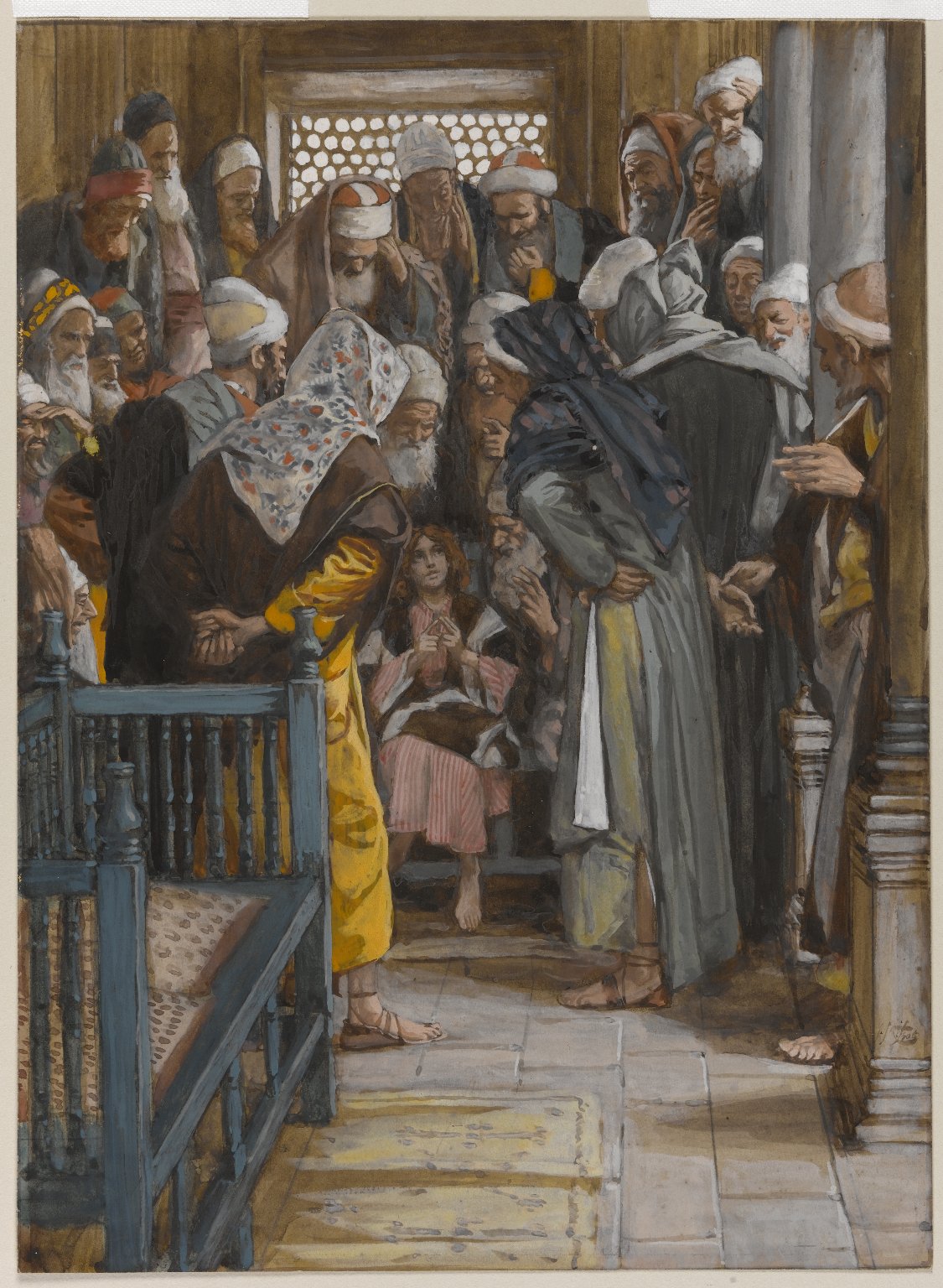
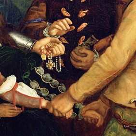
Release for the young explorers surely came about through the payment of money, probably a lot of it. Ransom is a way to describe this kind of payment, where something valuable is exchanged for the freedom of captives. John Everett Millais’ painting (above), The Ransom, depicts a father handing over of fistful of jewelry and a bag of coins to some men who have taken his daughters hostage. Revolutionaries, terrorists, and criminals have long used ransom as an efficient means of fund-raising, especially when their captives come from wealthy families or are politically well-connected.

Clearly, when payments are made to captors, the purpose is not to honor or reward the hostage-takers. Instead, these payments reflect an abiding concern for those who are held-captive, awaiting redemption.

This concept of ransom is deeply rooted in our Judeo-Christian tradition, and it shapes how we understand redemption. Think of the beloved Advent hymn, which begins this way: “O come, O come, Emmanuel, and ransom captive Israel…” In the Old Testament, in many passages like Psalm 49; Isaiah 35, 43, and 51; Jeremiah 31; and Hosea 13, we hear about how God’s promises inspire hope for the possibility of ransom from the power of death.

These insights help us understand Jesus’ words about ransom in Mark’s Gospel (in 10:45; parallel in Mt. 20:28). After predicting his suffering and death three times, Jesus tells the oblivious disciples that “the Son of Man came not to be served but to serve, and to give his life as a ransom for many.”

Yet, instead of a ransom-based understanding of Jesus’ sacrifice and death, many Christians think of Jesus’ saving work in a largely legal or juridical way. In this view, our sin involves a degree of corruption and guilt so bad that it’s beyond what we can make right. And so, human captivity to sin means that ‘a penalty must be paid, and punishment meted out.’ By this reckoning, only a ‘sinless one’ could pay the uncountable price, and bear the penalty for all. Therefore, Christ as a substitute for us, paid the price and endured the punishment so that we, ourselves, don’t have to, even though we are the ones who deserve it. Yet, according to this very common theory, the ‘price’ was paid to God, to satisfy God’s justice!

This legal or ‘punishment-substitution’ understanding of Jesus’ death did not become widespread for at least a thousand years after his crucifixion. Instead, during the first millennium, a different concept of Jesus’ mission was preeminent. It springs from the ransom words in Mark, as well as from 1st Timothy 2:5, where Paul writes, “…there is … one mediator between God and human kind, Christ Jesus… who gave himself [as] a ransom for all.”

According to this ransom view, ever since Creation, we have placed ourselves in the hands of Satan, by refusing to ‘delight in God’s will or walk in God’s ways.’ In effect, we have strayed into ‘the jungles of sin,’ and have allowed ourselves to be taken hostage by the Devil. We are held captive by our sin, and by our inclination to follow our own will. Like the two student hostages, we might have ‘paid’ our way to freedom ~ if we and they had had the means to do so. But we did not.

And so, showing his great love for us, Jesus offered himself to the Devil, as a ransom for our freedom. Jesus allowed the Devil to take him, as someone of even greater value than all of us. For Satan received as a ransom the sinless One, God’s own son. C.S. Lewis employs a similar ransom metaphor in The Lion, the Witch, and the Wardrobe. In this biblically-derived approach, the ‘price to be paid’ was a concession to the power of an enemy, and compensation for a loss, rather than (as in the later and more prevalent legal view) a payment to satisfy God’s sense of justice.

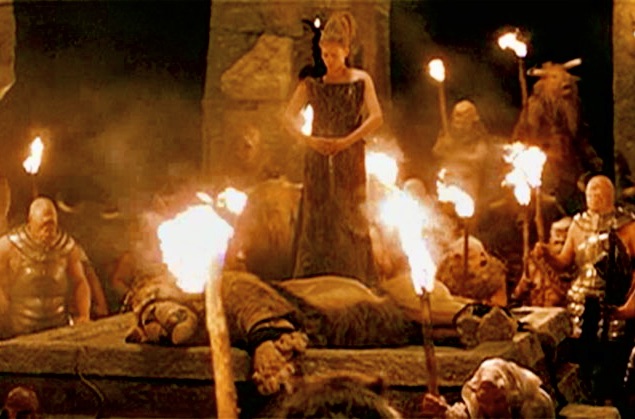
An image of Aslan’s self-sacrifice, from a film version of The Lion, the Witch, and the Wardrobe


This post is adapted from some material previously published in this space, with some additional imagery. It is based on my homily for Sunday, Oct. 20, 2024, which may be accessed by clicking here.

David Macaulay and Mosque Architecture

If reading this by email, please tap the title at the top to open your browser for the best experience. Then, clicking individual pictures will reveal higher resolution images.


Recently I became reacquainted with a book I discovered some years ago, by an author whose work I greatly admire – David Macaulay. It is his book on Islamic mosque architecture, based on a historically informed but fictional mosque erected in Istanbul in the 16th century. Macaulay’s great skill lies in his ability to provide the reader with insights gained from his use of drawing with pen and ink, frequently with color overlaid, in such a way as to unfold the often complex inner structure of the buildings he wishes to explore and explain. For a primer on traditional mosque design and construction, complete with a glossary of terms, the book is invaluable.

The project featured in this book is a mosque commissioned by Suha Mehmet Pasa, a fictitious high official in the early Ottoman period who engages in a charitable act inspired by his Islamic faith and the five pillars of Islam (faith, prayer, charity, fasting, and pilgrimage). He funds the design and construction of a complex of buildings that includes both a grand mosque and its accompanying courtyard and related structures, as well as a mausoleum for himself upon his death. The influence of the historical architect, Mirmar Sinan, as well as Sinan’s breathtaking Süleymaniye Mosque in Istanbul (depicted below), are plainly evident in Macaulay’s composition of the book.

Because of my own fascination with domes incorporated within mosque architecture, I will focus here on that aspect of Macaulay’s book, though he provides a comprehensive account of the construction of almost every feature of a traditional mosque from the early Ottoman period. I find most helpful the following diagrammatic illustration of the basic building components which together support the dome on such a mosque as the Süleymaniye Mosque, featured in a prior post.

The above illustration corresponds to the following floor plan for the same hypothetical structure.

Now, how did that imaginary 16th century architect, his masons and carpenters, manage to build the magnificent dome featured in this project, and as we find in the actual Süleymaniye Mosque? Macaulay unfolds the mystery with a series of instructive drawings that give us insight into the process. Once the proper height of the walls and support piers was attained, a semi-circular structure of wood was constructed to provide the proper curvature of the intended dome (as seen below).

This structure was then lifted up and placed upon a kind of spindle, so that it could revolve horizontally around the perimeter of what would become the brick structure of the dome.

With the rotation of this semi-circular wooden form, the builders could stack up the bricks according to the intended proper curvature of the inside of the dome, while allowing the exterior of the dome to be wider at its base, for greater strength and stability.

A final step in the construction of the main and other domes was the preparation of sheets of lead, cut in precise patterns so that they would sheath the dome with a series of overlapping panels, to avoid water intrusion:

The smaller domes covering areas of the courtyard and entrance portico were constructed in a similar fashion, but on a smaller scale, as seen in the following illustrations. A simple swinging pendulum-like wooden arm was employed rather than the more elaborate semi-circular structure used for the large main dome.

Completion of the construction of the main dome was followed by the finishing of the interior surfaces with plaster, and then with elaborate paint work, which of course involved the need for scaffolding and platforms.

Macaulay then provides two evocative interior views of the finished interior of the mosque, and from two unique perspectives.

These drawings and my primary focus upon the dome aspect of this hypothetical mosque project provide just a hint of the richness to be found in this evocative book. Though it may appear to be a ‘picture book’ intended for middle school students, it is actually a rich source of information for adults who wish to become familiar with the basic elements of historical mosque architecture, and the construction methods used to produce such buildings in the early Ottoman period. In addition to the highly instructive drawings, the glossary at the back of the book is also of significant value.

As readers might guess, I highly commend this book.


St John the Divine – A Building and a Gospel


In the summer of 1974, I left my Massachusetts prep school as one of the few graduates not intending to go on to college. I moved to Manhattan in a youthfully naive venture to try and replicate an aspect of the life of my hero, Frank Lloyd Wright. I wanted to follow his career path of eventually obtaining architectural licensing through practicing in the field, something that was and may still be possible.

Unfortunately, as a career move this was at an improvident time, largely due to what was then called “the oil crisis,” and its effect upon the economy. No architectural office was hiring beginning draftsmen, and some were taking on licensed architects to do the kind of basic drafting work for which I wanted to be hired. The former Frank Lloyd Wright associate, Edgar Tafel, was most gracious in allowing me to come to his New York City office for an interview and then by how he tolerantly responded to my youthful exuberance and evident lack of preparedness for the work. Philip Johnson was less patient with me. When I managed somehow to reach him by phone, he said, “Look – I don’t do the hiring around here. Talk to my associate!”

I had found a room a block and a half from the Cathedral of St. John the Divine, which was a prominent local landmark and soon became a welcome place to visit. Only years later did I discover that the house in which I had been able to rent my room, the former Alpha Delta Phi fraternity house, on 114th St, opposite the Columbia University Library, was where Thomas Merton had lived when he was a student there.

I would walk over to St. John’s, an alluring place to stop and rest. Now, at this point in my life, I would say it was ‘to pray.’ But I would not have said that then. Yet, as one beautiful phrase in The Book of Common Prayer Catechism puts it, “Prayer is responding to God.” Those are profound words. If taken seriously, we can recognize how many, many people in this world ‘respond to God,’ quite spontaneously and quite naturally – and aside from doctrine or ritual.

The magnificent space and architectural achievement of the unfinished cathedral of St. John the Divine was a profoundly converting space for me, in ways I did not realize then, and in ways that would not really make sense to me until much later.

Drawn to this place, absorbed with my intuitions about its architecture, and visiting frequently with inquiries, I volunteered to become a docent, a kind of tour guide for visitors before places like this cathedral became commercially oriented, leading to the charging of fees and the like. In the process of my time as a guide, I learned many arcane and obscure things, among them the size and height of the granite columns surrounding the main altar (54’ tall, 6’ in diameter); the number and architecturally significant variations among the chapels adjacent to the ambulatory surrounding the apse that encloses the high altar; as well as significant features of other side chapels in addition to the crypt.

If you had asked me then about the nature of my interest in that building, I would have said it was purely of architectural significance. Ask me now and I will tell you that I was seeking a closer experience of what St John the Divine shares with us in his Gospel. I was – as we say in a paradoxical way – unconsciously looking for God. But what I was really looking for, as we all do, is the experience of being found… and of feeling found, by God.

I think it is also providential that my year in New York, and the brief time I served as an occasional volunteer guide at the Cathedral, was when Canon Edward West was Sub-Dean, and Madeleine L’Engle was officially the cathedral librarian. I may have had only passing contact with either of them, but both were exemplars of how the arts may draw people into a more direct experience of what our Christian faith is all about. The Cathedral of St. John the Divine has represented this vision and value for decades.

Where St. John the Divine as a building nurtured my nascent spiritual awareness, the Gospel given to us through St. John the Divine, and the hymn-poems in his Revelation, have been for me a key, a doorway, and a beckoning gateway into a greater fullness of life.


Roger Tory Peterson’s Art, Helping Us See

If reading this by email, please tap the title at the top to open your browser for the best experience. Then, clicking individual pictures will reveal higher resolution images.


If you wanted to buy a guide to help you identify birds, what would you choose? A book with glossy photographs showing birds as found in nature? Or would you choose an artist’s rendition of those same birds abstracted from their natural setting? Without considering the question closely, I suspect that I am not alone in being one who would choose the former for what seems an obvious reason, that photographs purport to capture reality in what we call an objective way. And when seeking to identify birds, correct apprehension of reality is what we are after. Paradoxically, Roger Tory Peterson’s, Field Guide to the Birds, first published in 1934, has long been valued precisely because his paintings and notes may aid accurate identification of birds to a greater degree than can be obtained by studying photographs.

As we also find in the presumed intent of more recent, photo-based, bird books, Peterson’s aim was to help us see, and then upon seeing, correctly identify the birds we have apprehended in our sights. Yet, Peterson, a much-regarded pioneer in the environmental movement, sought to aid our perception by prioritizing the various unique properties of individual species, and then to highlight those features that distinguish them from other birds. With the aid of his editors and book designers, he helped to achieve these goals by adding small black lines or dashes pointing to various parts of each bird on the color illustration pages displaying his paintings.

These small lines correspond to observation notes in the text, signaling to the reader the principal identification marks and points of difference between various similar-looking species of birds (see below). His creation of this method for the identification of observed field marks in birds has come to be called the Peterson Identification System.

A pre-publication page from Peterson’s Field Guide. Note the small black lines or dashes, explained above.

The paradoxical limitation that may accompany a photographic guide to birds is that a photograph captures an object in only one posture in one moment of time. Photographs are also dependent upon existing light conditions, and where the object of attention may also visually be obscured or overwhelmed by its larger context.

With paintings, Peterson may have been better able to help us see three dimensional aspects of the birds he portrayed while yet employing a two dimensional medium, in part because those birds are presented against a non-distracting neutral background. By painting rather than photographing, he was able to emphasize and enhance certain features of birds, such as subtle areas of color and the impact of light upon them, to a greater extent than would have been possible with the photographic means available to him at the time. In the process, Peterson demonstrated a consistently high degree of proficiency in his work of illustration, while also achieving what are arguably finished works of art that help us perceive beauty in the natural world around us.

The Finches page from my grandfather’s 1959 edition of Peterson’s Field Guide


Note: Having featured Peterson’s work, there are many newer bird identification books being published, and they are worth exploring when someone seeks a reliable birding guide. For many people of my generation, Peterson’s work will always be on the shelf, given its art rather than his having employed photo-based images, especially since his books are so widely available. I am proud to have and use my grandfather’s annotated copy (above), with his sightings noted on numerous pages going back to the 1960’s.

I am conscious of the fact that I featured multiple color photos of the Common Nighthawk in my prior post, as well as having offered a substantial amount of information about this particular species. If bird guides were to offer an equivalent kind and amount of coverage of every species commonly observed, they would be immense, and very expensive!

Roger Tory Peterson (1908-1996). It is one thing to be serious about one’s life work, and another to be able to laugh about it!


Vivian Maier, Who Saw Beauty in People on the Street

If reading this by email, please tap the title at the top to open your browser for the best experience. Then, clicking individual pictures will reveal higher resolution images.

A classic self-portrait by Vivian Maier


Vivian Maier (1926-2009), whose artistic works were until recently largely unknown, is now credited with being among the most significant street photographers of the 20th-century. Her main way of supporting herself was as a nanny in New York City. But clearly, her vocation was to see the people around her in a sensitive and insightful way, and document her encounters with them through the art of photography. As a perceptive observer, she captured them ‘as they were.’

My hunch is that her much-appreciated work as a caregiver for children, in the context of their families, positively reflected an inborn gift for discernment about other people as she apprehended the beauty she found within them. This may have provided her with a greater sense of tolerance and comfort with how others could appear, some of whom she photographed in states of disarray, plagued by the challenges of poverty and or illness, as well as those who seemed to be among the elite and socially inaccessible.

Vivian Maijer took thousands of photographs in the years before our new era of digital photography, and she never had a sizable proportion of her images developed into stored negatives. Traditional cameras in her era allowed light to pass through their lenses so as to impact chemically-coated light-reactive rolls of plastic film. These rolls of film then required either commercial processing, or the equivalent in private ‘dark rooms,’ where the light-sensitive film could be transformed into a stable medium. It is worth noting that, in its earlier days, photography was dismissed as being a lesser (or not even an) art. Yet, photography, as Maier’s work exemplifies, has the power to communicate great beauty, inspire goodness, and convey significant truths.

She was nevertheless unassertive with regard to what may have been seen as her ‘hobby’. She seems to have had confidence in her talent, and in the reasonable validity of her expenditures on cameras and film (a lot of film!), as well as the costs of developing the film she chose to have processed. And yet, we can only wonder why she did not seek out public recognition of her talents and work in a more encompassing way.

A compelling example of Maijer’s work

Three variables mark Vivian Maier’s accomplishments in photographic proficiency:

First, she was adept at capturing compelling and memorable images of people whose face and expression, and or posture, caught her interest.

Second, she became very proficient in producing images in black and white that have a significant light value contrast between those two reference points (light and dark). She also appears to have become adroit in manipulating the technical features of cameras such as shutter speed and aperture. For example, and taking into account the speed at which various film types absorb light, a quick shutter speed is often required when capturing people and objects in motion, to avoid a resulting blurred image. At the same time, when the shutter speed is fast, the aperture or degree to which the shutter is set to open in terms of size, not only affects how much light is let in but, interestingly, also affects how far objects in the distance remain in focus. Her attainment of these skills allowed her to be in greater control of depth of field, something important when taking photographs of people in public settings.

These first two variables involve skills that can be learned through practice. The third significant variable is picture composition, an inherited gift as much as it may be something that can be taught. Whether or not it can be learned through study, I believe that she had it naturally.

The following are some of the most significant images I have found in the available online archive of Vivian Maier’s oeuvre or life’s work.

There are, to be sure, photos of men (as below), but her most compelling images, I believe, are those involving women from a complex variety of what are now called ‘social locations,’ in New York City.

I find the following artistic self-portrait both visually compelling as well as insightful about herself.

What a remarkable ‘amateur’ photographer was Vivian Maijer!


Finding Beauty in the Most Unexpected Places

If reading this by email, please tap the title at the top to open your browser for the best experience. Then, clicking individual pictures will reveal higher resolution images.

Actor Koji Yakusho portraying Hirayama looking upwards, in the film Perfect Days


An improbable premise underlies the remarkable film, Perfect Days, and it is displayed in two principal ways. A Tokyo public toilet cleaner has a positive attitude, even a cheerful spirit, as he approaches his daily routine of attending to places where other people leave their waste. And yet, the primary places where this man is lucky to work are the architecturally significant public toilets commissioned and built for the 2020 Tokyo Olympics. The film portrays these places well. Some have suggested that the architectural features of these structures may have inspired the movie’s production. Nevertheless, the film is centered upon one man’s approach to how he lives every day.

He is a man about whom we know only his surname, and we learn more about his daily routine than we do about his inner life. The latter, his interests and perhaps aspirations, are suggested by the books he reads and the music to which he listens while driving. Many scenes depict him at his work. But the film does this in ways that do not romanticize his occupation, while he is shown cleaning and polishing toilet bowls and seats, as well as sinks and other aspects of plumbing. The film skillfully negotiates the ambiguous terrain lying between a heroic portrayal of an apparently righteous man, and a sentimental celebration of an unreal figure.

A montage of some of the public toilets featured in Perfect Days

The approach to life epitomized by Hirayama in the film is one of contentment. He models someone who accepts the limitations presented by the contexts in which many of us live, and he displays an openness to unexpected moments of discovered and quiet beauty. The film is not overtly spiritual. Yet, these qualities may represent – to some Western viewers like me – compelling reflections of Japanese culture as it has been shaped by Buddhism.

Hirayama at work on a hobby, Bonsai

In addition to the overt paradoxes at the heart of the film – a happy toilet cleaner and beautiful public toilets – the film subtly presents other aspects of Japanese society that Western visitors might notice. In what may surprise many who are not of Japanese heritage, regarding a very private culture where people typically meet one another in commercial establishments rather than in personal dwelling places, public baths with full nudity are common. I experienced occasional visits to public baths in my youth, growing up in Japan.

Hirayama in the neighborhood bath house

And within the context of this very private culture, some Tokyo public restrooms were created with transparent glass walls, appearing to risk users to full disclosure (the glass walls magically become opaque when the doors are locked).

Three motifs or tropes in the film are memorable. Hirayama is portrayed as always looking up to the sky when emerging from his home in the morning on his way to work, and is also seen gazing upwards (as in the photo at the top of this post). This suggests that he unconsciously senses a connection with something bigger than himself, and this may be the source of his frequently displayed habit of smiling at others.

Another motif, surely related to the first, is the employment of black and white sequences that portray flickering images, usually of dappled sunlight glimpsed through tree limbs, which Hirayama captures with his old-fashioned film camera. Most often, he seems to take these photos during his lunch breaks in a local park. In relation to these images, the movie highlights the Japanese word, and concept, of komorebi, which in a single word expresses the idea of sunshine filtering through the leaves of trees overhead.

The third is the employment by the movie makers of the Sumida River in Tokyo, long celebrated in Japanese art, over which we see Hirayama cross while walking, driving, or biking. The river appears to symbolize a form of divide between the part of the city where his small apartment is located, and the more elegant commercial district where he usually works.

My favorite image of Tokyo’s Sumida River in art, a woodblock print by Kobayashi, Kiyochika ({1847-1915} name in traditional Japanese order)

These juxtapositions in Perfect Days of contrasting details, color versus black and white, and interior privacy and public life, along with the harmony in which they are presented, distinguish this film. To me, it is remarkable that this movie was made by a Western filmmaker, regardless of the assistance provided by Japanese colleagues. A studied sensitivity to what I know about Japanese culture is evident in the film’s portrayal of this fictional character in improbable circumstances, as it invites us to discover – along with Hirayama – beauty in the most unexpected places.

Hirayama, gazing upwards, holding his old-fashioned film camera


Chora Church: A Byzantine Treasure

If reading this by email, please tap the title at the top to open your browser for the best experience. Then, clicking individual pictures will reveal higher resolution images.

Dome over the Side Church (or parecclesion), Chora Church


We missed being able to visit this remarkable place by a day! Sadly, after staying in Istanbul for four nights, the historic Chora Church that had undergone four years of renovation would not reopen until the day after our departure.

Dating back to the time of Constantine in the early fourth-century, the Chora Church was built as part of a monastary outside the walls that were constructed when Constantinople became the new capitol of the Roman Empire in 330 A.D. Its rural location led to its formal title, Church of the Holy Savior in the Country (or Chorai, in Greek).

Interior of the original central nave (naos) in use as a mosque, with Christian mosaics and frescoes covered over

Chora, like the later Hagia Sophia, has over its history served as a church, a mosque, a museum, and now once again as a mosque. As I have noted in prior posts, the fact that buildings like Hagia Sophia and Chora have been able to transition from church to mosque without significant structural change helps us perceive how what became normative in mosque architecture had its origins in churches from the early Christian, pre-Islamic era. As a precursor to Hagia Sophia, the original walls of Chora may provide one of the earliest examples of what would develop into the cruciform plan for churches, a design pattern that became predominant in the Christian East. This approach to design for worship spaces is centered on a square, covered by a dome, a departure from the early rectangular basilica plan favored in the western Roman region.

Floor plan of the Chora Church

In the floor plan above, note the subtle Greek Cross pattern of the central nave (or naos) below the large dome. As this plan indicates, the original, late Classical period Chora was significantly expanded during the Byzantine period, between the 11th century and the 14th century.

Section drawings of Chora Church showing the location of some murals and frescoes

In addition to its cruciform plan, and the church’s great antiquity, another feature that distinguishes Chora is its impressive collection of well-preserved Byzantine mosaics and frescoes, largely from the early fourteenth-century.

Visitors to Chora admiring the murals in the Byzantine-added “side church”

The bulk of the surviving mosaics and frescoes are located primarily in the side church (or parecclesion). This may be due to the central nave or naos having been used for Islamic worship during a significant portion of the building’s history. One of the many beautiful frescoes depicts a common theme found in works of art from the Christian East, that of the Harrowing of Hell. Images based on this theme depict the Christian belief concerning the first saving actions of the Risen Christ: pulling Adam and Eve out of their tombs and the clutches of the underworld (image below).

A fresco in the Side Church – Anastasis (or Resurrection): The Harrowing of Hell

A beautiful example of the Chora mosaics depicting Joseph and Mary’s enrollment for taxation in Bethlehem

Interior view of the side church

Like the later Hagia Sophia, Chora Church – for a time as a museum and now a mosque – still serves as an edifying spiritual place for Christians and people of other faiths to visit. For Orthodox Christians in the East, Chora’s numerous mosaics and frescoes provide multiple opportunities to (re)engage with biblical stories and with articles of faith in a way that the contemporaneous art in the much larger Arena (or Scrovegni) Chapel in Padua, Italy, provides enrichment for Western, Latin, Christians.

Exterior view of the southeast corner of Chora Church (note the later addition of a ‘flying buttress’)

A 1903 photograph of the west entrance to Chora in the late Ottoman period


The Mystic Rumi’s Burial Place

The burial place of the mystical Sufi poet, Rumi, in Konya, Turkey

Here are some photos from a recent visit to the mausoleum of the mystic Sufi poet, known in the West as Rumi. It is a very holy place for many who visit there.

The honorary coffin cover, sitting far above the entombed remains of the mystic Rumi
A Persian style multi-faceted dome in the same building
An interior view showing some of the remarkable calligraphy on the wall surfaces
A broader interior view
An original 13th century silver door
A replica small space in the courtyard adjacent to the mausoleum