Author: Stephen Holmgren

I have been an Episcopal priest for thirty eight years, having served in parishes and in academia. My interests include art and theology, liturgy and spirituality, and I love to go sailing whenever I can.

The Architectural Vision of John Gaw Meem

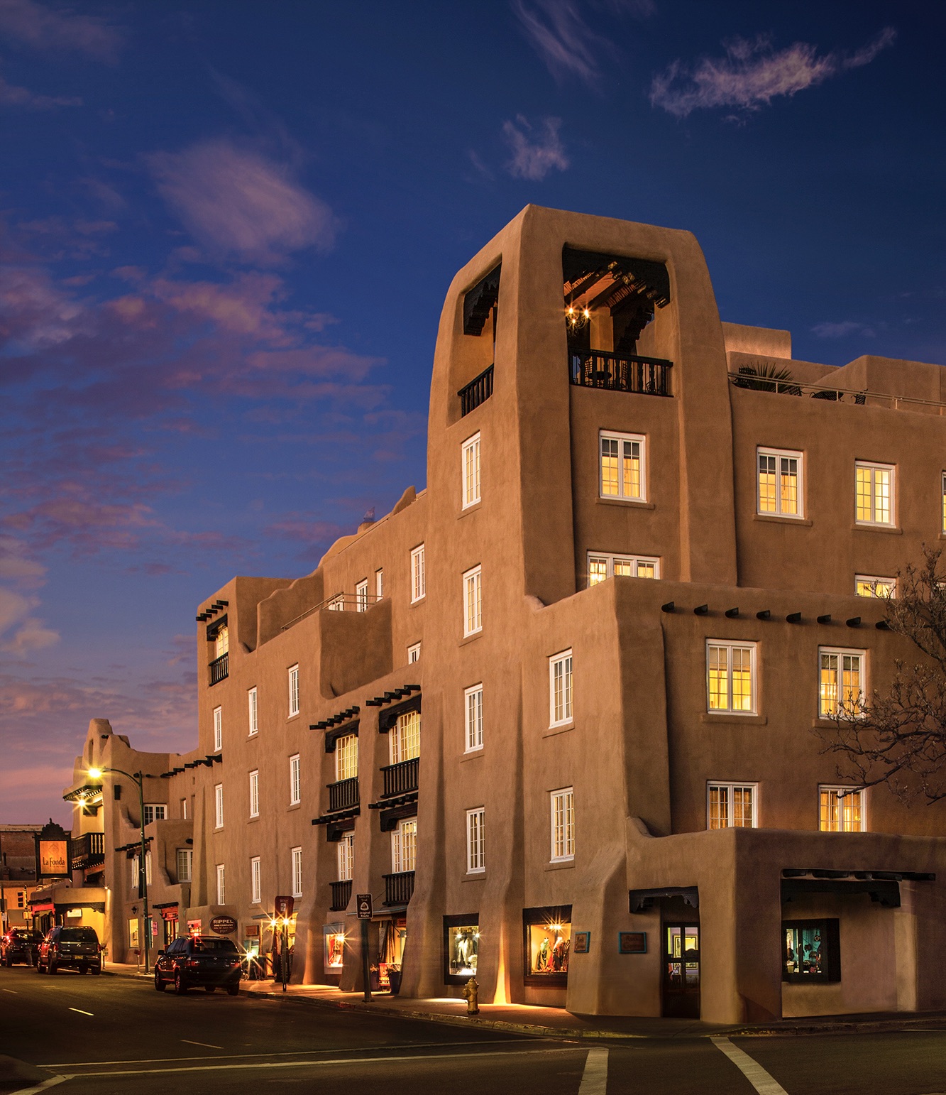
Renovation and Extension of the La Fonda Hotel, Santa Fe (1927)


John Gaw Meem is generally credited with having led the recovery and promotion of an historically Spanish-Pueblo Revival approach to building design in the central district of Santa Fe, NM, as well as in its environs. Warm tones in beiges and browns adorning the surfaces; soft rounded edges and corners characteristic of adobe buildings; a general preference for asymmetry; slightly upward sloping walls with accompanying exterior buttresses; and protruding beam-ends of the flat roof supporting logs evident also in the interior ceilings; all these and more are features of this recognizable ‘style.’

Yet, speaking of ‘style’ may create a misapphrension. Whereas more recent contractors and builders may imitate some of the above mentioned features in homes now quickly built for mass consumption, John Gaw Meem pursued an informed appreciation for the structural character and integrity of his region’s most important historical buildings. He as diligently applied himself to the practice of historical preservation as he did to his own genuinely creative work, where he typically disciplined his architectural vocabulary so as to remain faithful to the traditional features he so intentionally studied.

Depicted above is the result of his design for a renovation and extension of the historic La Fonda Hotel in Santa Fe, a project that seems to owe as much to the historic Taos Pueblo as it does to modern needs and sensibilities. Set side by side with the above, we can consider Meem’s great achievement with the main library for the University of New Mexico, in Albuquerque, a sizable institution for which Meem designed and / or oversaw the planning of some 25 buildings after being named campus architect in 1933.

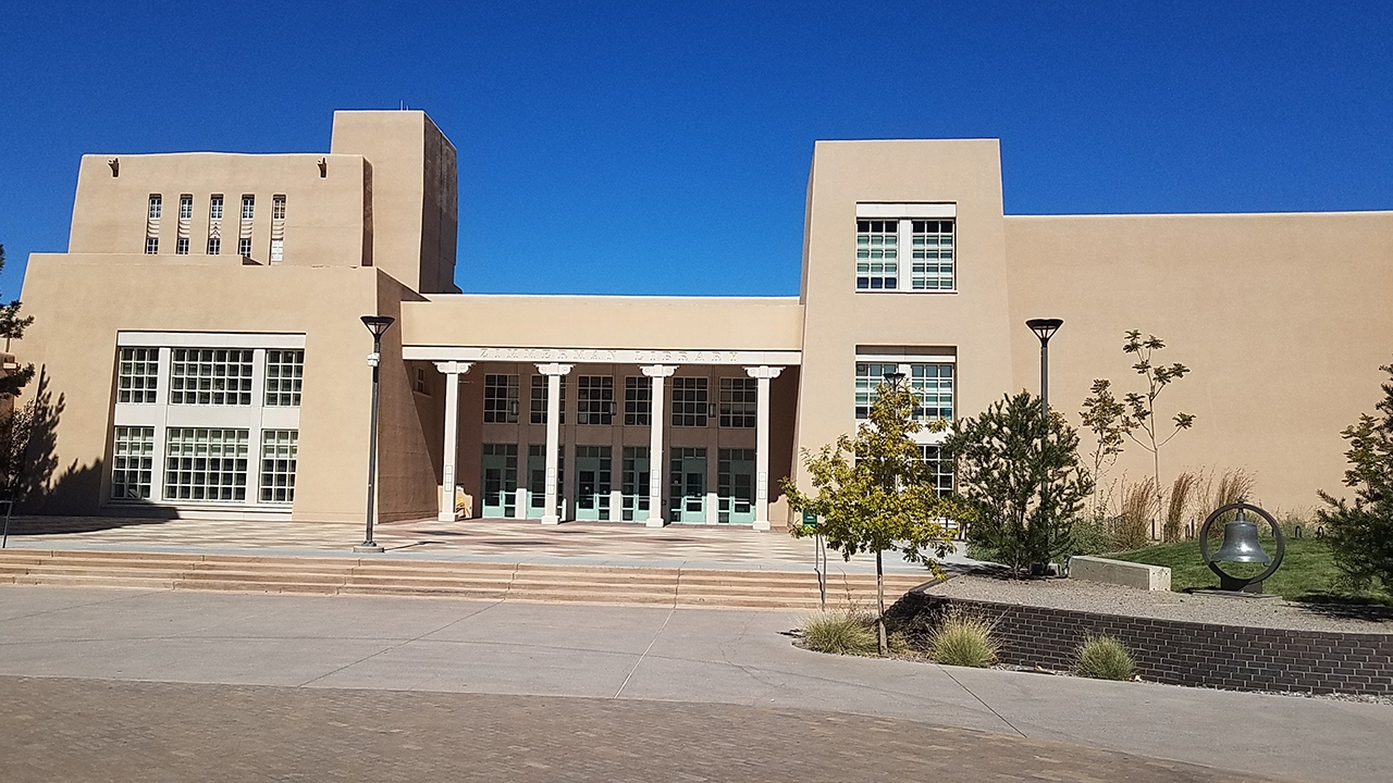
Zimmerman library, exterior main entrance (1936)

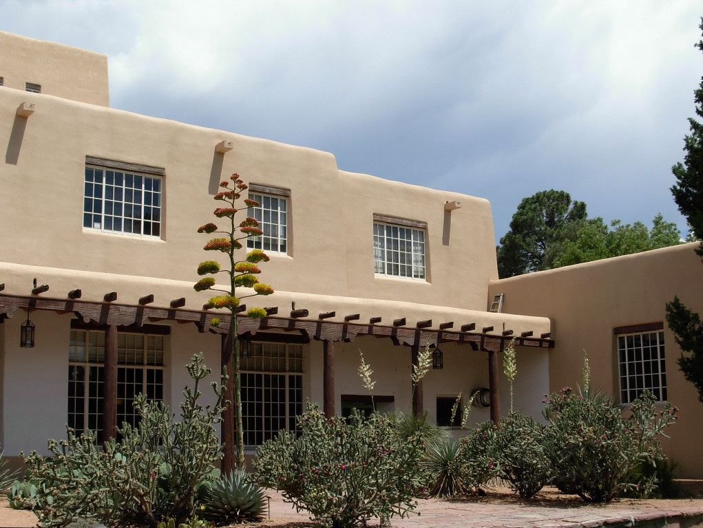
Zimmerman Library, interior courtyard

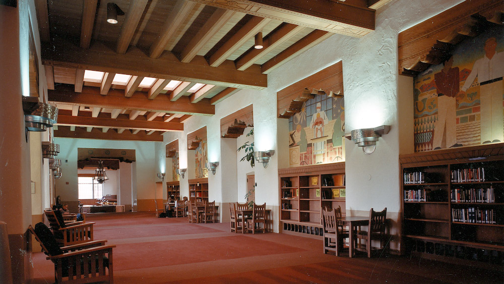
Zimmerman Library, interior view

Here we find two distinguished buildings, the La Fonda Hotel extension and the UNM Zimmerman Library, separated by less than a decade in terms of their design and construction, which both exhibit Meem’s sensitive appreciation for the legacy of Spanish-Pueblo architecture, as well as its adoption by the diverse immigrant culture of the Southwest.

Like the writer, Walker Percy, John Gaw Meem came to discern his vocation in the context of receiving care for tuberculosis in a sanitarium. For Percy, it happened in upstate New York, whereas Meem found himself and his guiding vision in Santa Fe. From small beginnings involving private commissions for houses, Meem expanded the range of his work to also include commercial buildings, historically-informed designs for new churches as well as the restoration of historic examples, and structures providing for the functional needs of public eduction that were equally attentive to humane and aesthetic considerations relevant to a learning community.

One of Meem’s highly regarded projects for a public building was his Colorado Springs Fine Arts Center (1934), a building reflecting the European modernist influence of his era as well as echoes of design ideas implicit in his obviously pueblo-adobe inspired buildings. This project clearly demonstrates how Meem’s high regard for historic precedents did not inhibit his ability to work more freely in a contemporary way, adapting chosen materials and design principles to emerging requirements.

Here (below) is a photo of Meem standing on a balcony of the original theatre of the Colorado Springs Fine Arts Center.

In the future, I look forward to offering a post related to some of  Meem’s designs for homes, as well as one featuring his evocative contributions for Santa Fe area church architecture.

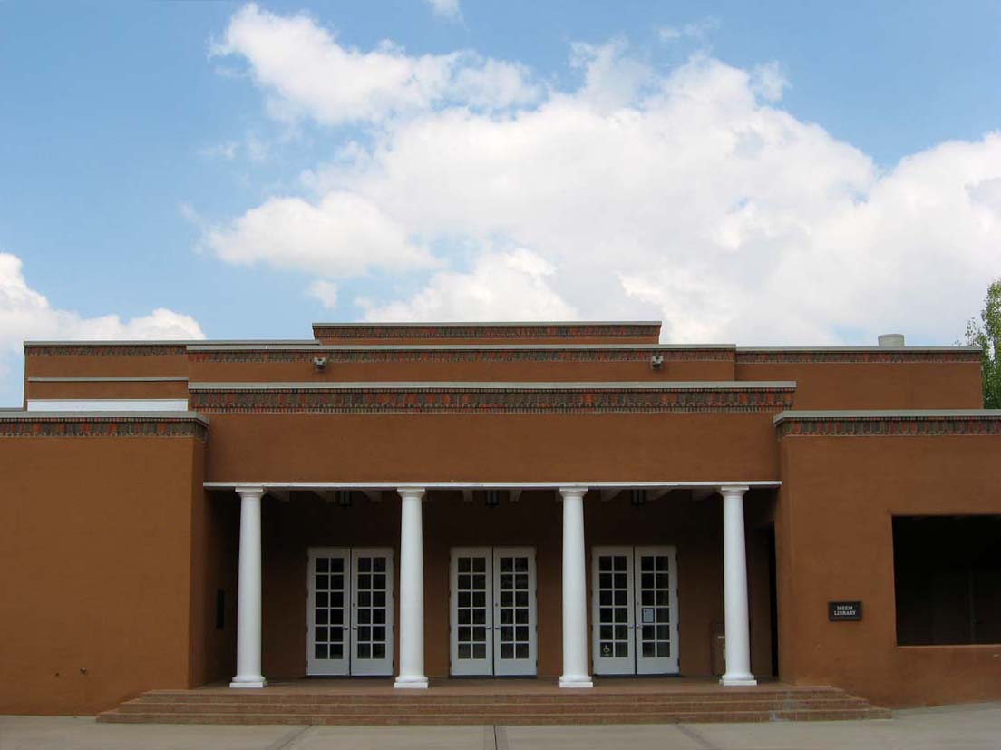
Evidence of his influence: the Meem Library at St. John’s College, Santa Fe, by David Perrigo, inspired by and in honor of JG Meem

On Donkeys and Horses


I would like to return to a quote from Psalm 147:10, the wider significance of which may not be apparent. In my most recent post, I reflected on the contrast between the Psalmist’s assertion concerning God’s lack of delight in the strength of a horse, and God’s probable appreciation for the beauty of the same.

But what lies behind that stark observation by the Psalmist? The answer may be found in many images from within the Bible, and can most readily be seen in the dramatic story of Jesus’ entry into Jerusalem.

As James Tissot vividly portrays the moment, Jesus enters Jerusalem to acclaim and praise, riding on a donkey rather than a horse. At that time, many armed and horse-mounted Roman soldiers entered and left this city as they did to and from many others across the Empire. But not the Prince of Peace, who arrived without earthly weapons upon a humble beast of burden.

This is in keeping with a significant body of biblical imagery where horses are associated with military and / or government power. A most dramatic example is found in the story of the Israelites escaping from Egypt, pursued by “the chariots of Pharaoh and his army.” Exodus, in a passage often termed ‘The Song of Moses,’ gives voice to Israel’s joyful recollection about the event: “I will sing to the Lord, for he is lofty and uplifted; the horse and its rider has he hurled into the sea.”

Jesus’ entry into Jerusalem on a donkey is not only a historical recollection; it also provides a legendary association with the unique physical markings of that animal. Donkeys have two perpendicular stripes on their backs, one running from the neck to the tail, and the other forming a cross as it runs down over the shoulders.

Hence, the poetic observation that the one who entered Jerusalem riding on a cross was lifted above it on a cross. The one who refused to enter the city posing as a challenge to military authority, was himself subject to its power and in its most brutal form. So, the one who arrived possessing spiritual authority chose not to act with worldly power. He was then subject to a military power whose authority was compromised.

As I have previously suggested, horses have provided an image of beauty through a long history of their portrayal in various art forms. Yet, those magnificent animals have an even longer history of association with military might and conquest, and the subjugation of peoples less prepared to defend themselves. Consider how the historically recent introduction of the horse transformed the lives of native American peoples and their community relations with others. Yet, the humble donkey (or burro or ass), more diminutive in stature, and which so readily bears our burdens, has a beauty of its own. Though sometimes less deferential to human guidance than many horses, a donkey’s physical presence is less likely to be intimidating despite its demonstrable strength and endurance.

The Beauty of an Appaloosa Horse

While composing a prior post on the beauty of a horse, I was reminded of a portion of the Pslams – “{The Lord’s} delight is not in the strength of the horse (PS 147:10).” Yet, God must surely delight in the beauty of a horse, a possibility that may have occurred to some of us during the recent Triple Crown racing season and / or through admiring Dega’s renditions of race horses. Perhaps the Lord especially delights in the breed of horses known as Appaloosa’s.

Traveling back and forth between Japan and my parents’ birth home area of Minneapolis, we met a family on one of the voyages across the Pacific who had a ranch in Montana. Among the many wonderful discoveries during multiple visits there was the beauty of the Appaloosa. A ‘spotted backside’ might not at all be desirable among humans and some other living beings, but in my view this common Appaloosa trait provides one of the most compelling amalgams of both solid color and random patterning that I know of in the animal world.

Most closely associated with the Nez Perce nation among indigenous American peoples, the breed initially suffered along with the decline of the community propagating its existence in the latter 19th century. Yet, despite that sad history, and perhaps because of its compelling beauty, the Appaloosa breed of horses has since thrived.

Our friends’ ranch had numerous Appaloosas, but three that I remember fondly, and for differing reasons. One, named Lonesome, a striking looking horse, had Thoroughbred blood lineage and was tall and slim, with a reputation for being occasionally arbitrary as was another more dramatically colored one named Blue. Leo, like Lonesome, was mostly spotted all over but, when first seen with his more compact and robust physique, could be identified as having an American Quarter Horse lineage.

My favorite, the one with whom I became most familiar, was Marble, a mare of not-readily-evident Appaloosa lineage, among which some are almost white and others appear almost black. Marble looked like a common brown Morgan horse, except for one distinctive detail – she had one blue eye, like one sees in some Australian shepherd dogs. Unlike the sometimes mercurial Lonesome, and the sometimes stubborn Leo, Marble would let me bridle her in the pasture, lead her into the stable next to the tack room, and saddle her without much difficulty.

An Appaloosa gelding, with a Morgan-coloring like “Marble” (note the slight brindle pattern)

The patterned coat commonly associated with Appaloosa horses may be an acquired taste, much like variegated plants among gardeners. I find horses of this background stunning to look at, and I especially appreciate how they have often been portrayed in Western art, such as in the paintings of Charles M. Russel (whose expressive Western-themed paintings I hope to feature in a future blog). It tells us something about the aesthetic sensibility of the Nez Perce that they they would have pursued breeding and cultivating the bloodline of these horses, not only for their utilitarian value but also for their sheer beauty.

The Delta Art of William Dunlap

Book cover of Dunlap’s 2006 retrospective art survey book


If Andrew Wyeth had migrated to the Delta region of Mississippi, some of his paintings may have turned out looking like those of William Dunlap. Folks not from the central deep South will usually associate that term, the ‘Delta,’ with the outflow of the great river south of New Orleans in several branched outlets. Yet, the term, the ‘Delta,’ in the mid and deep South refers to the region abutting the Mississippi River south of Memphis, bordered by Arkansas and Mississippi. Historically, and until the present, it has been characterized as one of the poorest regions of our nation and also known as the birthplace of the Blues, a fact which may not be coincidental. Lush with vegetation in a multitude of vibrant greens during the summer, the Delta has a stark beauty in the winter, especially where trees have been removed for farmland. Usually not cold enough for lasting snow, gray skies often complement the gray trunks and limbs of deciduous trees, as well as of cypresses in the swamps and by the river.

William Dunlap’s paintings, particularly the more recent ones, capture well the landscapes of this mostly rural part of ‘flyover’ America. As his artwork often depicts, the low-on-the-horizon winter sun pokes through bands of dark clouds, where in the evening a surprising warm glow can enliven an otherwise flat and bleak landscape. Dunlap lived in many places in the Old South while growing up, but the north central hill country of Mississippi, and Webster County, remained a homing point connected with his grandparents. Yet, I find his most evocative paintings are of the comparatively flat alluvial terrain on the east bank of ‘the American Nile’ south of Memphis.

Dunlap grew up feeling like he had lived in two eras of history, one being the late 19th century whose social legacy permeated the circumstances of his youth, and the other stemming from his having been born at the end of WWII, having come of age in the 1960’s. Images in many of his paintings reflect this paradoxical tension between old world cultural patterns and practices, and new world adventurous explorative freedom.

The dogs in his paintings reflect aspects of this dynamic. Dunlap’s grandfather bred and raised Walker hounds (most memorably represented in the top painting), which are often depicted as his central subjects within expansive landscapes. According to J. Richard Gruber, they are “used as a surrogate for man (and himself) in his works.” Here, in his choice of subject matter, we find another rural ‘old south’ in tension with an emerging new world. It is most markedly suggested in one of his paintings where he places a power plant cooling tower, releasing steam, behind a rural farmstead fronting an open field (not depicted).

This may help us appreciate the term Dunlap coined to describe his approach to painting, ‘hypothetical realism,’ a term which I think applies equally to the work of Georgia O’Keeffe. Remarkably, Dunlap basically taught himself to paint, and focussed his early work on Rembrandt and other ‘Old Masters,’ while also displaying the evident influence of modern masters such as Larry Rivers, Jasper Johns and Robert Rauschenberg. The effect of some of these more recent artists’ work can be seen in two of the paintings above, by the visual inclusion in the skyline of the regional names, Delta and Arkansas, in label-stylized fonts preferred by many Pop Art painters. Once again, we encounter a dynamic interplay between historically traditional approaches to representational painting and the 20th century reactionary revolt against them.

Dunlap is a truly gifted painter, both in terms of what he has been able to accomplish, but also in terms of his encompassing creative vision. Internet images, upon which I have relied here, only begin to suggest the expanse of his creative perspective.


For those who might want to see more of Dunlaps paintings, as well as learn more about him and them, I commend his coffee table book, Dunlap (which, through Amazon and or other sources may still be available, and which provides a much more accessible resource for appreciating the painter’s work:  (https://smile.amazon.com/Dunlap-William/dp/1578069041/ref=sr_1_5?crid=1YS7GNY6ZE2AS&keywords=dunlap+william+dunlap&qid=1654915393&s=books&sprefix=%2Cstripbooks%2C91&sr=1-5).

The Beauty of Matsumoto and its Castle

Matsumoto Castle, Nagano Prefecture, Japan


Many will remember the Nagano 1998 Winter Olympic Games, which were located in a region commonly referred to as the Japanese Alps. I was blessed to have the opportunity to camp there as a Boy Scout when growing up in Japan. Like the region in Europe for which this mountainous area is often named, Nagano has abundant snow in the winter, as well as hot and humid summers.

Matsumoto attracts many to the city and area for reasons apart from its attractive geography and its winter and summer recreational offerings. The region also has a strong history related to the revival of the Japanese folk art movement. Yet, the main association many will have with Matsumoto and Nagano Prefecture is the beautiful Matsumoto Castle (1594). It is typically ranked as being among the top three preserved historic and traditional Japanese castles, along with Himeji and Kumamoto Castles, and it remains my favorite among them.

Recently, I raised a question regarding how and why beauty might emerge from, and / or be expressed within the context of evil (https://towardbeauty.org/2022/02/26/the-beauty-of-picassos-guernica/). Matsumoto Castle was planned and built within the circumstances of clan warfare, to be a place from which warriors might spring to attack while also providing a place of safe refuge.

Yet, look at this remarkable ornamental structure, with its far beyond functional sweeping (and finally upturned) pagoda-like roof overhangs. Noticing this alerts us to the similarity between these architectural elements and those of strictly religious structures from a much earlier heritage, whether Buddhist or Shinto, like Matsumoto’s Zenkoji Temple (photo below).

Zenkoji Temple

So why, then, would feudal warlords build a castle, principally ordered toward physical safety through providing refuge from or preparation for lethal battle, by erecting a building resembling a temple or a shrine? This question is worth considering.

Possible answers to this question might involve speculation about the following: powerful and wealthy heads of clans desiring their dwelling places to resemble structures representing the highest artistic achievement of their culture; shrines and temples, as well as the abodes of princes and feudal lords, providing peaceful havens for rest and restoration for themselves and their families; and, people willing to live and die for what they worship with their deepest beliefs and commitments, as well as for what they most fear losing, whether spiritual or material.

I suspect the explanation lies in a complex mix of these several considerations.

We might also reflect on how, by contrast, medieval European castles generally evidence a primary concern for physical safety in the face of armed hostility, with aesthetic considerations not absent but distinctly secondary. How remarkable it is, then, to regard the principal surviving ancient Japanese castles, now visited by vast numbers of people who marvel at their peaceful beauty, and who can only vaguely imagine the warrior circumstances of their earliest inhabitants.

The Beauty of a Henry Moore Sculpture

Working model for Henry Moore’s, Three Piece No. 3: Vertebrae (1968)


I have long admired Henry Moore’s sculptures. Through his willingness to explore various ways of representing the human form, as well as his less representational considerations of abstract shapes, Moore has left a huge legacy. His exploration of aspects of the human body is compelling. I especially like an example that can perhaps be described as a hybrid between those works and his interest in more abstract contours. I am referring to his Three Piece No. 3: Vertebrae, shown above. I first came to see and interact with this sculpture while in college, when visiting a scaled up larger version of it on the Safeco Plaza in Seattle (depicted below).

Moore’s Three Piece No. 3 involves a sculptural adaptation of a basic element of both human and animal anatomy, spinal vertebrae. It clearly suggests its biological source while also providing a dynamic interplay between three objects inspired by the same bones.

The top photo above is of the bronze casting of the preliminary plaster model for the sculpture, with roughly the dimensions of 3′ x 8′ x 4′. It is evocative in that scale, where we find it sitting on a plinth for viewers in a gallery. Moore, in the following year, then created a significantly larger version of the same, measuring roughly 9′ x 24′ x 10.5′, of which the Seattle plaza installation is an example. About ten years later, in 1978, the sculptor was commissioned to scale up the work for an even larger placement in the City Center Park Plaza outside the Dallas City Hall. The photos below depict the artist’s own copy of the the Seattle version of the work, as seen in the rather different setting of the Henry Moore Foundation Studio and Gardens, in Hertfordshire, England.


There is something compelling about Moore’s discernment regarding shape, form, and the dynamic interplay that we can see among otherwise static masses of beautifully aged bronze. These are not arbitrary shapes, and I think something within us recognizes the intrinsic connection between these abstract-looking forms and our own physical embodiment. Why do we find such sculptural elements attractive and compelling? Possible answers to this question might lead to a book length response. But I think we can say this: with sculptures like his Vertebrae, as well as with his representational exploration of the overall human form, Moore has shared with us recognizable instantiations of physical beauty with which we have a real connection, and one that is spiritual as well as aesthetic.

For when we recognize beauty in art, and or in nature, we recognize our disposition toward finding beauty. In finding beauty, we are able to discern something profound about ourselves as well as about the imprint within us of the love of our Creator, who is found within all beauty.


The Beauty of a Whistler ‘Arrangement’


Arrangement in Grey and Black No. 1, by James McNeill Whistler (1871)

This post continues the prior one featuring Whistler’s Nocturne in Black and Gold (scroll below)


Whistler was sensitive to some similarities between his approach to painting and the realm of music, and often gave his paintings titles that suggest this connection. He chose words for naming them like arrangement, harmony, symphony, as well as nocturne – a word the composer Debussy (upon whom Whistler’s art had a profound effect) chose for some piano works. Perhaps the most significant commonality between music and some of Whistler’s paintings (as well as with modern abstract art) is that instrumental music is rarely representational in the sense of being about depiction. Instead, such music seeks to convey meaning by evoking sensation and emotion within the listener. For example, Ferde Grofé’s orchestral Grand Canyon Suite is less an effort to describe or portray that magnificent geological locale than it is a means by which the composer can express, and evoke in listeners, the sublime experience of wonder encountered by many who visit there. Understanding this point helps us appreciate Whistler’s goal with many of his paintings, and especially his nocturnes.

For these reasons, Whistler’s most famous painting is probably his most misunderstood. His Arrangement in Grey and Black No. 1 (note Whistler’s title), yet commonly referred to as Whistler’s Mother, clearly demonstrates the painter’s ability as a gifted portraitist. As with many such paintings, Whistler communicated a positive regard for his model, inviting us to share his appreciation for the person. Yet, by comparing this painting with a photograph of his mother helps us perceive his primary intent.

For Whistler did not choose in the painting to represent his model by a frontal or three quarter view (as in her photo), but from the side, in profile. With the title providing an important clue, Whistler’s principal goal with this painting was less to depict his mother than achieve an overall tonal composition. In a large painting, predominantly comprised of a study of shades and of subtle color, these tonal elements nevertheless help highlight the beauty of his sitter’s face.

As different as the three paintings featured here and in my prior post may appear, they have much in common in terms of the painter’s sustained interest in continuing to study a range of shades and subtle colors, as well as in an overall composition or ‘artistic arrangement.’ In this respect, the work of the 19th century Whistler in some ways foreshadowed paintings like those of the 20th century abstract expressionists, Mark Rothko and Barnett Newman, as well as the figurative works by Francis Bacon.

The Beauty of a Whistler Nocturne

Nocturne in Black and Gold, the Falling Rocket, by James McNeill Whistler (1875)


One of Whistler’s most remarkable paintings, Nocturne in Black and Gold, subtly rich in tone and with bright bits of color, bankrupted him as a result of a libel suit. A famous art critic, John Ruskin, had accused Whistler of “flinging a pot of paint in the public’s face,” and for the nerve of asking two hundred guineas for the result. Whistler asked the court not to consider this work as a traditional representational painting but rather as what he termed an ‘artistic arrangement.’ Its purpose was therefore not strict visual representation, for which a photograph would be more suitable. Instead, he sought to evoke the experience of having been at the depicted waterside gardens after dark during a fireworks display.

When asked by Ruskin’s attorney how long it had taken him to paint the canvas, Whistler frankly admitted that it was just a few hours. But then, he added, that even so, it took a lifetime of learning to create the work.  Whistler won the lawsuit. But he was awarded the smallest amount possible, one farthing, which financially ruined him.

Whistler had identified himself with the at-that-time daring phrase, ‘art for art’s sake.’ Viewers new to his work may find themselves using the title, Impressionist, to characterize his ‘artistic arrangements.’ With such paintings, he may appear to be connected with other painters identified by that label, as he was a contemporary with many of them. He shared their strong interest in newly discovered Japanese wood block prints by artists such as Hiroshige. And, like the Impressionists, he often sought to capture his subjective apprehension and experience of a particular scene, rather than depict it objectively in the way that ‘photorealist’ painters more recently have sought to do.

And yet, in contrast to those formally identified as Impressionists, Whistler often worked with a more limited palette, extensively employing black and various shades of gray as well as those of taupe, while seeking what he called a tonal harmony. As a result, though he was not averse to working with bright color, his use of it tended be more limited as compared with paintings by Van Gogh, Monet and Renoir. Further, while valuing atmospheric effects like his predecessor, JMW Turner, Whistler was also a gifted draftsman who periodically pursued precision in representation. This can be seen in many of his portraits, and in the way his paintings often feature linear boundaries for defining areas of tone and color within a composition (such as in his self-portrait, Arrangement in Grey, below).

I will follow up on this posting with a second one regarding Whistler’s painting, next week, when I will reflect upon the connection between his Nocturne in Black and Gold, and his Arrangement in Grey and Black No. 1, commonly mis-titled as Whistler’s Mother.

The Beauty of The Sagrada Familia

Interior view of Antonio Gaudi’s The Sagrada Familia, in Barcelona, Spain


Antonio Gaudi (1852-1926) designed the now famous basilica of The Sagrada Familia, Barcelona, Spain, to which he gave himself fully for the last 43 yeas of his life. The basilica remains unfinished. Although we most often associate structures like gothic cathedrals with the 12th through the 14th centuries, Gaudi’s visionary work has assured us that there will be a 21st century future for them.

The genius of Antonio Gaudi’s vision for The Sagrada Familia lies in his wedding of a modern understanding of mathematics with a timeless appreciation for the power of light, color, and the shapes and rhythms of the natural world around us. As much an engineer as a visionary architect, Gaudi shared with Frank Lloyd Wright an intuitive appreciation for how the mathematical and geometrically describable structure of trees, seashells, beehive combs, and other aspects of the natural world could inform the architectural integrity of a building. And, like his medieval predecessors, Gaudi recognized the continuity between what we learn from the Book of Nature and what we learn from the Book of Scripture. How paradoxical it is that one of the most modern cathedral-sized churches in Europe may also be strongly traditional, and historically rooted.

Being aware of the etymology of words often associated with the architecture of Frank Lloyd Wright helped me to understand his work and that of Gaudi. Wright used the word ‘organic’ in the title of one  of his influential books. Another word, ‘radical,’ is also often used to describe his apparent departure from traditional architectural design. Yet, here is the curious thing. When we hear the word ‘radical,’ we think a departure from tradition is being signaled. But dictionary definitions of that word alert us to what it really means. Radical means, in one way or another, of the root. Radical therefore means less a departure from tradition than it does a rediscovery or re-appropriation of it.

To speak of Gaudi’s radical vision for The Sagrada Familia can be a way to discover the organic character of its nature-inspired design. For the ‘roots’ of this building lie in Creation, both in terms of the multiplicity of form, and yet also in consistency and uniformity of structure, and in the extensive and subtly evocative use of color – not simply in the windows, but on the columns and walls.

Moved by the visions of St. John, as recorded in Revelation, Gaudi perceived the Church – both as the community of the Body of Christ and also as a physical structure enabling our assembly for liturgy – as having come down from heaven, so that the divine presence would now be tangibly among us. The words of Revelation 21:1-6 appear to have been at the heart of Gaudi’s vision for his new church, which seems to express the promise of “a new heaven and a new earth,” and be an embodiment of “the holy city, the new Jerusalem, coming down out of heaven from God.”

As at least one observer notes, while diligently preparing the design for The Sagrada Familia, Gaudi shaped a building. In the process, God shaped Gaudi. Te Deum laudamus! May our encounter with the result of Gaudi’s work have the same effect upon us.

Sagrada Familia basilica still under construction in Barcelona.


For deeper insight concerning the design and structure of Sagrada Familia, see the video, The Gaudi Code, with this link: { https://www.youtube.com/watch?v=w3e8sckgWqQ } For a further and deeper exploration of Gaudi and his approach to Sagrada Familia, read The Sagrada Familia: The Astonishing Story of Gaudi’s Unfinished Masterpiece, by Gijs van Hensbergen. Also very helpful is the visual guide book, The Basilica of the Sagrada Familia: A Temple Converted into a Universal Work of Art.


The Beauty of Lutyens’ Approach

Rashtrapati Bhavan, originally known as Viceroy’s House, New Delhi (1912-29)


Edwin Lutyens was a British architect who approached the challenge of producing new homes and buildings in several historically sensitive and imaginative ways. He was born about the same time as Frank Lloyd Wright, whose work also adapted historical architectural themes and patterns in a modern manner. Lutyens’ approach, while equally inspired, tended to be less daring and perhaps more compelling to a wider swath of his contemporaries, especially with regard to his public buildings and monuments. And like Wright, Lutyens showed a sympathy with and appreciation for architectural features and elements from other regions and cultures (if not always their people) than his own.

Lutyens lead a group of architects to lay out and design a new capitol for India at what would be called New Delhi. Combining aspects of buildings from the western classical tradition with those of the Indian sub-continent, Lutyens with his team produced some notable structures. Among the most beautiful is Rashtrapati Bhavan, originally known as Viceroy’s House and Government House (shown above).

While he excelled at producing public architecture on a large scale, Lutyens was also adept at designing homes, with an early example being one for the noted horticulturalist, Gertrude Jekyll. Equally fascinating to me is his adaptation of the 16th century Lindisfarne Castle into a home on Holy Island (1901-14 / shown below). This residence provided the setting for the 1960’s film, Cul-de-Sac, through which I first became familiar with Lutyens’ work.

Lutyens was commissioned to design an astonishing number of war memorials, perhaps the most impressive being the Thiepval Memorial in France (1928-32, photo below), to honor the some 72,000 British and South African men who died in the WWI Battle of the Somme. His unrealized project for the Liverpool Metropolitan Cathedral (1930/ not shown) demonstrates another facet of his remarkable ability as an architect, once again blending an historical design awareness with attention to contemporary needs.

One of my favorite Lutyens buildings is his design for the British Ambassador’s residence complex in Washington, D.C., his only completed project in North America (shown below). I had the opportunity to visit the residence in the 1980’s in connection with a charitable fundraising event. Though the building, completed in 1928, is in an unmistakably Queen Anne style, as were some early Frank Lloyd Wight Chicago homes, its scale and proportion also have a forward-looking appearance.

A significant aspect of what I consider the beauty of Edwin Lutyens architectural vision was his ability to inhabit the design sensibility of an earlier age, or that of a culture very different from his own. At the same time, he was able to produce structures that do not simply mimic the influence of their sources but which also achieve a somewhat timeless synthesis that is rather contemporary. Lutyens died in 1944 just after the birth of the kind of modern European architecture we associate with the Bauhaus, Mies Van der Rohe, Walter Gropius, and Le Corbusier. Examples of what is now referred to as ‘post-modernism’ in architecture show a return to a design approach that sometimes seems to evoke the work of Edwin Lutyens.

Lutyens’ 1939 Runnymede Bridge, UK (completed 1961), another example of his extensive architectural portfolio.