[If reading this by email, please tap the title at the top to open your browser for the best experience.]
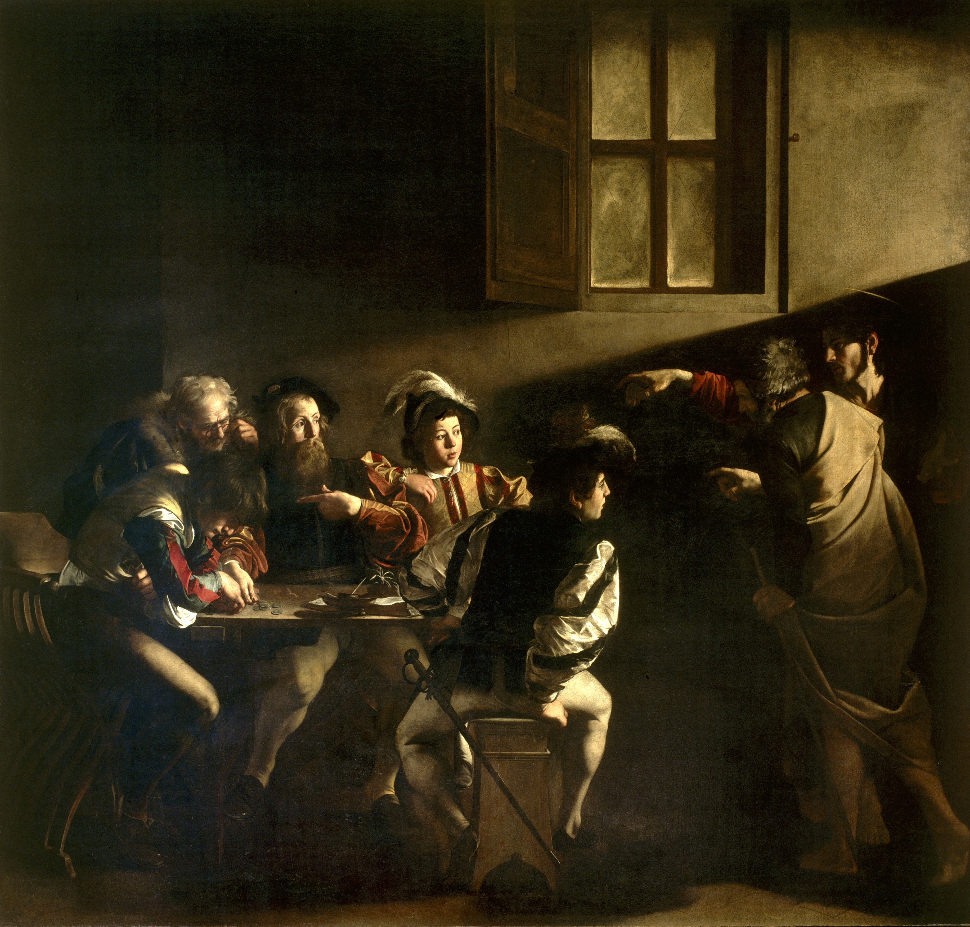 Caravaggio, The Call of St. Matthew (1619-1620)
Artists who portray biblical figures and events – particularly those who approach their work in a self-consciously Christian way – often feel free to explore the dynamics of Gospel scenes in a personal and imaginative manner. Some Gospel stories lend themselves to such an explorative approach. Other stories seem to prompt a portrayal of biblical persons and their circumstances in a more literal, text-dependent way.
The call of the tax collector in Matthew 9 provides a good basis for both, especially at the hands of the great early 17th century Italian painter, Caravaggio. Above, we see his painting of The Call of St Matthew, based on what may be a brief narrative self-portrait provided by the Gospel writer about his decision to respond to Jesus’ summons to follow him. Here, Caravaggio displays a fidelity to the biblical story even though the artist depicts the event with figures clothed in garments characteristic of his own time and place.
Several aspects of the painting should attract our attention. For they have the power to draw us into the scene and its place in the broader sweep of what some have called ‘the great story.’ The figure on the right side of the picture is obviously that of Jesus, who with bare feet has entered the place where the tax collector Matthew may be both entertaining himself as well as conducting his business. The room where the group of men are sitting is darkened, a detail that is surely symbolic given how light enters the room from the direction of Christ’s arrival. As Matthew’s Gospel quotes Isaiah (in chapter 5), “the people who sat in darkness have seen a great light, and for those who sat in the region and shadows of death light has dawned.”
Notice also Caravaggio’s sensitive rendering of Jesus’ outstretched hand. It is highly reminiscent of Michelangelo’s nearby Sistine Chapel ceiling panel depicting God’s act of creation and gift of life to Adam through a similarly depicted outstretched arm.
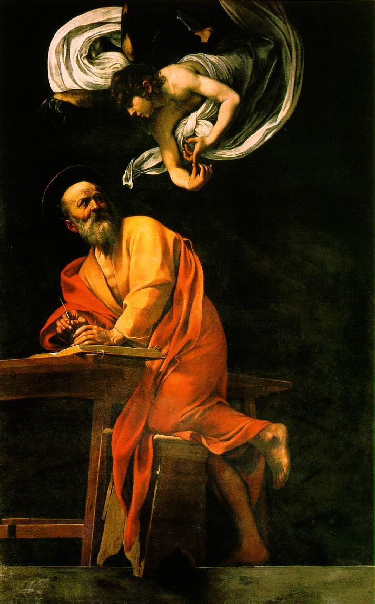
But which of the sitting men portrays Matthew? The answer is by no means obvious, and may be intentionally ambiguous. A ready candidate is the gentleman facing us, seated in the middle of the group, who appears to point to himself. By his gesture, he seems to ask in response to Christ’s summons, “Do you mean me?” His pointing hand, a visual echo of the pointing hand of Jesus, and the look on his face call attention to himself. Further, this bearded man bears a resemblance to the older-looking Matthew depicted in Caravaggio’s, The Inspiration of St Matthew (shown below).
Yet, another possible candidate for an identification with Matthew in this picture is the young man portrayed on the left side of the painting, whose head is bowed over and who is focused on some coins before him. In support of this identification is the presence of two other young men sitting at the opposite end of the table, whose gaze is fixed upon the unexpected visitor. By contrast with all three, Caravaggio may instead have intended to portray the mature Matthew in his accompanying The Inspiration of St Matthew painting, as well as in his The Martyrdom of St Matthew, both of which are located in the same church in Rome as The Call painting. For in the ‘call’ image, a young man is invited to leave his dubious present occupation and circumstances in order to follow Jesus, which seems most fitting. This invitation leads to a subsequent application of the maturing man’s talents in support of God’s mission, centered on the One whom he would come to recognize as the Messiah. As Caravaggio may have depicted in this scene, the potential consequences of accepting Jesus’ summons may just be dawning upon the young man.
Caravaggio’s paintings display a remarkable skill in rendering people and places in a most realistic way. His paintings are also highly regarded in recognition of his flair for dramatic pictorial compositions that feature a strong contrast between light and dark. He might have applied these skills primarily in the pursuit of fame and material wealth. Such intentions are likely to have numbered among his goals. Yet, Caravaggio’s work exhibits an undeniable spiritual sensitivity. This makes it most appropriate that we can view and appreciate his three St Matthew paintings together in a church in Rome rather than in a museum.