If reading this by email, please tap the title at the top to open your browser for the best experience. Then, clicking individual pictures will reveal higher resolution images.

Someone as long-lived and hugely prolific as Frank Lloyd Wright might have been vulnerable to self-imitation in his work if he had run out of ideas before he ran out of clients. But like Picasso with regard to painting, Wright frequently surprised and impressed the wider public as well as many critics by his astonishing creativity, evident through several phases of self-reinvention in his work. Absorbing much from his teachers, Louis Sullivan among others, he then fundamentally transformed what he learned by creating new paradigms for architecture. FLW advanced our concept of what is beautiful and worth achieving through the design of buildings, and in helping us perceive the aesthetic potential of inspiring spaces in which to live and work, and simply be.
I have previously featured Wright’s 1923 Tokyo Imperial Hotel, located just down the avenue from the Japanese palace of the same name. Sadly, it was demolished in a 1960’s rebuilding program. An earlier structure for Chicago by Wright, with which the Imperial had considerable affinity, was his Midway Gardens, a large and elaborate project built in 1914. It was also subsequently razed despite its auspicious location on the Midway in the city’s Hyde Park neighborhood. Located across from Washington Park, and astride 60th Street, the Midway Gardens facility sat adjacent to the former location of the great Chicago Columbian Exposition of 1893, in an area graced by the landscaping of Frederick Law Olmsted.
Now less well-known than its later Tokyo counterpart, Midway Gardens succumbed to its early demolition in 1929 due, at least in part, to Prohibition and the Great Depression. It is said that the complex was built with such structural integrity that the firm contracted to apply the wrecking ball went out of business as a result of its financial loss on the project.
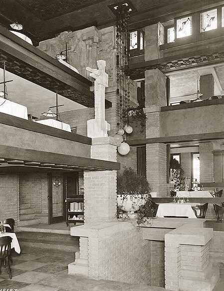

Midway Gardens interior (above), Imperial Hotel interior (below)
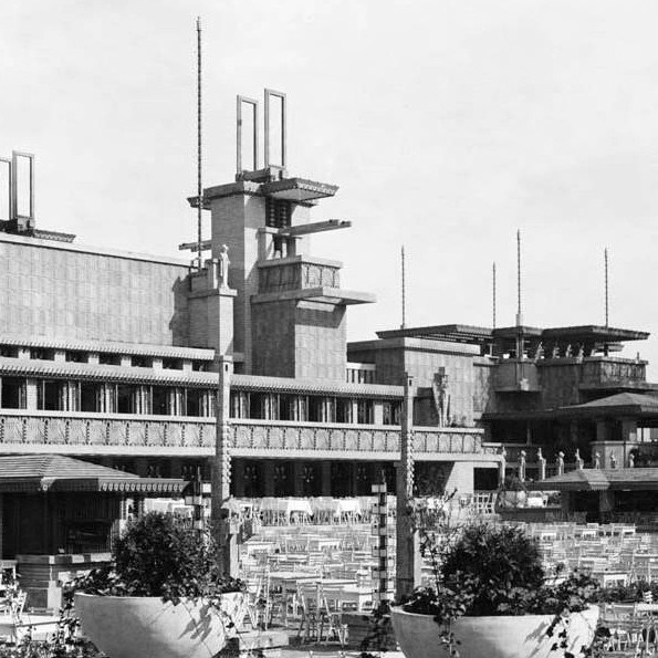
Midway Gardens was created to provide Chicago with a year-round, indoor/outdoor, concert and entertainment venue where one could enjoy dining and socializing while being able to listen to live music. Like the Imperial Hotel and a number of Wright’s California houses, it was built in what is called the Mayan Revival style, and featured Wright’s characteristic horizontal bands of yellow brick intermixed with pattern-imprinted concrete block, soaring cantilevered terraces and overhangs, and Wright-designed ornamental features such as sculpture, light fixtures, and garden urns. As with so many of his projects, FLW prepared and oversaw the implementation of plans for every detail from roof and window design to that of the dining tables and restaurant china.
Of particular interest at Midway Gardens were Wright’s designs for the sculptures and sculptural elements executed by Alfonso Iannelli, many of whose stoneworks were lost in the subsequent demolition. Wright’s timeless designs for the Sprite sculptures later reappeared in stone at Taliesin West, and reproductions of them continue to be commercially available today.
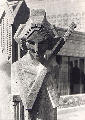

A “Sprite” executed by Alfonso Iannelli based on Wright’s plans

Courtyard architectural detail
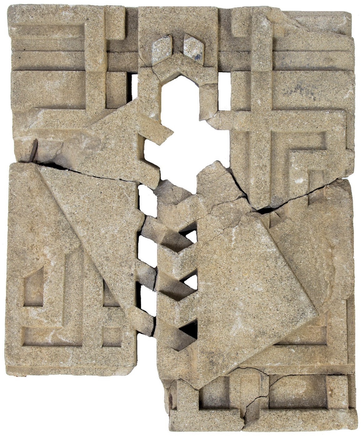

Surviving cast concrete forms designed by Wright
Midway Gardens interior terrace
Unfortunately, no color photos of Midway Gardens appear to have survived. However, photos of the Imperial Hotel help give us a sense of the design qualities of the Gardens structures and of what it would have been like to visit there. The foreign language labeled illustration below helps us appreciate the overall scale and character of the complex, and what a loss it is to American architecture that the facility was demolished, especially when it would be so congenial to contemporary design sensibility.


The Cottage Grove Avenue entrance area

Midway Gardens in its heyday
A link to my prior post on Wright’s Imperial Hotel can be found here. I am indebted to the website, WikiArquitectura, for some of the photos included here.
Note: blog settings have been changed to provide more opportunity to offer comments, using the link below.