If reading this by email, please tap the title at the top to open your browser for the best experience. Then, clicking individual pictures will reveal higher resolution images.
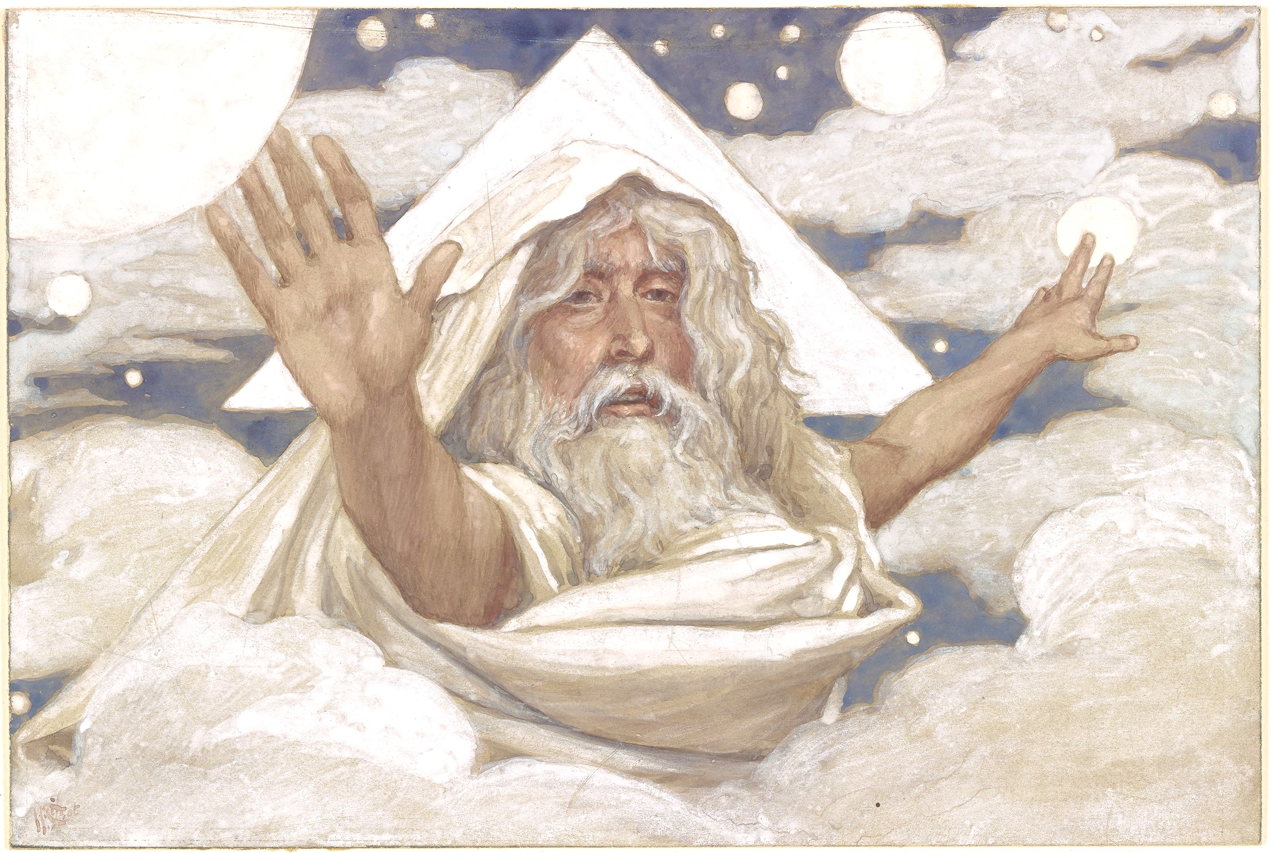
James Tissot, God Creating the World
If you are a Christian, and if you reflect on your formation as a person of faith, consider this question: Do you believe it is reasonable for God’s will to make sense to us? To ask this question opens the door to discovering how our beliefs about God were shaped, as well as our beliefs about God’s providential ordering of the world. Indeed, does God even want us to think about such things, or are we simply to accept and obey the divine will, regardless of whether we find this reasonable.
These questions also bear upon how we reflect upon what happened in Jerusalem 2,000 years ago, events that we consider during this Holy Week.
Broadly speaking, the Catholic tradition of thought – going back at least to Thomas Aquinas – anticipates a discernible overlap between divine rationality and that of created and redeemed human nature. God’s rationality is imprinted upon our powers of reasoning. By contrast, broad strands of the Protestant tradition – with its comparatively elevated concept of the Fall and human sin – have not nurtured and have even discouraged a similar expectation of such an overlap. Accordingly, we cannot expect or believe that our rationality has any real continuity with divine rationality.
One of the two traditions described above has emphasized the self-revealing comprehensibility of God, who intends for us to know, and not simply obey, the divine will. The other tradition has privileged the sense that God was and is wholly other, and therefore God’s ways are incomprehensible, except for small graces. Each of these two traditions has therefore had a different understanding of what it means for us to have been created in the image and likeness of God (see Genesis 1:26, in context).
A related and observable distinction regarding these two broad traditions concerns the relationship between grace and nature, and how this is construed. In the wider Catholic understanding, grace is more often seen as infusing nature, and present everywhere. Whereas a common view often found in Protestant piety anticipates that grace touches nature episodically, and sometimes is antithetical to it, given nature’s and our Fallen state.

James TIssot, God Appears to Noah
Another way we can distinguish the spiritual influence of the two traditions I am sketching here concerns the nature of God and of God’s activity. For example, shaped by a broadly Catholic catechesis, it is believed that there are at least three things that God cannot do: create a rock bigger than God can lift; choose to cease to exist; and, command us to hate ‘him.’ For, in the spirit of that same catechetical tradition, each of these three theoretical possibilities would be irrational, and thus contrary to the divine nature and being, as well as to who and how we were and are made to be.
Most Protestant thinkers and preachers would likely dismiss the first two of these three (im)possible ‘things’ as perhaps irrelevant rhetorical distractions. Yet, the third thing, however disagreeable and unforeseen in light of the New Testament, would probably be conceded as theoretically possible, especially given the historically Protestant stress on divine freedom and the importance of acts of will for personal right-believing. (In other words, though God could, God wouldn’t.)
A result of these differences between the two traditions is that questions about sin, misfortune, and the presence of evil, have tended to be handled differently in Protestant belief and teaching as compared to that shaped by Catholic spirituality. This difference can be noticed when we reflect on and speak about ‘bad things’ that happen to us. Does God cause such misfortune, or, allow it? How we tend to answer this ‘cause’ question can reveal something about the Christian catechesis by which our thinking and beliefs have been shaped. And how we think about this question regarding divine responsibility will benefit from insight going back to Aristotle concerning four different aspects of what the word ’cause’ can mean.

James Tissot, God’s Promises to Abram
Here is a fundamental question that can bring many of the above strands of thought into focus: Do we believe that God always loves us; always seeks intimate fellowship with us; and always seeks to draw us more fully into the merciful embrace of God’s redemptive purposes? Or are our answers to these facets of a fundamental question somewhat qualified? And if qualified, then by what?
Especially in view of our observance of Good Friday this week, I believe that we can answer this question about how God loves us in the affirmative. And we can do this without overlooking or ignoring such NT images as the narrow gate, and the Lord who will ask what we have done for the least of his brothers and sisters.
CS Lewis, among others, reminds us of a way that we can appropriately affirm God’s abiding love for all people. We can illustrate Lewis’ view with the following image: We may weep when we come before Him at the end of our lives. But our tears may be both from sorrow as well as from joy at our redemptive inclusion, despite all that may count against us. As long as, in that moment, we acknowledge Him, and who He really is. For we all will have the opportunity to do so.
Alleluia – Easter comes for everyone. If only we could better see how and why that is true!
Additional note: As an Anglican, I include my own tradition within what I refer to above as the broadly Catholic tradition. My goal with this post is not historical analysis but to provide grounds for reflection regarding two differing – yet sometimes overlapping – ways of approaching some central questions.