Author: Stephen Holmgren

I have been an Episcopal priest for thirty eight years, having served in parishes and in academia. My interests include art and theology, liturgy and spirituality, and I love to go sailing whenever I can.

Chihuly Garden & Glass ~ Seattle

[If reading this by email, please tap the title at the top to open your browser for the best experience. Then, clicking individual pictures will reveal higher resolution images.]


On a recent trip to Seattle I visited the Chihuly Garden & Glass exhibit at Seattle Center. This collection of Dale Chihuly’s glass work, which includes both large and small objects and installations, provides a splendid way to become familiar with what the artist has accomplished so far over the course of his career. The extensive exhibit gives the visitor an excellent introduction to the methods that Chihuly has employed when embarking upon various projects and insight about how he has revolutionized many aspects of contemporary glass making.

An initial large room contains a display of smaller Chihuly creations set within the context of a selection of his baskets and related objects from First Nations peoples, as well as an assemblage of his large framed photographic prints of Native American individuals by Edward Curtis.

A large gallery within the exhibit features Chihuly’s Mille Fiori (a thousand flowers in Italian), inspired by memories of his mother’s garden. An information panel indicates that the pieces in this installation, gathered from several series of his prior work, “rely less on tools and more on the use of fire, gravity and centrifugal force.”

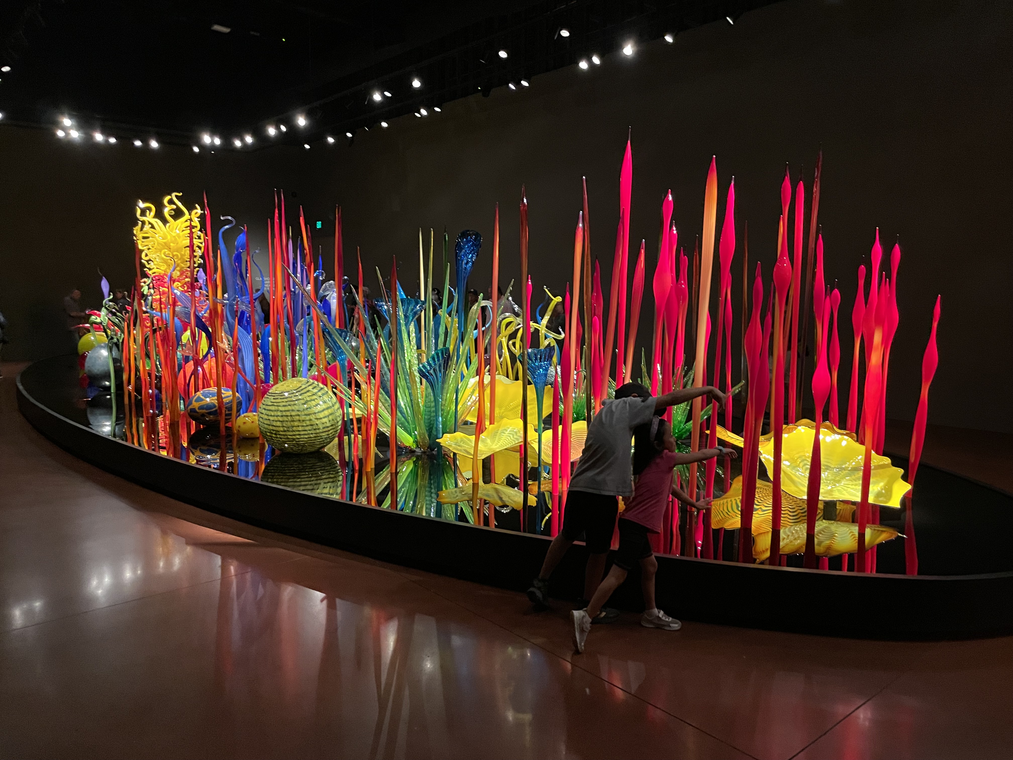
Two youngsters enjoying engagement with Mille Fiori while helping to provide us with an indication of the assemblage’s scale.

A display titled Ikebana and Float Boats is featured in a subsequent room. Having pursued glass making in Seattle and in Venice, both near significant bodies of water, Chihuly experimented with glass objects thrown into a river in Finland, where youth from the area in wooden boats helped retrieve them. Intrigued by the interaction between the objects, the light above, and the water below, the artist continued to develop these interests after traveling to the Japanese island of Niijima. There he became reacquainted with the glass globes traditionally employed by Japanese fishermen as floats for their nets, which he had first seen as a youth beach combing on Puget Sound. At the same time, Chihuly was inspired by the Japanese art of flower arranging, called Ikebana. He combined his interest in the glass globes with the inspiration provided by Ikebana and imaginatively adapted these forms within boat-shaped structures that have been displayed in galleries and upon ponds.

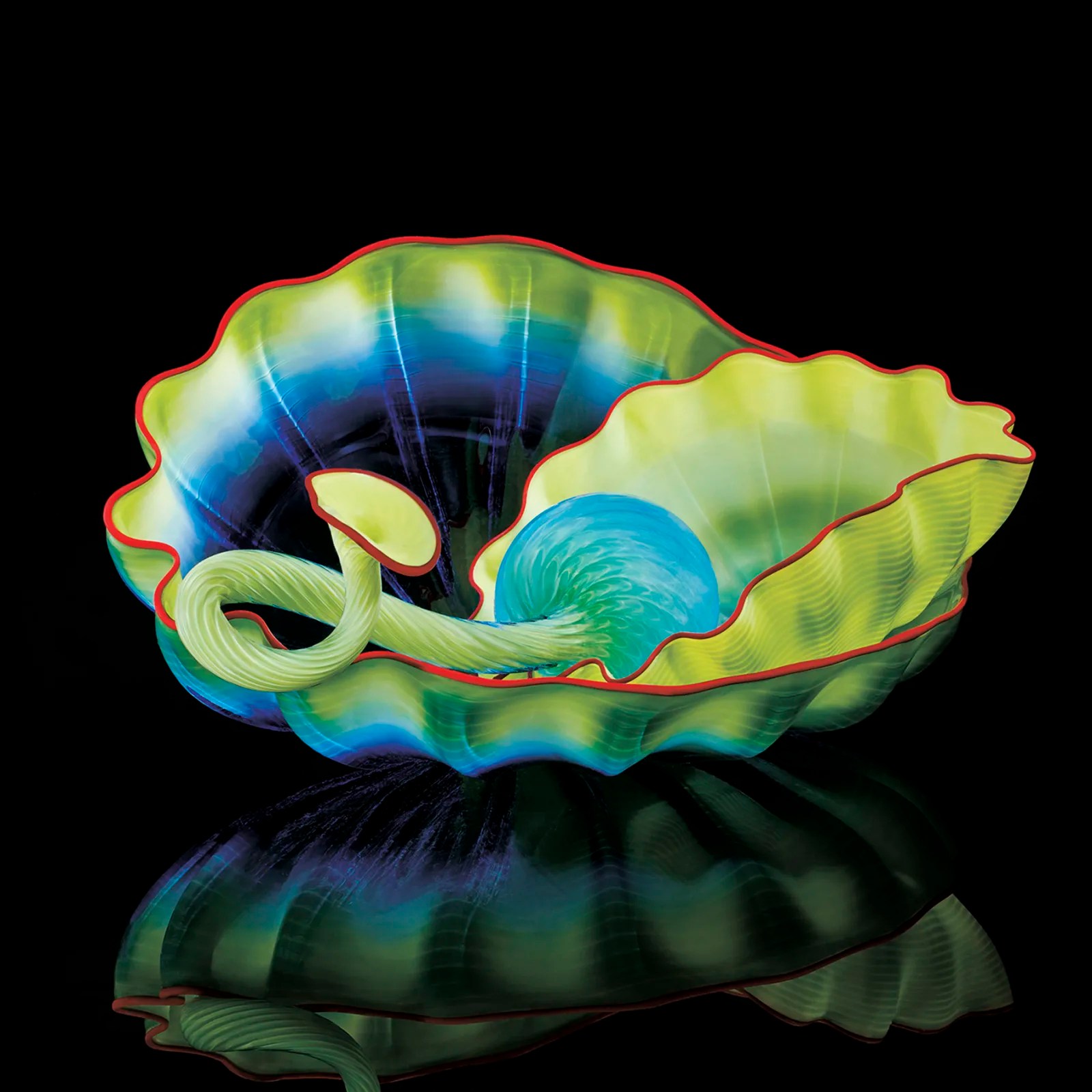
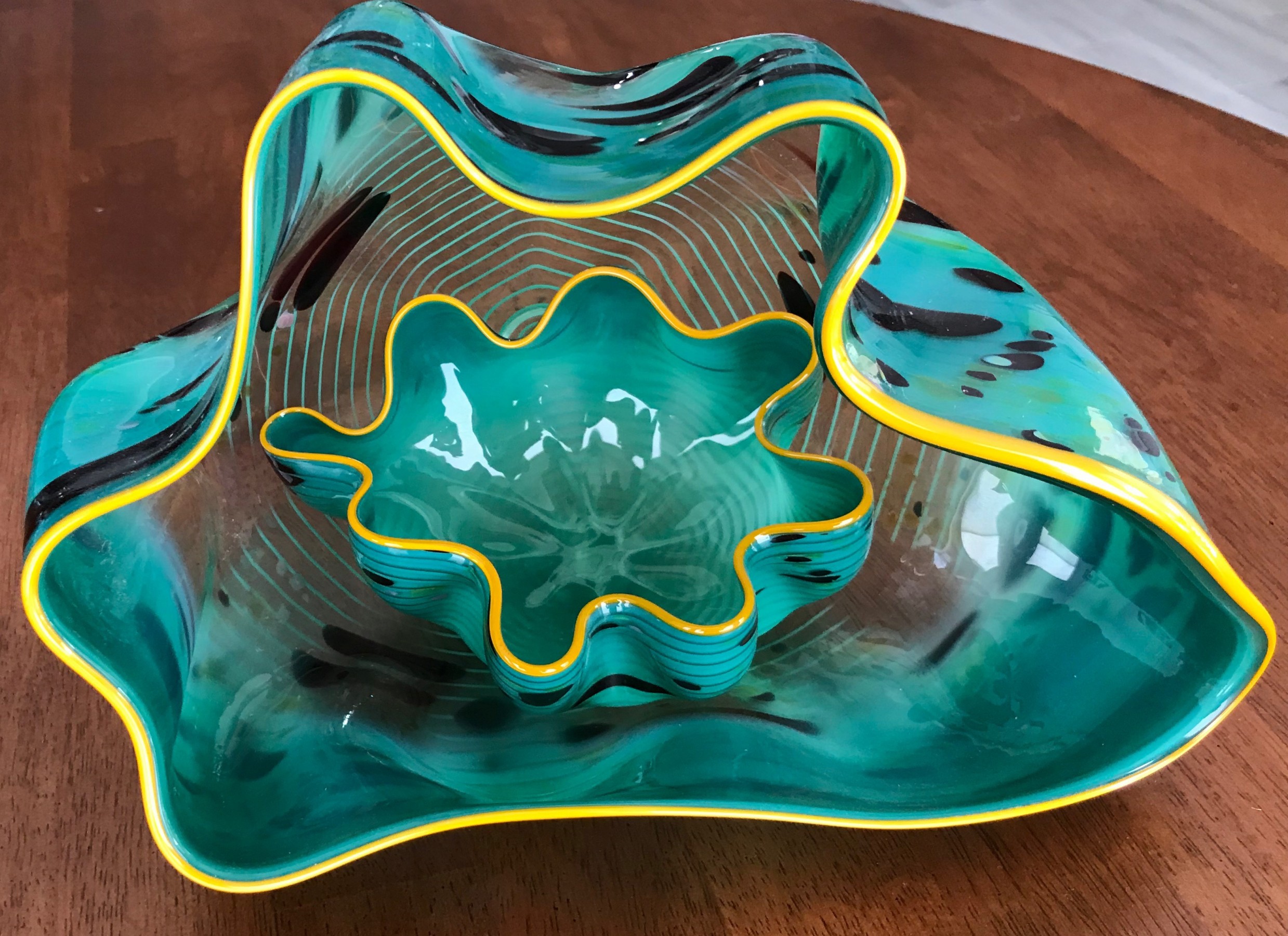
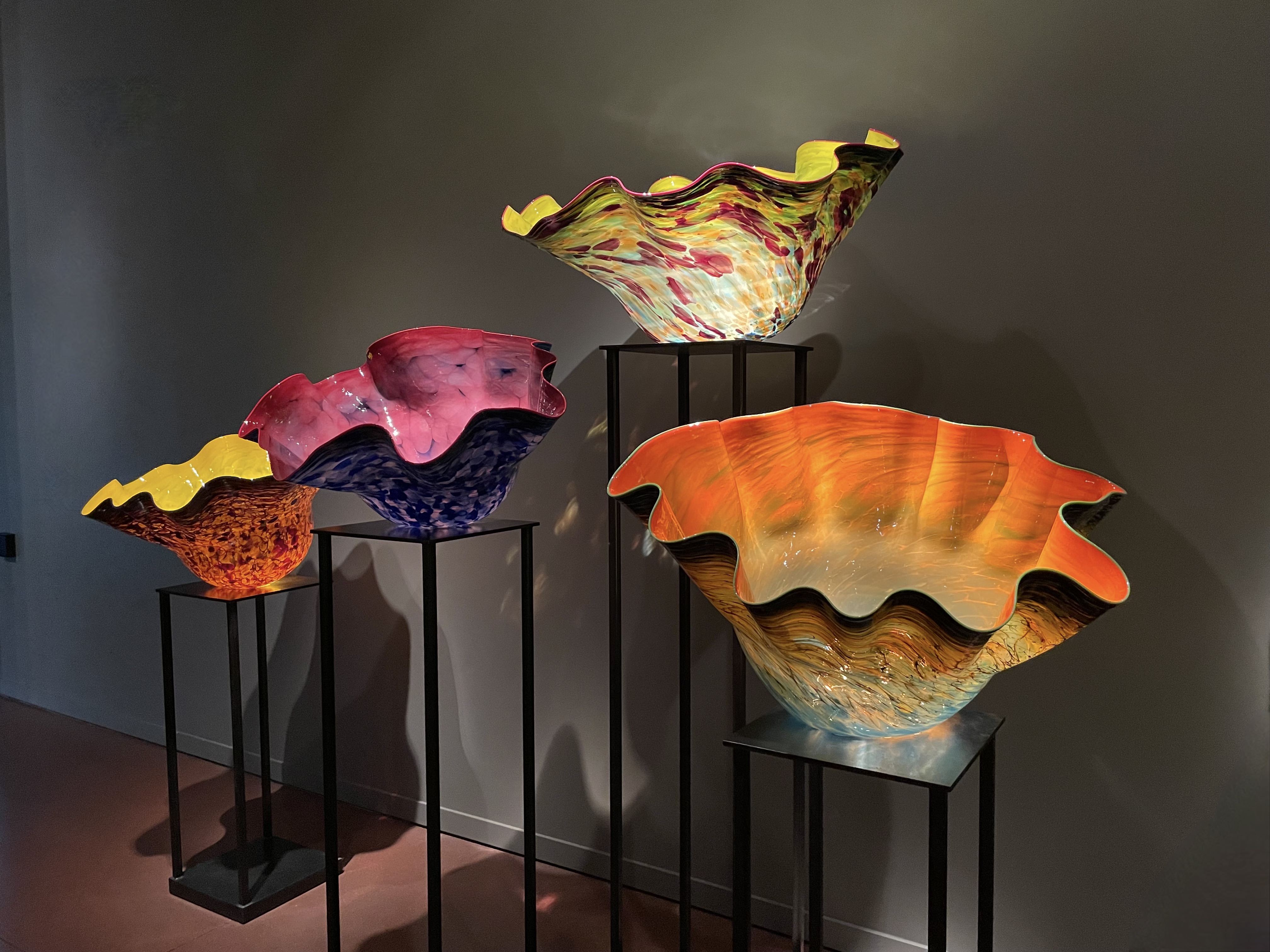
Another gallery space features large bowl-like objects from Chihuly’s Macchia series. As a guide at the Chihuly exhibit makes clear, no one has yet been able to produce a truly black form of glass. Yet, Chihuly has come close with his occasional use of very dark blue and purple. Through his Macchia series, he sought to incorporate every one of the other 300 colors that are available for glass making. Noticing that colors within stained glass windows often appear more alive when illuminated from behind by the diffused light of a bright cloudy sky, Chihuly began to experiment with including a white layer within objects between the inner and outer colored layers of glass. The presence of speckles and striations of additional colors results from when molten glass is rolled on a flat metal surface that has been sprinkled with multiple-colored bits of glass.

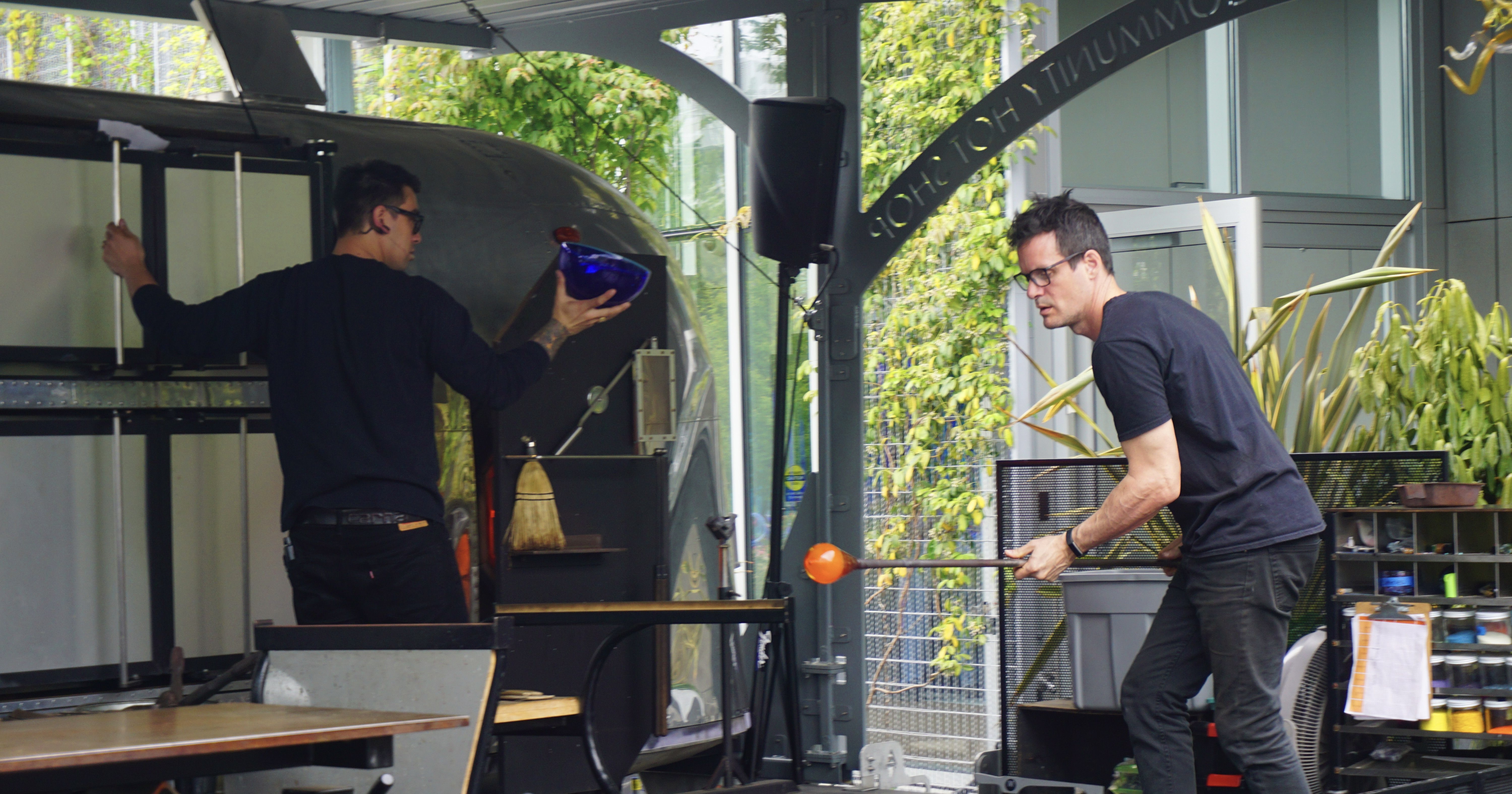
Near the end of a tour through the exhibit one finds a courtyard where an informative glassblowing demonstration is offered, which brings alive some of the challenges inherent in working with this medium.

Chihuly Garden & Glass provides a lively sense of the remarkable extent of the artist’s output, and the breadth of his highly imaginative vision for what can be done with glass as an art form. The exhibit is well worth a visit for those able to travel to the Seattle area.

Chihuly’s Glass Installations

[If reading this by email, please tap the title at the top to open your browser for the best experience. Then, clicking individual pictures will reveal higher resolution images.]

Marine Blue and Citron Tower, by Dale Chihuly, installed in 2021 at Taliesin West, Arizona


The making of art glass, especially when glassblowing, begins with glass melted in a furnace heated to over 2,000 degrees f. by gas-powered flames. As the artist works with the material, additional quantities of glass shards are typically added to the furnace. The added glass may be clear or colored, especially when recycled glass is employed, and other ingredients can be added to achieve a desired hue or tint.

Once, when my glassblowing instructor was scooping shards of recycled material into the flames, he accidentally lost grip of the metal scoop, which fell into the molten glass. To his delight, this produced a most beautiful and unexpected yellow color in the subsequently formed glass objects. Of particular note in Chihuly’s work is the conjunction of multiple colors, and the agate-like striations involving both colored and clear portions of glass.


At the most basic level, glassblowing involves attaching a glob of molten glass to the end of a tube-like metal pipe, which is then spun while air is introduced into it. At first this creates a globe-shaped object. Spinning the material fixed to the pipe can have an effect like that of a spinning pottery wheel upon wet clay. In both cases, the material can be formed into a symmetrical mass. But it can also be spun out of shape into a mess.

Whereas hands are used in ceramics to do the primary shaping, with molten glass a number of tools are employed to achieve various effects. These include assorted molds which Chihuly and his assistants may use to produce the rippled edges in some of his finished pieces like those depicted below. Wooden paddles, tweezers, cutting shears, and a variety of other tools are used in the process of shaping the very hot glassware while it is being formed, sometimes pulling and stretching it, at other times changing its orientation by causing parts of a piece to turn in on themselves. All the while the glassware artist must periodically reintroduce the work in progress into the open end of the furnace, or apply a torch to its surface, so as to keep the material hot and malleable.

Lower image: A portion of Chihuly’s Persian Ceiling, lit from above

In recent years, Chihuly has become known for his sometimes massive installations of glass. These often involve a seemingly uncountable number of objects linked together by an upright frame, suspended from a rack, or cradled from below. Viewers might encounter these installations indoors where they are displayed as a chandelier might be hung, or placed in an outdoor setting.


With his artistic exploration of the possibilities inherent in the manipulation of molten glass, and by pushing the parameters of what conceivably may be accomplished through working with this medium, Chihuly has created a huge portfolio of truly remarkable work. Of note is the way that so many of his pieces simultaneously have a sophistication that appeals to specialists and collectors, while at the same time being works of art that bring delight and wonder to children as well as to those who may not credit themselves with being aesthetically aware or sensitive. Dale Chihuly has effectively devoted his career to helping others encounter and perceive beauty in new and unexpected ways.

Another Chihuly installation, Fire Amber Herons, at Frank Lloyd Wrights’ Taliesin West

Dale Chihuly and the Art of Glass

[If reading this by email, please tap the title at the top to open your browser for the best experience. Then, clicking individual pictures will reveal higher resolution images.]

Paprika Persian, by Dale Chihuly


Many of us associate glass as a material for art with beautiful stained glass windows, or with fine cut-glass objects. Yet, until the widespread impact of modern art, stained glass has most often been characterized by the two dimensional pictorial representation of biblical or historical figures and events. And decorative glass objects, especially when fashioned from clear leaded glass, have until recent times come largely in the form of functional vessels like vases and decanters.

The career of Dale Chihuly has coincided with a renewed interest in the artistic potential of glass when applied as a medium beyond the parameters associated with everyday objects. It was not until the second half of the twentieth century that many college and university art departments offered courses in and provided studios for work with glass beyond the design and making of windows, as well as for other materials such as fibers (e.g., weaving). This may have been due to a historic assumption that glassblowing and textiles, along with pottery, are best understood as being within the category of ‘crafts’ rather than as fine arts.

For these and other reasons, encountering the fruit of Chihuly’s longterm exploration of glass and its aesthetic possibilities can lead to an experience of stunning discovery. As we have seen regarding the evolution of David Shaner’s ceramics, Chihuly has moved far beyond producing beautiful but also utility-oriented objects, toward what may be more properly termed glass sculpture. Throughout the range of Chihuly’s work with glass we find a number of features that deserve to be noted. These include his appreciation for the capacity of color, form, texture, arrangement of parts, and scale to evoke interest and delight.

Capri Blue Seaform

Seagrass Seaform

Chihuly’s use of color immediately captures our attention as we view his work. Unlike the challenge faced by those who draw or paint, where choosing and mixing color is a more direct process, color selection and its manipulation within molten glass is more complicated. In glass making, as it is for ceramicists who work with glazes, the artist must attend, at least at a basic level, to some chemistry, the physical plasticity of the material, and be open to chance regarding both.

Another noteworthy feature of Chihuly’s glassware is his intentional inclusion of areas of opacity, translucence, and transparency. With all three of these variables, his manipulation of surface reflectivity – a property often associated with high quality glass – deepens our appreciation for his work. He achieves beautiful effects when he allows these differing aspects of his materials to appear adjacent to one another in the same finished pieces. I find this to be especially apparent in the two pieces depicted immediately below.

Two sculptural glass works by Dale Chihuly (name and date uncertain)

An additional feature of Chihuly’s mature glass work is the variability of the form and of the shape of the objects he has created. As the artist’s portfolio has expanded with the development of his career, he has moved well beyond the pursuit of symmetry, practical utility, and manageable size, with regard to the items he has fashioned. This is especially true of the large scale installations to be featured in a subsequent post.

Given all this, the name Chihuly has become synonymous with paradigm-shifting glasswork that is vibrant and joyfully attractive.

Dale Chihuly with one of his large glass installations in the background

The Beauty of a New Dog

[If reading this by email, please tap the title at the top to open your browser for the best experience. Then, clicking individual pictures will reveal higher resolution images.]

Tissot at 8 weeks, and a self-portrait by his namesake (it was the eyes!)


After experiencing some health issues this past spring I decided it was time for us to consider getting a new dog. Our rat terrier mix, Puddums (or Pudsie), died a few years ago at the happy age of 17. We still think of her affectionately and have missed canine company after moving back South in retirement.

Our oldest son with Pudsie

As Spring began to warm up south Louisiana, we thought it might be nice to have a similar addition to our household if we could find another puppy like Pudsie had been. A local shelter had a litter of rat terrier-mix puppies ready for adoption and the little guy in the photo at the top seemed just right.

His name is Tissot (pronounced ‘Tea-so’), named after a favorite Franco-British painter whose work I have often featured here. Now about 5 months old, he has lived mostly during the daytime on our screened porch. It has proved to be a good place for him to figure out that ‘elimination’ best occurs outside rather than on the floor. With the wave of Southern summer heat we have been experiencing recently, he enjoys cooler afternoons and nights in my study.

He still possesses some of his very sharp ‘baby teeth’ and is a tenacious chewer, even at the expense of some stucco on the porch! Various versions of a well-known brand of hard rubber toys have proved the most resilient to the onslaught of his teeth. We joke about him being perhaps a cross between a fox and a whippet, given his long back and tail, as well as his alertness to anything that moves and his remarkable speed relative to his small size. One thing not so small are his ears, which may have a correspondingly high sensitivity. To my surprise, my playing a small scale of three or four notes on a new recorder prompted him to respond with a mournful howl!

His uncertain lineage may include a retriever of some kind. For he never seems to tire of fetching a thrown ball, and he loves to walk with a stick in his mouth. His high energy level has proved good for me in that we take a brisk two and a quarter mile walk five to six mornings a week through the woods and by a wide creek. As a result, I am in better shape. But our walks leave me hot and tired, and him ready for more. I like to think of him as my ‘therapy dog,’ except that I sometimes wonder if he is not the one who might need therapy! Especially when he is turning in fast, tight circles in his often successful attempt to grab the white tip of his long tail. Yet, he will not be a puppy for ever.

A wise friend who is a retired neurosurgeon said something recently that has stayed with me. We were visiting together while his dog was seeking our company and attention. He said that dogs may be the only animal made by our Creator whose primary aim in life is to please us. No matter how independently-minded some dogs can be (Tissot may have some Jack Russell terrier in him), my friend’s comment rings true in my experience. Caring well for a dog, even a smaller one, is not inexpensive and may involve a considerable time commitment. But it is hard to put a price on all-around better health and the pleasure of canine companionship.

A painting (The Hammock) by Tissot’s namesake from the artist’s society painting days

Transfigured By Beauty

[If reading this by email, please tap the title at the top to open your browser for the best experience. Then, clicking individual pictures will reveal higher resolution images.]

James Tissot, Jesus Goes Up Alone Onto A Mountain To Pray


In a painting whose title refers to one of Jesus’ common practices, James Tissot portrays him as caught up in prayer, an involvement he widely encouraged his followers to pursue. Regarding prayer, the Catechism in The Book of Common Prayer may surprise us. To the question, what is prayer, we find an answer which begins with these words: “Prayer is responding to God…” Jesus modeled a life wholly centered on responding to God, in heart and mind, in soul and body. On one occasion, he appeared transformed while at prayer. Over time, his followers discerned how God was fully present within him.

The story of his Transfiguration on a high mountain, reported in the first three Gospels and commemorated this past Sunday, provides a narrative demonstration of this truth. What Tissot depicts regarding Jesus when alone at prayer was later revealed semi-publicly on that mountain in the company of Peter, James, and John, as well as with the heavenly apparitions of Moses and Elijah. It was then fully revealed in Jesus’ Resurrection appearances.

Exodus 24 provides the background for this, and tells us something astonishing: “Moses and Aaron, Nadab and Abihu, and seventy of the elders of Israel went up {Mt. Sinai}, and they saw the God of Israel.” In Exodus 34, we learn that when Moses came down from the summit, “the skin of his face shone because he had been talking with God. When Aaron and all the Israelites saw Moses… they were afraid to come near him.” The text suggests that Moses then started putting a veil over his face for the sake of those who were unused to, or unprepared for, the glory and power of God’s immediate presence.

Paul, in 2 Corinthians, extends and also alters this idea of the veil. Instead of it being a means to protect people from a direct encounter with divine glory, the veil has become in Paul’s letter a kind of impediment. When our hearts and minds are not open to God, nor sensitive to God’s power, we become hardened. We become hardened in such a way that our hearts and minds are veiled, preventing us from perceiving God’s glory.

But Christ has set aside this veil. As a result, “all of us, with unveiled faces, {see} the glory of the Lord as though reflected in a mirror (2 Cor. 3:18).” And weare being transformed into the same image from one degree of glory to another, for this comes from the Lord, the Spirit.” Through prayer, we also are transformed.

Fra Angelico, The Transfiguration (San Marco, Florence)

The Transfiguration of Jesus is all about the unveiling of God’s glory. Jesus takes Peter, John and James up with him on a mountain to pray. While he is praying, the appearance of his face changes, as does his clothing. In contrast with the Exodus and Pauline images of light shining on a surface, Luke presents God’s glory as coming from within Jesus. In other words, he radiates God’s glory rather than reflecting it. Luke tells us that Moses and Elijah, who appear with him, appear in his glory. This may mean that Jesus has shared his glory with them in a way that prefigures what he will share with all of his followers after his Resurrection.

This should lead us to ask a good question: If we feel like there is a veil between us and the divine presence, where does this veil lie? Does God ‘hide’ behind a veil, either to protect us, or challenge us? Or is the veil within ourselves, formed by our spiritual blindness and our lack of openness to how the Holy Spirit imparts glory? Paul suggests that our experience may be like that of the earlier Israelites, for whom hard-heartedness caused them to be blind to the bright light of God’s glorious presence, whether in Moses’ face or when reading and hearing the Law. Hard-heartedness can be equally blinding for us, veiling the glory that is all around us.

And where, according to Paul, do we find this glory? We find it in the faces of everyone who has been open to God’s transforming Spirit. In other words, we can find it in each other, as well as in ourselves. For this reason it can be like looking into a mirror, as the glory that we will perceive in others is the same glory that they can perceive within us.

Yamasaki’s Graceful Architecture

[If reading this by email, please tap the title at the top to open your browser for the best experience. Then, clicking individual pictures will reveal higher resolution images.]

Minoru Yamasaki behind models of the proposed World Trade Center towers


Minoru Yamasaki was one of the most significant American architects of the mid-twentieth century while also one of the least known. Since 9/11, almost everyone has seen images of his now lost World Trade Center towers that formerly crowned the southern tip of Manhattan. Yet many are unfamiliar with the man who designed and gave them their attractive and delicate facades. I first encountered Yamasaki’s distinctly modern yet historically informed approach to architecture as a child while my parents were on furlough from mission work in Japan. It was likely because of Yamasaki’s Japanese heritage that they became interested in his Northwestern National Life building in Minneapolis, opened in 1965, which he had designed for that company’s new headquarters (images below).

The Northwestern National Life building has design elements recognizable in a number of other structures designed by Yamasaki. His career-long approach to architecture consistently incorporated a classically inspired modernism that features a verticality and gracefulness of design, an approach which appears to owe as much to the great European gothic cathedrals as it does to Greco-Roman antecedents. This quality of his work is particularly evident in the decorative plaza towers and buildings he designed for the 1962 World’s Fair U.S. Science Exhibit in Seattle (now the Pacific Science Center, below).

U.S. Science Exhibit towers and buildings, 1962 World’s Fair, in a vintage photo

The 1962 Michigan Consolidated Gas Company building in Detroit (below) was Yamasaki’s first ‘skyscraper.’ The stonework tracery and narrow windows on the facade of this building, as well as the arcade of columns surrounding the glass-walled atrium on the entrance terrace level, are recurring motifs in his architectural designs. Some of these elements can also be found on Yamasaki’s 1960 College of Education building for Wayne State University (further below), as well as Olin Hall and other buildings he designed for Carleton College in Northfield, Minnesota.


The Michigan Consolidated Gas Company building, Detroit. Plaza Sculpture by Giacomo Manzu.

The College of Education building for Wayne State University (Detroit, 1960)

Above: Olin Hall (Science Building) and lecture theater for Carleton College (Northfield, MN, 1961)

Watson Hall dormitory (1966) adjacent to a Japanese Garden at Carleton College (note how the exterior columns subtly curve outward at the base)

Above: McGregor Conference Center, Wayne State University (Detroit, 1957), exterior and interior

Yamasaki’s design for the Reynolds Metals Regional Sales Office (below, 1959) incorporates elements found in the buildings featured above while also architecturally acknowledging the business of the company that commissioned it. Evident is the architect’s use of ornament clad to the facade of the building, but here in the form of a metallic visual screen attached to the building’s exterior. These elements, as well as the open terrace, and the glass-walled atrium surrounded by columns, are design features that we find over a decade later in his plan for the World Trade Center.

Some aspects of Yamasaki’s architectural work such as the terrace and reflecting pool adjacent to his McGregor Conference Center, as well as to his Reynolds building, may appear to embody an aesthetic sensitivity characteristic of Japanese culture. Raised by a Japanese family in America, Yamasaki – while recovering from serious illness and surgery – traveled to Japan, Italy, and India, in 1953, on an extended sojourn that provided not only recuperation but also inspiration.

Not all of Yamasaki’s designs are characterized by strong vertical lines and distinct angles, as well as by detailed surface ornament. Two notable exceptions are his 1956 St. Louis Lambert Airport terminal building, and his 1964 West Gym for Carleton College (both below).

Despite the passage of years, Yamasaki’s architectural designs continue to have a fresh and winsome appearance. His buildings stand apart from many examples of urban modernism, where reflective glass-clad buildings often appear indistinguishable from one another and where attention to human scale seems overlooked, especially in the experience of those who approach such structures. By contrast, Yamasaki’s buildings remain attractive and inviting.

Yamasaki displaying a scale model of his Wayne State College of Education building (above), and as featured on the cover of TIME magazine (1963).

The completed twin towers of the World Trade Center prior to 9/11

David Shaner’s Beautiful Ceramics

[If reading this by email, please tap the title at the top to open your browser for the best experience. Then, clicking individual pictures will reveal higher resolution images.]

An intriguing sculptural pot by David Shaner, with an unglazed exterior


Through his love for ceramics, David Shaner became an accomplished artist whose work was and is widely known for his mastery of traditional pottery techniques as well as for the red glaze that bears his name. The influence of Japanese potters as well as those who studied their work is evident in Shaner’s own earlier pottery. Over the years his interest in non-traditional pot-making grew into a developed pursuit of what we might call ceramic sculpture. Here (below) are three Shaner pots that show his willingness to explore forms that move beyond the circular shape we usually associate with clay that has been molded on a rotating wheel and bat (or platter on which a pot is shaped). Notice the manipulation of the rims of the second and third pots, as well as the presence of the Shaner’s Red glaze on all three.


In Shaner’s work, these explorations of the plasticity associated with raw clay then progress to more dramatic departures from traditional pot making. Such pot making is largely focused on forms where the subsequent utility of the result is at least suggested if not also intended (as with Shaner’s teapot displayed in a prior post). In addition to the pot depicted at the top of this post, I share below a number of my favorite examples of what I have referred to as his ceramic sculptures.

A number of these examples of Shaner’s explorative work with fired and glazed clay are termed his series of ‘pillow’ pots, suggested by their rounded ‘puffed-looking’ forms. In addition to his regard for the work of fellow potters, Shaner admired the sculpture of the modern Japanese artist Isamu Noguchi, as well as that of the British sculptor Henry Moore, with whose work he felt an affinity. Below are some more examples of Shaner’s ceramic art.

David Shaner’s traditional-looking pots represent well his skills and lifelong dedication to mastering the medium for his chosen work. His sculptural art is more immediately identifiable as representing a vision expressed in ceramics that was uniquely his own, and which continues to be widely admired.


David Shaner taking a break, and another example of his work as a ceramic artist.

The Beauty of Shaner’s Red

[If reading this by email, please tap the title at the top to open your browser for the best experience. Then, clicking individual pictures will reveal higher resolution images.]

David Shaner, Tea Pot {Japanese style, 1977), with Shaner’s Red Glaze


Shaner’s Red is a polychromatic glaze named after the potter who first applied it to many of his pots. I became familiar with Shaner’s Red on extended visits to family friends who had a pottery studio and a kiln for firing clay at their ranch in Montana. My parents had met them on a ship returning from Japan, where our friends had pursued their interest in traditional ceramics. In addition to throwing pots, they collected a range of examples of ceramic artwork including Asian and Native American, as well as contemporary work by David Shaner and others associated with the Archie Bray Foundation, in Helena, MT. As a youth, I found the color of Shaner’s red and sometimes green and gold glaze alluring, in part because of its variability during firing. In addition to buying assorted mineral and other glaze components, Shaner also gathered found ingredients for his glazes much like weavers often gather natural materials for dying wool.

One brief biographical statement offers this tribute to David Shaner: “His exquisitely formed vessels with their understated glazes are a reflection of the man himself, a man in harmony with his environment and at peace in himself. Shaner was also noted as a teacher, a collector, and a generous contributor to the world of ceramic art and the field of environmental protection; his gardens which he called his ‘spiritual work’ included notable specialized collections.”

Among those who pursue the art of pottery, the color known as Shaner’s Red is a familiar reference point for glazes applied after a first firing of shaped raw clay. Though the red coloring is largely due to iron oxide being in the mix, this glaze by David Shaner is well known for the way it often morphs into other colors during the firing process, with beautiful results. A canister style pot by Shaner (below, 1988) displays this color variability, which is to some extent within a ceramicist’s ability to manipulate while yet retaining an unpredictability that is often a feature of this art form.

Some examples, below, of pots by other artists displaying something of the range of colors yielded by the application of Shaner’s Red.


Here is one ‘recipe’ for Shaner’s Red: 527 Potash Feldspar; 40 Talc; 250 Kaolin; 40 Bone Ash; 213 Whiting; 60 Red Iron Oxide; 2% Bentonite. The significance of the numbers and the nature of these elements are foreign to me. But they are doubtless meaningful to ceramicists who mix their own glazes. The point in sharing these details is to illustrate how, regardless of the precision involved in finding, measuring, and mixing these elements, the exact outcome of their combination and application cannot be foretold in advance.

Shaner was once asked about this at a workshop he had given. A participant later reported that “his reply was something to the effect that to make it look right, you had to be in the right phase of the moon, hold your tongue just right, call on the correct kiln gods, etc. He was obviously kidding but what he was saying is that this is a tough glaze to work with.” Another potter who has applied the same glaze offers this observation: “… the cooling schedule most affects Shaner’s (and other) iron reds. Shaner’s needs a long slow cool, or firing down, for the red color to resurface…”

Having introduced what is perhaps Shaner’s most widely-known contribution to contemporary American ceramics, his eponymous glaze, I plan in a subsequent post to share further about him and provide additional examples of his pottery, especially in light of his later transition from traditional pot making to what is more properly termed ceramic sculpture.

David Shaner in his studio (1989)

The photos behind him appear to include one of the esteemed Japanese potter, Shoji Hamada, at work on a pot (upper right). Another photo (top right) features an example of Shaner’s own work that is clearly influenced by the Japanese folk art tradition (the tea pot illustrated above).

‘Beauty’ and Jackson Pollock

[If reading this by email, please tap the title at the top to open your browser for the best experience. Then, clicking individual pictures will reveal higher resolution images.]

The Fury, 1943


The name “Jackson Pollock” and the word “beauty” may seem to make for an unlikely pairing. For some, Pollock’s famous ‘drip’ paintings are not only an acquired taste but continue to be the butt of bad jokes about what happens when you give a chimp a pot of paint.

These observations may bring to mind the story about when the art critic, John Ruskin, accused the artist, James M. Whistler, of “flinging a pot of paint in the public’s face,” and the nerve of asking two hundred guineas for the result. Whistler – painting in ways ahead of his time – wanted viewers of the work in question not to consider it as a traditional representational painting but rather as an ‘artistic arrangement.’ When asked how long it had taken him to paint the canvas, Whistler frankly admitted that it was just a few hours. But then, he added, it had taken a lifetime of learning to create the work. Jackson Pollock likely felt the same about his drip paintings, which made him famous.

Some viewers of “modern art,” particularly the genre of art commonly labeled as abstract expressionism, may wonder if the abandonment of representation in painting (and in other art forms) simply provided license for less than skilled artists to create and financially benefit from work that ‘broke all the rules.’ Yet, and paradoxically, many of those whose work we associate with this kind of art received rigorous training in traditional methods of drawing and painting at the Art Students League in New York. In effect, they had learned the rules so that they could break them with integrity. Pollock was among those learners, when he had studied under the tutelage of Thomas Hart Benton. Pollock’s earliest remunerated work was in the form of murals featuring traditional imagery, commissioned by the Depression era WPA (the Works Progress Administration) for public buildings such as libraries and post offices.

I am comfortable employing the word beauty with which to characterize and describe some of Jackson Pollock’s drip paintings. Unlike the proverbial results of turning monkeys loose with pots of paint, or giving kindergarteners free rein with the same, Pollock’s mature work evidences an aesthetic intuition formed over years of persistent engagement with paint on flat surfaces.  Over time it yielded striking results. I find many of these paintings both intellectually stimulating and emotionally stirring.

What I am calling a formed intuition within the artist’s temperament bore fruit in the form of several perceivable variables among his drip paintings. First, we can appreciate the sophistication of his color choices. Despite an initial sense that these paintings contain a cacophony of clashing streaks of full spectrum color, closer inspection reveals that Pollock often employed a limited color palette in these works, sometimes with an almost Zen-like restraint. Second, he had an undeniable eye for composition. This is discernible within the apparent chaos on the surface of his drip paintings where pattern, unexpected order, and rhythm, can convey a sense of balance. Third, the well-documented energy the artist applied to the creation of these canvases is effectively communicated by the visual results he attained, which in my experience draw the viewer in to a deepened engagement with his vision.

Pollock at work.

Drip Painting (title?), 1951

Autumn Rhythm (Number 30), 1950. This composition, despite its energetic patterning, has a subtle tone due to the very limited and neutral color palette.

Number One, 1950 (Lavender Mist). Another subtle composition, in marked contrast to The Fury, depicted above. Viewers appreciating Lavender Mist, in a photo (below) showing the scale of many of Pollock’s drip paintings.

Number 14 (Gray), 1948. Paradoxically both lyrical and restrained, where movement displaces a perceived need for the addition of color.

This one (title and date uncertain) is also lyrically full of joyous movement but with color.


Pollock’s famous Number 11, (TheBlue Poles, 1952) on display.

Pollock in motion, creating an indelible image of vitality that continues to speak to and move people today.

The Beauty of the Seth Peterson Cottage

[If reading this by email, please tap the title at the top to open your browser for the best experience.]

Frank Lloyd Wright, Cottage for Seth Peterson, 1958

The last commission completed by Frank Lloyd Wright before his death was a small cottage for Seth Peterson. While diminutive in scale, this architectural gem incorporates many of the design features we associate with the Wright’s visionary work. A native of the region near Taliesin, Wright’s home and studio, Peterson had once sought to become one of the student-apprentices there. He later sought to commission Wright to design a personal cottage, sending a check in advance. After declining Peterson’s request more than once, Wright, having already spent the fee, was obliged to fulfill the request to provide the plans. Admirers of FLW’s architecture can be glad for Peterson’s persistence and that this small project was completed with impressive results.

Sadly, Peterson did not live to inhabit the cottage. Yet subsequent owners and devotees of Wright’s legacy helped preserve this small treasure. The fully restored cottage sits on land that is now part of a state park, and it became the first Wright home later available for guest rental (and remains so).

Attention to the relatively simple floor plan of the cottage helps orient those newly acquainted with it to identify some of the principal characteristics of Wright’s many home designs.

The entryway on the upper left side of the plan is in many ways typical of Wright’s preferences in that the structure is approached from the rear and then from the side. Slender double doors open into the compact interior which at the same time appears expansive due to the raised roof and ascending ceiling, which provide shelter over a wall of glass punctuated by warm cedar or redwood uprights. Complementing the beckoning view to the left, over a valley and lake, straight ahead the visitor sees more windows and double doors that open onto a side terrace. This prompts an initial sense that the primary orientation of this small home is toward the natural beauty of the landscape just beyond.

Passing beyond the dining table and chairs (Wright designed, of course) and into the main part of the living space, a second principal point of orientation for the cottage emerges. This is as it is with most FLW-designed homes, where one finds a massive fireplace featuring the same stone work evident throughout the structure and its surrounding terraces. While fireplaces of this kind and scale provide a central anchor point for so many of these domiciles, the plan helps us perceive something more. Wright typically grouped the kitchen (what he termed the workspace), utility room, and bathroom(s) together with the central fireplace in a practical way. Yet, visually and experientially, the fireplace always took pride of place and tended to obscure attention to those other spaces and their functions.

The relatively diminutive scale of the bedroom and bathroom in this cottage befit that of the cottage as a whole, and yet a study of many of Wright’s other house plans reveals a similar result. Just like his designs for kitchens, Wright’s apportionment of space for nighttime rest and personal hygiene was at best modest. It is as if he strongly believed that the greatest amount of waking time for a home’s residents should be in its common areas, where – beyond personal needs – one might pursue learning, social interaction and an experiential connection with the natural world.

In my view, the following photographs show the cottage at its best.

The terrace, which provides a lovely place to enjoy a summer evening.

The Seth Peterson cottage continues to receive guests through all seasons of the year.