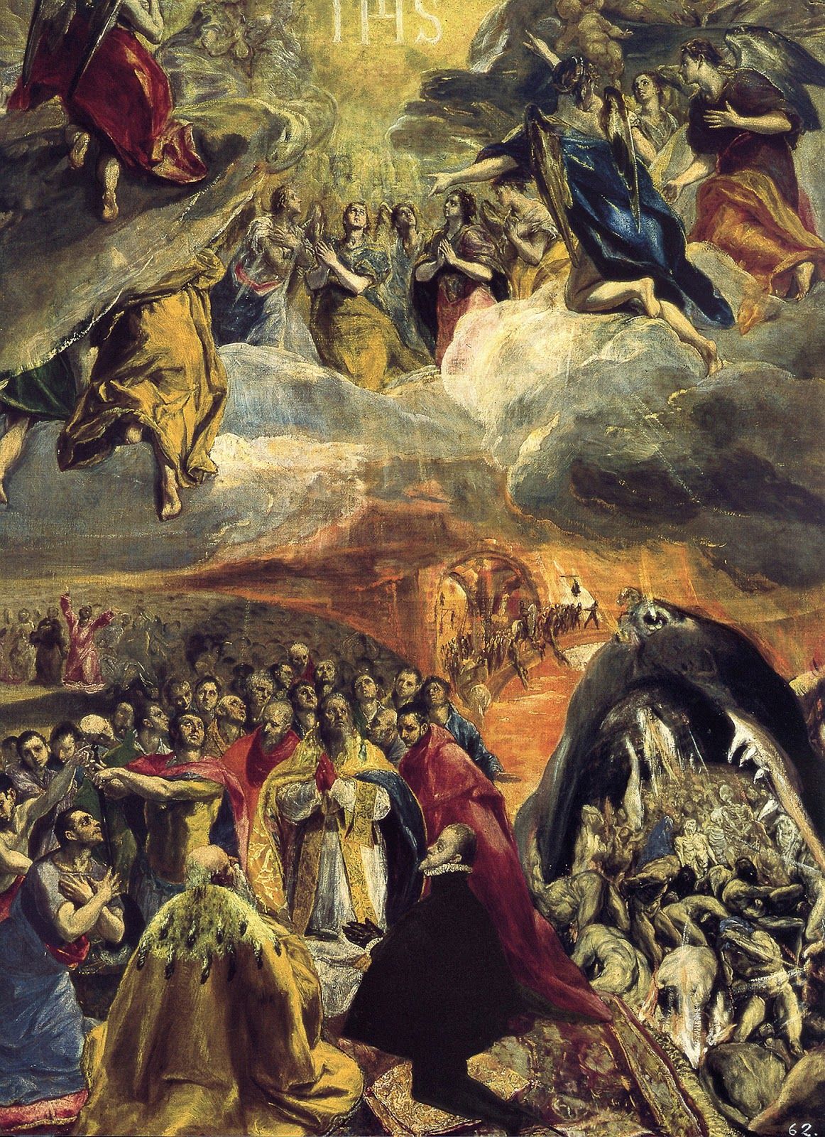
El Greco, Adoration of the Holy Name of Jesus (1579)
Today is the Feast of the Holy Name, otherwise commonly known as New Year’s Day. The traditional name for this day on the Church’s calendar refers to the event of Jesus’ circumcision and his naming on the 8th day. Most of us are well familiar with his name, but not necessarily with its origin.
As we recently noted with regard to Alexander Ivanov’s painting of the Annunciation to Joseph, when the angel appeared to the latter in a dream, Joseph was instructed to anticipate the birth of this holy child, and to name him Jesus. The following image helps us appreciate why:
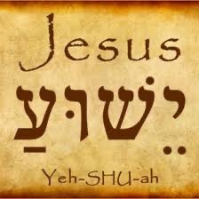
Jesus is an anglicized form of the name we know from the Old Testament as “Joshua,” or from the Hebrew as “Yehshuah.” And why would this divinely promised child be named in this way? Because Joshua was God’s faithful servant who led God’s people across the Jordan River into the Promised Land.
El Greco’s painting depicted above may not be immediately clear in its connection with this feast day. The letters, IHS, at the very top of the painting represent a Latin transliteration of the first letters of Jesus’ name in Greek. Figures in heaven, joined by the angels, are shown in adoration of the divinely revealed name, and its salvific significance. Human figures, including Philip II of Spain, a Pope, and other notables, are depicted in the foreground, who gather in prayerful regard for the same. Paradoxically, to the side of this pious gathering we find the yawing jaws of hell, in an image that may owe something to Hieronymus Bosch, portraying the suffering and demise of those who refuse to acknowledge that same name, and the saving reality it represents.
I think of and pray for my nephew, Joshua (‘Yeshuah’), and his family on this day.