Beauty of Creation

Jason Sparks’ Artistic Adaptation of Tenkara Flies

If reading this by email, please tap the title at the top to open your browser for the best experience. Then, clicking individual pictures will reveal higher resolution images.


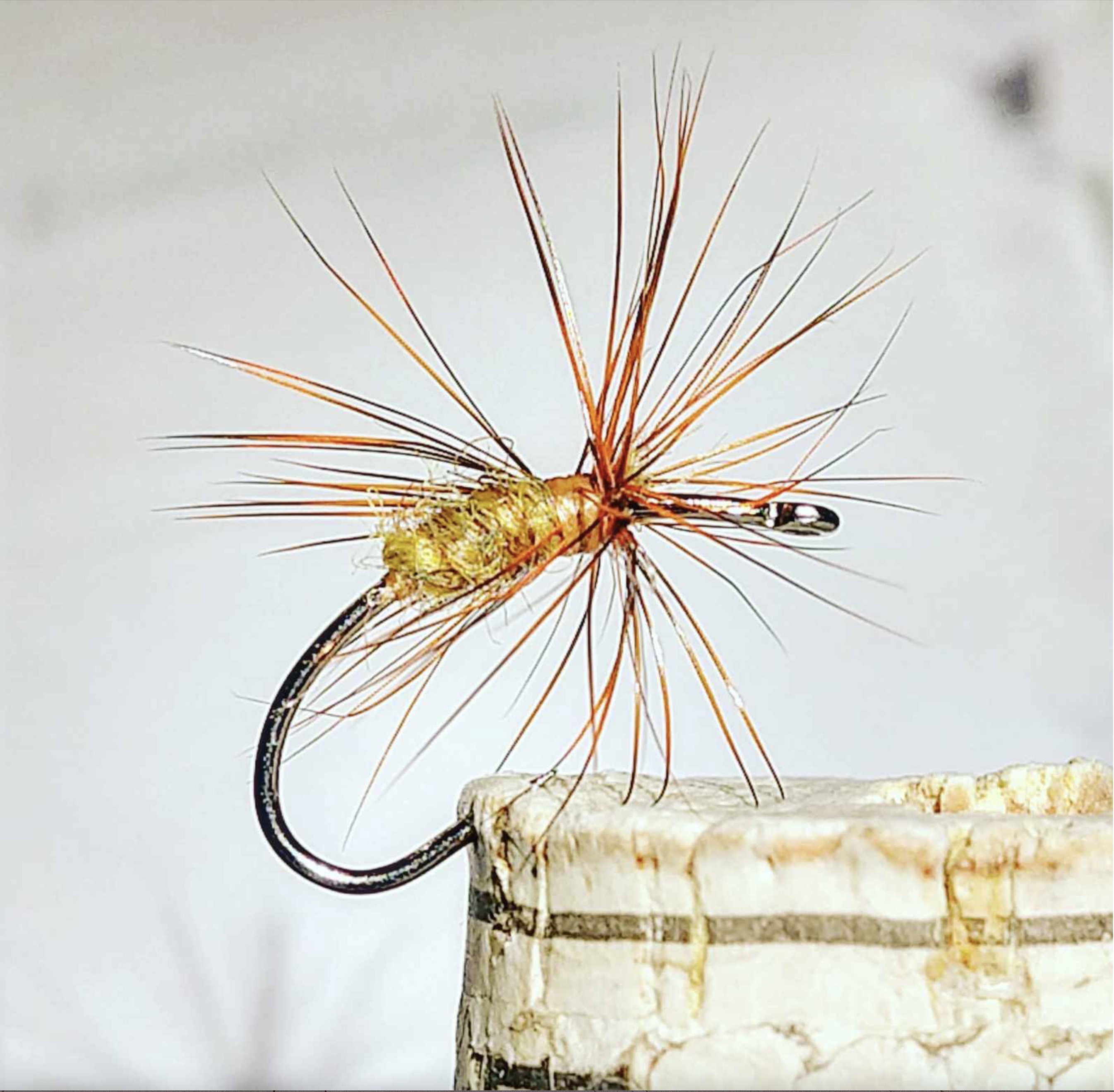
I discovered the handiwork of Jason Sparks through the writing of Jason Klass, a Colorado fisherman who has come to fish exclusively using the Japanese approach to fly fishing called Tenkara. Tenkara fishing has at least two distinguishing features, the first having to do with a difference from typical American fly fishing rods. Compared to familiar Western examples, Tenkara rods are very long poles, historically made of bamboo, along with a fixed-length line of roughly the length of the pole, and no fishing reel for the line. The flies used in Tenkara fishing are the second distinguishing feature. Tenkara flies, as in Jason Sparks’ beautiful example (above), generally feature hackle feathers (rooster and or hen) tied to the hook in a way that projects the feather’s barbs forward, toward the eye of the hook. This creates a pulsing motion when the fly is pulled against the current in a stream.

The anatomy of a fish hook. (Sparks prefers barbless hooks to facilitate ‘catch and release’ fishing)

The artistic design work of Jason Sparks, and his adaptation of traditional Tenkara flies, stress an intentional use of natural materials. In order to appreciate the originality of his flies, it’s worth considering examples of traditional Tenkara flies.

A traditional Tenkara fly tied by Dr. Hisao Ishigaki, a recognized authority on Tenkara fishing and fly tying

Traditional Tenkara flies are composed of three basic materials, a hook, thread, and part of a feather. The thread is wrapped around the neck of the hook, creating a base; thread-wraps then secure part of a feather to the hook; the feather is then spun around the shaft of the hook while perpendicular to it, thereby spreading the feather’s barbs. More thread is then wrapped around the shank of the hook, and tied off with a knot.

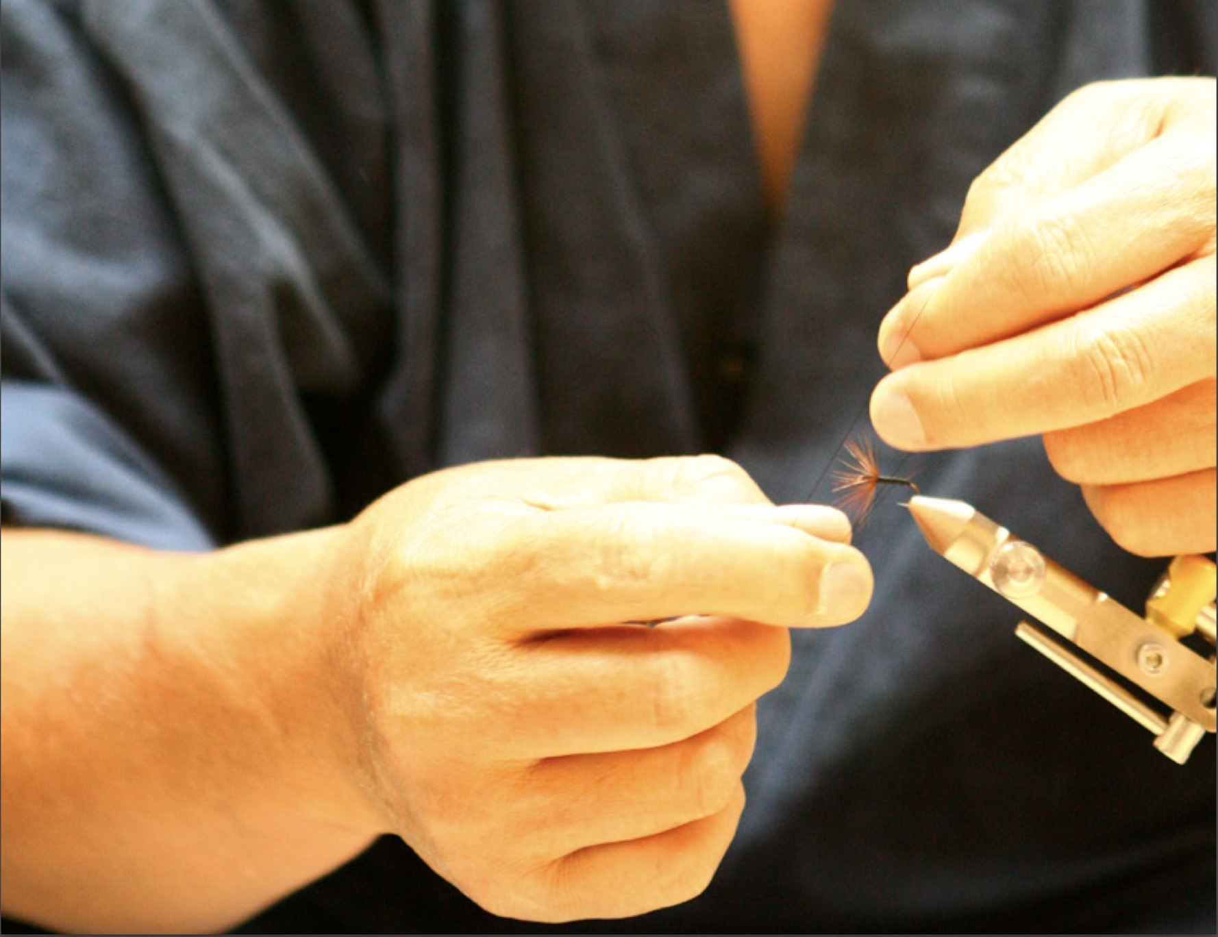
Almost all fly tyers make use of a vice, as depicted in the photo above, which holds the hook in place while the fly is created. One Japanese authority, Katsutoshi Amano, is famous for tying Tenkara flies without a vice:

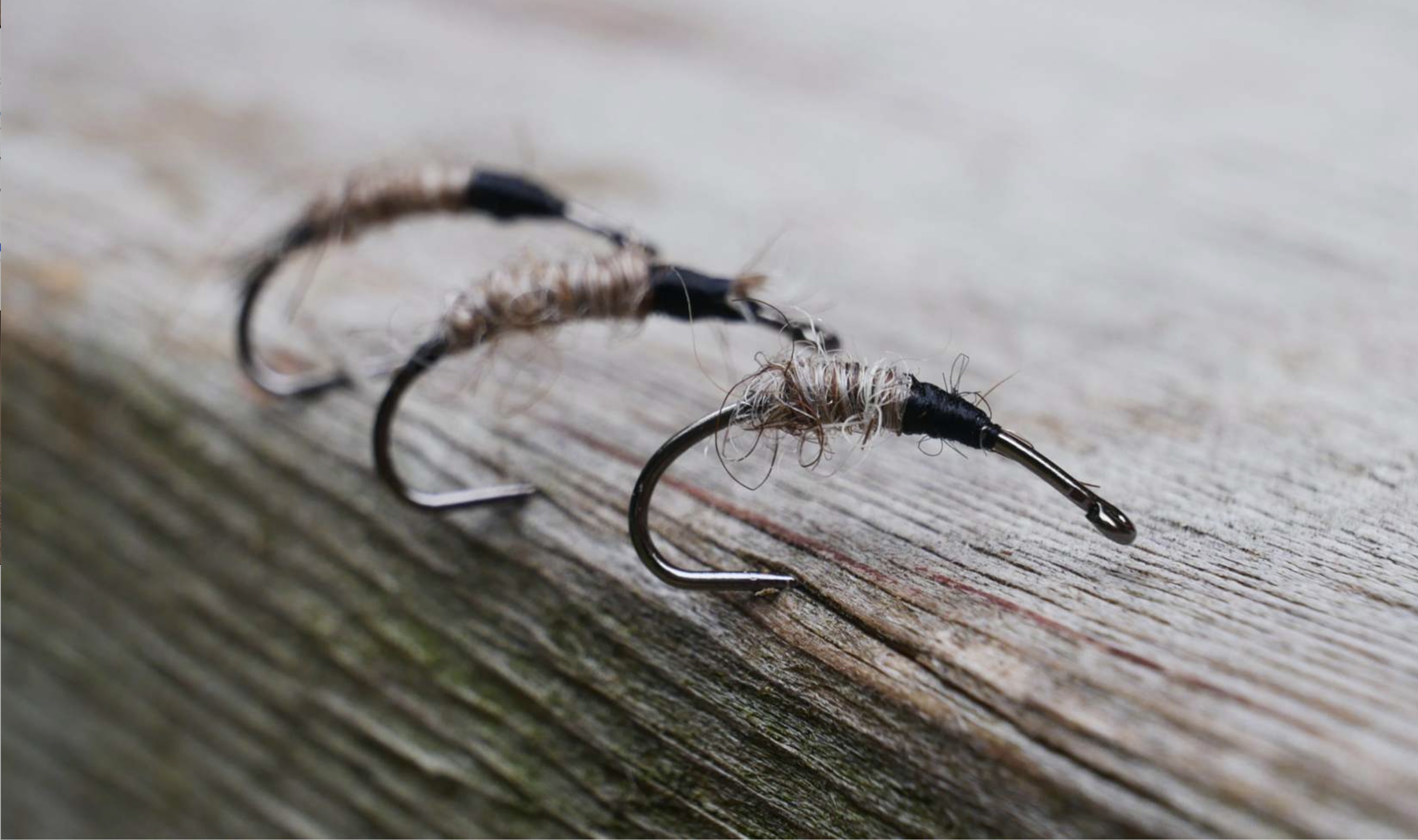
Observing these aspects of traditional Tenkara fly design helps us appreciate Jason Sparks’ creativity and aesthetic sensibility, as he creates works of art that actually catch fish. His willingness to work beyond the usual parameters of Tenkara flies can be seen in his choice of hooks. Those employed by the two Japanese masters in the photos above feature straight shanks in the upper part of the hook.

Sparks frequently uses what are commonly called scud or nymph hooks, which have a long and curving shank, where the eye of the hook tilts slightly downward. A similar tilt can be seen in another type of hook he often uses, which has a traditional straight shaft of moderate length, but which also has a wide gap above the hook’s point and a somewhat squared bend between it and the shank. These various features can be seen in photos of Sparks’ flies included below.

In both the photo directly above, as well as the one at the top, we see Sparks’ use of a scud hook, yet with minimal added material on the hook’s shank. While many tyers match fly body materials with the size of the hook, Sparks finds that a hook’s size matters less than the presentation of the material attached to it. Further, by locating that material closer to the middle of the shank, it is easier to attach or replace the fly line (and leader) to the hook’s eye.

With his preference for using natural materials, Sparks likes to tie with silk thread, and he prefers naturally dyed woolen yarn from the Shetland Islands, given its variations of color and textured finish. With a yarn ‘body,’ and the spiky feather barbs wrapped around the hook, Sparks achieves very ‘buggy-looking’ flies:

Two points are worth noting about Jason Sparks’ flies. Though the examples here look large, they are actually not very big, being photographed closely to help us appreciate their detail and composition. His typical hook sizes range from an 8  to a 12 or 14 (in most cases less than an inch, and many considerably smaller). And, second, Sparks often directs the feather barbs both forward and rearward, in contrast to the usual forward tilt of many traditional Tenkara flies. These features can also be seen in the following examples:

Sparks also ties flies that are commonly called nymphs, suggesting the appearance of bugs in their larva stage of development. With these flies, we notice the absence of feathers, and a spare use of other materials such as Sparks’ preferred Scottish yarn:

Despite how much of the hook is exposed in these examples, Sparks contends that they are effective for fishing.

Jason Sparks is obviously a gifted fly tier and has made a significant artistic contribution to this avocation, which for some is also a form of employment. In contrast to the neatness and precision of his finished flies, Sparks’ fly tying desk resembles the workspace of many others who tie flies:


Readers interested in fly tying may wish to look at my prior post, The Beauty of Fly Tying, which may be accessed by clicking here.

Japanese Thatched Roof Farm and Country Houses

If reading this by email, please tap the title at the top to open your browser for the best experience. Then, clicking individual pictures will reveal higher resolution images.


Those who watched the Winter Olympics broadcast from Nagano, Japan, may have gained some familiarity with a region sometimes referred to as the Japanese Alps. While living in Japan, my parents developed a deep interest in Japanese folk art (Mingei). Through this, they became acquainted with Sanshiro Ikeda, a recognized authority on Mingei, who built craft furniture. Through our trips to Nagano-ken (or prefecture), we visited Ikeda’s small furniture factory and the country farm house he had restored, and in which he lived. Through these visits, we became familiar with Matsumoto, its beautiful many hundred year old castle, and the surrounding Nagano countryside. My strongest memory, though, is of Ikeda’s restored traditional farmhouse, and those like it in the area.

The choice of Nagano prefecture as a location for the Winter Olympics was based on the fact that that region regularly receives a good deal of snow. As a consequence, the historic pattern for the design of farm and country houses involves very steep roofs which are quite often thatched. The combination of these two characteristics in the resulting roofs renders them amenable to heavy snow loads, which also help provide additional insulation against the seasonal cold weather.

These farm and country houses are typically built from wooden posts and beams, with plaster or stucco walls, and wooden plank floors if not otherwise covered with tatami mats made of straw and rice husks. The equivalent of what we refer to as rafters, and the lath cross pieces or straps supporting the thatched roof material, are typically beams made from tree branches or thick and thin pieces of bamboo, lashed together with rope, something that surely would not pass building codes for contemporary construction.

Traditional house with beams lashed together (above) and stucco walls above sliding shoji (lattice door and window panels), seen in the lower photo.

Instead of any form of central heating, generally unknown in Japan until modern times, many of the rooms on the ground floor would have a footwell in the floor, at the base of which traditionally there would have been a small charcoal brazier (charcoal kotatsu). Those in the room sitting on the floor, with their legs dangling in the footwell, managed to stay warm with the benefit of a small table over their thighs and knees, above the footwell, along with a lap blanket suspended from the low table.

A kotatsu blanket (with table top removed)

Kotatsu design (traditional charcoal and contemporary electronic patterns)

A similar but very shallow well-like indentation in the floor provided a place for cooking at the floor level.

Quite often these houses would feature one or two successively smaller floors above the ground floor in a way that will recall Western A-frame ski lodge houses. Typically, the sleeping areas would be on the upper floors with futon beds laid out on the tatami mats, thick quilts provided, and pillows stuffed with uncooked rice grains.

Interior of a traditional farmhouse showing a futon (or Japanese mattress), and a quilt covering, set above tatami mats.

Below, I am including a selection of photos of various examples of traditional Japanese country houses and related buildings, which demonstrate the consistency with which this approach to domestic architecture was adopted and practiced through the centuries. The first three photos show what appear to be contemporary structures built in the historic farmhouse style (followed by photos of historic structures).

The following photos feature historic structures.

The same village area (as in the photo above it) on a winter’s evening

The well-preserved historic examples of Japanese farm and country houses in the photos above, as well as the contemporary reproductions employing this historically-informed approach to domestic architecture, attest to the heightened appreciation that Japanese people have for their ancient culture. It may be that, as in some other parts of the world, the highly advanced technological developments characterizing the urban areas where most of their people now live, has nurtured a deep and latent regard for aspects of their nation’s social, artistic, and spiritual heritage.


Appreciating Chrysanthemums in Japan

If reading this by email, please tap the title at the top to open your browser for the best experience. Then, clicking individual pictures will reveal higher resolution images.

Ichimonji Kiku variety chrysanthemum – the basis for the Japanese Imperial Crest

The chrysanthemum-based Japanese Imperial Crest, Yasukini Shrine, Tokyo, and on Japanese passports


Every year, in November, the residents of Tokyo are treated to the Kiku MatSuri flower show, the annual chrysanthemum exhibition featuring a most stunning display of flowering plants propagated by some of Japan’s most skilled gardeners and horticulturalists. Kiku is the Japanese common name for chrysanthemum (originally native to China), and matsuri is the Japanese word for festival. Geographically about 30 degrees north of the equator, Japan’s climate has some affinity with that of Louisiana, with hot humid summers, and occasional frosts and even a rare snow shower in Tokyo. Chrysanthemums appear to grow well in both regions.

A photo of the 1914 Kiku Matsuri (note how the gentleman wears a western hat with Japanese clothing and wooden sandals {geta})

In our country at this relatively same time of the year, we are used to seeing large containers of chrysanthemums, covered with abundant blossoms, offered for sale in displays outside large box stores and nurseries. Yet, they tend to be small blossomed plants, differing from one another usually only in terms of color. At the Kiku Matsuri festivals, many varieties of mums, some of them exotic-looking, are beautifully arranged for viewing in a very formal and traditional setting. Yushima Shrine in Tokyo often serves as a location for these displays.

Kiku Matsuri displays of mums outside Yushima Shrine, Tokyo (above and below)

I have strong and clear memories of walking around these remarkable chrysanthemum arrangements with my parents and brothers, and being astonished at the multi-blossomed plants with a wide spread of blooms, extending upwards from a single or a few stems.  One version of this practice is known as Sanbon-Jitate, which features three large blossoms grown from a single stem. Each of the blossoms is symbolic, and represent the heavens, the earth, and humankind (as in the image below). Yet, clearly, all of the chrysanthemums on display at these annual festivals are in one way or another carefully and labor-intensively grown.

Atsumoto Kiku variety of mums (above), grown and featured in Sanbon-Jitate arrangements

The above bonsai, featuring miniature blossoms, provides another example of labor-intensively grown chrysanthemums

The Atsumoto Kiku variety of chrysanthemum (featured further above, and in the photos below) is a classic Japanese form of the plant, with its dense and thick blooms. This variety is propagated in many colors, among which the most beautiful may be the two colored Tomoenishiki variety.

Other examples of the Astumoto Kiku variety are shown below.

Another very attractive variety of Japanese kiku (or mums) is the Kudamono Kiku, known in English by the common name, spider mum, shown in the images seen below.

The propagation and cultivation of chrysanthemums in Japan by skilled gardeners reflects the highly refined aesthetic vision possessed and valued by many of the nations artisans, and by the wider society in which they live and practice their craft. The delicacy and exquisite beauty of many of these flowers, and yet the transitory nature of their flowering, speak to a cultural appreciation for what can be apprehended and enjoyed in the present moment, much like the way in which Japanese people (and foreign visitors) will in great numbers visit shrines, temples, and castle parks in the springtime to view the cherry blossoms.

Seeing these photos reminds me of the diligent care with which many Japanese gardeners, artists, and craftsmen engage in a lifelong pursuit of aesthetic perfection in a single area of practice, whether it is in propagating new forms and elaborate displays of chrysanthemums, throwing clay pots, writing in caligraphy, or seeking to make the most beautiful and durable sword. Though in each case individuals pursue the practice, it always seems to be in the context of a guild or society of fellow practitioners, and always with a significant degree of community awareness of the importance of this or that art for the wider society in which the practice of it is engaged.

Small and edible chrysanthemum blossoms added as a garnish to sashimi (traditional Japanese raw fish)


From Dream to Reality: Michael Pollan and His Writing House

If reading this by email, please tap the title at the top to open your browser for the best experience. Then, clicking individual pictures will reveal higher resolution images.


In an updated preface to his book, A Place of My Own: the Architecture of Daydreams, Michael Pollan laments how some readers approach his book expecting something like a “how to” guide to building their own writer’s hut or shack. Though he does provide a wealth of detail concerning the construction methods he used, the book’s richness lies in its thoughtful engagement with the idea of human shelter and its function in architecture. Of particular note is the attention he gives to the French writer, Gaston Bachelard, whose book, The Poetics of Space, prompts a good deal of reflection by Pollan. The author quotes Bachelard with words that obviously inspired the subtitle of A Place of My Own: “I should say: the house shelters daydreaming, the house protects the dreamer, the house allows one to dream in peace.”

Michael Pollan dreams of building and inhabiting what we might call his own writer’s studio in the woods behind his Connecticut home. As he muses about its possibilities, he considers potential designs in dialogue with his chosen site for the small building. From a book by the English geographer, Jay Appleton, he gleans the insight that ideal human shelters provide two dialectically interconnected values, ‘prospect’ and ‘refuge.’ A shelter conducive for human flourishing provides both the opportunity to view and appreciate one’s surroundings while at the same time providing a secure resting place. Achieving these twin goals becomes one of Pollan’s priorities for his little writing hut.

At the same time, while embarking upon this project to build his place for writing, he acknowledges that the endeavor also provides the occasion for him to examine the idea of architecture, and its contemporary role in Western society. He discovers – through a gift subscription to Progressive Architecture magazine – that the field has increasingly become focused on the exploration and expression of ideas, leaving behind a principal focus upon providing beautiful yet practically useful spaces and structures for human habitation and work.

The interior of Michael Pollan’s writing house (note the daybed in the foreground)

Pollan realizes that what he wants to build is not something that points to something else, or to a set of ideas and concepts (as is the case with some contemporary practitioners in the field of design). Instead, he wants a structure that he can use for everyday work, for reading, and as a place where occasionally he can have a nap. With his aversion to the little building becoming an artistic statement rather than something truly useful, Pollan’s book reminds me of a principal theme in Tom Wolfe’s splendid little book, From Bauhaus to Our House.

Especially in the first two chapters, Michael Pollan offers a set of thought provoking and historically informed reflections on the nature and purpose of architecture, which are shaped in a writerly way. As much as I was drawn to the concrete aspects of his project – as in his account of his search for the ideal design of the window through which he would look while writing – I found his engagement with the theoretical aspects of the project to be very compelling. A good example of the latter is his reflection on our conscious experience of form and pattern in buildings, and our unconscious experience of the spaces we encounter and through which we move. Other examples include the role of feng shui in his selection of a site for his project, as well his explanation of the function of the Golden Section (or Divine Proportion, 1/1.618) in deciding the parameters of the rectangle for his floor plan.

Most of all, I appreciate Pollan’s delineation of the difference between the 20th century modernist or International Style approach to architecture, which abstractly stressed universality of form and consistent design elements regardless of a building’s context, with the architecture of someone like Frank Lloyd Wright, who focused on the connection between his buildings and their location within their chosen sites and his intentional employment of local materials. Pollan offers an insightful two-columned table to illustrate the difference between the two, with the first (stressing universality) labeled, “There,” and the second (stressing locality) labeled, “Here.”

All in all, he has given us a finely written book.


Roger Tory Peterson’s Art, Helping Us See

If reading this by email, please tap the title at the top to open your browser for the best experience. Then, clicking individual pictures will reveal higher resolution images.


If you wanted to buy a guide to help you identify birds, what would you choose? A book with glossy photographs showing birds as found in nature? Or would you choose an artist’s rendition of those same birds abstracted from their natural setting? Without considering the question closely, I suspect that I am not alone in being one who would choose the former for what seems an obvious reason, that photographs purport to capture reality in what we call an objective way. And when seeking to identify birds, correct apprehension of reality is what we are after. Paradoxically, Roger Tory Peterson’s, Field Guide to the Birds, first published in 1934, has long been valued precisely because his paintings and notes may aid accurate identification of birds to a greater degree than can be obtained by studying photographs.

As we also find in the presumed intent of more recent, photo-based, bird books, Peterson’s aim was to help us see, and then upon seeing, correctly identify the birds we have apprehended in our sights. Yet, Peterson, a much-regarded pioneer in the environmental movement, sought to aid our perception by prioritizing the various unique properties of individual species, and then to highlight those features that distinguish them from other birds. With the aid of his editors and book designers, he helped to achieve these goals by adding small black lines or dashes pointing to various parts of each bird on the color illustration pages displaying his paintings.

These small lines correspond to observation notes in the text, signaling to the reader the principal identification marks and points of difference between various similar-looking species of birds (see below). His creation of this method for the identification of observed field marks in birds has come to be called the Peterson Identification System.

A pre-publication page from Peterson’s Field Guide. Note the small black lines or dashes, explained above.

The paradoxical limitation that may accompany a photographic guide to birds is that a photograph captures an object in only one posture in one moment of time. Photographs are also dependent upon existing light conditions, and where the object of attention may also visually be obscured or overwhelmed by its larger context.

With paintings, Peterson may have been better able to help us see three dimensional aspects of the birds he portrayed while yet employing a two dimensional medium, in part because those birds are presented against a non-distracting neutral background. By painting rather than photographing, he was able to emphasize and enhance certain features of birds, such as subtle areas of color and the impact of light upon them, to a greater extent than would have been possible with the photographic means available to him at the time. In the process, Peterson demonstrated a consistently high degree of proficiency in his work of illustration, while also achieving what are arguably finished works of art that help us perceive beauty in the natural world around us.

The Finches page from my grandfather’s 1959 edition of Peterson’s Field Guide


Note: Having featured Peterson’s work, there are many newer bird identification books being published, and they are worth exploring when someone seeks a reliable birding guide. For many people of my generation, Peterson’s work will always be on the shelf, given its art rather than his having employed photo-based images, especially since his books are so widely available. I am proud to have and use my grandfather’s annotated copy (above), with his sightings noted on numerous pages going back to the 1960’s.

I am conscious of the fact that I featured multiple color photos of the Common Nighthawk in my prior post, as well as having offered a substantial amount of information about this particular species. If bird guides were to offer an equivalent kind and amount of coverage of every species commonly observed, they would be immense, and very expensive!

Roger Tory Peterson (1908-1996). It is one thing to be serious about one’s life work, and another to be able to laugh about it!


Encountered Beauty: Nighthawks in a Dark Sky

If reading this by email, please tap the title at the top to open your browser for the best experience. Then, clicking individual pictures will reveal higher resolution images.


I have clear memories of a particular time of day in a town where I lived for two short periods of time, Northfield, Minnesota. In middle school, and then during college, I would frequently walk over the Water Street bridge spanning the Cannon River, by the old dam and historic Malt-O-Meal mill. On summer evenings and nights, I remember almost always hearing the distinctive nasal or buzzing be-zeet, be-zeet sound of birds calling to one another in the sky above. When I first observed them, I wondered what kind of birds these were, and about their surprising nocturnal behavior as compared with other birds more familiar to me. Based on the white patches on the underside of their wings, visible from the reflected glow of the lights in the town center below, I was able to identify them as Common Nighthawks, based on Roger Tory Peterson’s well-known book, Field Guide to the Birds.

Seeming to fly far above me, I was curious about their size, imagining them to be rather large. I then learned that their size and weight puts them somewhere between a common robin and a crow, suggesting that they do not fly as high as I had first imagined. Nighthawks are insect-eaters, which accounts for why they are so evident on summer nights, amidst the target rich environment of flying bugs swarming over city lights.

With their long wings, these birds engage in bat-like flapping as well as in gliding, and I remember them flying closely together as they went about their nocturnal feeding. The American Bird Conservancy website describes them in this way: “the Common Nighthawk’s erratic, acrobatic flight style gives the bird its folk name, ‘bullbat’.” Memorable in this regard is the way that they make occasional dives toward the ground. Some observers report that these dives cause the wind under their wings to make a booming or a whooshing sound, though I don’t remember hearing it.

I was intrigued to learn that, given their relative size, these birds will roost and nest on such apparently vulnerable locations as the ground, elevated tree limbs, ledges, and even gravel rooftops. Among things I appreciate about Nighthawks is how their mottled coloring, with blends of light and dark feathers, has adapted them well to survive in a variety of environments, and helps to protect them from predators like hawks and falcons. Of course, there are those incongruous white wing patches, which may be an evolutionary bow to some needs parallel to survival, both the attraction of a mate and the procreation of offspring.

The shape and size of Nighthawks’ comparatively long wings aid not only their feeding activity while flying, but also the extraordinarily long annual migration they make between their breeding grounds in North America to their winter habitats in South America. In fact, they are believed to have one of the longest migration patterns of all North American birds.

To me, Nighthawks are an unexpected kind of bird to find in a town center or in a city, given their dimensions and surprising willingness to live and reproduce in proximity to the commercial activity we associate with such areas. I am always delighted when I recognize their sounds above me on a summer evening, as I look up to see them wheeling about in the darkness, with their white wing patches flashing here and there.

In the natural world around us, with all its dynamic interrelationships, these amazing birds are our fellow creatures. In relation to them, as well as to other examples of what traditionally have been termed flora and fauna, we are called to engage in God-like stewardship. We all seem to have our favorite species in nature that we want to protect and care for. Needless to say, Nighthawks are high on my list.


The Nighthawk page from my grandfather’s copy of Peterson’s Field Guide to the Birds


The Beauty of a Homing Pigeon

A stunning Belgian racing pigeon, sold for $1.9 million


My title for this post may appear ironic or implausible. Yet, there is a long history of careful stewardship of homing pigeons by pigeon fliers and ‘fanciers.’ They breed beautiful, graceful, and powerful birds. Some racing birds are capable of flying a thousand miles, mysteriously finding their way back to their nests at speeds between 60 and 100 miles an hour! Most homing pigeons are not quite in that league.

I first became intrigued with the idea of having a small flock of homing pigeons when I was a Boy Scout in middle school, in Japan. A fellow troop member had a flock of some 20 to 30 birds. I went over to his house after school and watched him release them from his roof-edge loft. Then he would scatter bird seed on the roof and enter the loft, a signal to the birds that ‘dinner time’ had arrived.

Multicolored homing or racing pigeons in a Texas loft

His loft, as my later and smaller ground-level pigeon coop would be, was constructed of parts of old wooden shipping crates, then quite common in port cities like Yokohama. Those crates provided solid structural starting points, generally weather resistant, and adaptable to various pigeon loft configurations. What was left to be found was some mesh screen, some wood with which to fashion a simple door, and a set of dangling vertical rods (the formal name for which I have forgotten) which, resting against a wooden ledge, would allow the pigeons to return to the coop while passing through them, but not able to exit again.

A homing pigeon resembling one of the first in my small flock (note the leg band)

My first two birds, received from my friend, had distinct colorings different from common city pigeons. The female had a tan color and the male’s feathers were an overall charcoal gray and black. With them, I raised several more pigeons having beautiful darker brown feathers with white stripes. This was while the adult birds acclimated themselves to their new circumstances, and gained a new homing point for their flights. If I recall correctly, it takes at least a few months for this to happen.

It seems significant that the Gospels record the Holy Spirit descending upon Jesus at his baptism, as being like a dove (a pigeon relative) rather than – as some might have imagined or hoped – like a falcon or an eagle. Doves and pigeons, the latter offered on the occasion of the infant Jesus’ presentation in the Temple, are symbols of peace, while avian raptors more often figure in war and or civil power-related imagery.

Over the couple of years I kept pigeons, I may have had as many as 8 or 10 in my small coop, some of which I purchased from local Japanese fanciers. I particularly prized the white birds, and saved up paper-route money to buy them. Once, I bought a beautiful one without having a proper transport case with me, and carried it home through the Yokohama streets. After my journey of a mile or two, almost near home, the pigeon in my hands and held in the proper way, suddenly startled me and flew off to its former home!

I never raced my pigeons, though that is a common hobby for those who raise homing pigeons. Transporting the pigeons by vehicle (in vented carry boxes) to an assigned location, they are then released at a particular time, and clocked regarding the speed of their return to their home lofts. How homing pigeons are able to do this is not yet fully understood, though it is thought to involve magnetoreception, a sensitivity to the Earth’s magnetic field.

My time with my pigeons came to both a happy and a sad end. I was examined and proud to receive the pigeon raising merit badge from the Boy Scouts.

And then one morning, some months after this, I went to check on my pigeons before school. I was devastated to find that a cat had gotten in during the night, and I had lost my beloved birds.

As you might imagine, from time to time I muse about having a small flock of these amazing and faithful birds once again.

The Beauty of an Appaloosa Horse

While composing a prior post on the beauty of a horse, I was reminded of a portion of the Pslams – “{The Lord’s} delight is not in the strength of the horse (PS 147:10).” Yet, God must surely delight in the beauty of a horse, a possibility that may have occurred to some of us during the recent Triple Crown racing season and / or through admiring Dega’s renditions of race horses. Perhaps the Lord especially delights in the breed of horses known as Appaloosa’s.

Traveling back and forth between Japan and my parents’ birth home area of Minneapolis, we met a family on one of the voyages across the Pacific who had a ranch in Montana. Among the many wonderful discoveries during multiple visits there was the beauty of the Appaloosa. A ‘spotted backside’ might not at all be desirable among humans and some other living beings, but in my view this common Appaloosa trait provides one of the most compelling amalgams of both solid color and random patterning that I know of in the animal world.

Most closely associated with the Nez Perce nation among indigenous American peoples, the breed initially suffered along with the decline of the community propagating its existence in the latter 19th century. Yet, despite that sad history, and perhaps because of its compelling beauty, the Appaloosa breed of horses has since thrived.

Our friends’ ranch had numerous Appaloosas, but three that I remember fondly, and for differing reasons. One, named Lonesome, a striking looking horse, had Thoroughbred blood lineage and was tall and slim, with a reputation for being occasionally arbitrary as was another more dramatically colored one named Blue. Leo, like Lonesome, was mostly spotted all over but, when first seen with his more compact and robust physique, could be identified as having an American Quarter Horse lineage.

My favorite, the one with whom I became most familiar, was Marble, a mare of not-readily-evident Appaloosa lineage, among which some are almost white and others appear almost black. Marble looked like a common brown Morgan horse, except for one distinctive detail – she had one blue eye, like one sees in some Australian shepherd dogs. Unlike the sometimes mercurial Lonesome, and the sometimes stubborn Leo, Marble would let me bridle her in the pasture, lead her into the stable next to the tack room, and saddle her without much difficulty.

An Appaloosa gelding, with a Morgan-coloring like “Marble” (note the slight brindle pattern)

The patterned coat commonly associated with Appaloosa horses may be an acquired taste, much like variegated plants among gardeners. I find horses of this background stunning to look at, and I especially appreciate how they have often been portrayed in Western art, such as in the paintings of Charles M. Russel (whose expressive Western-themed paintings I hope to feature in a future blog). It tells us something about the aesthetic sensibility of the Nez Perce that they they would have pursued breeding and cultivating the bloodline of these horses, not only for their utilitarian value but also for their sheer beauty.

The Delta Art of William Dunlap

Book cover of Dunlap’s 2006 retrospective art survey book


If Andrew Wyeth had migrated to the Delta region of Mississippi, some of his paintings may have turned out looking like those of William Dunlap. Folks not from the central deep South will usually associate that term, the ‘Delta,’ with the outflow of the great river south of New Orleans in several branched outlets. Yet, the term, the ‘Delta,’ in the mid and deep South refers to the region abutting the Mississippi River south of Memphis, bordered by Arkansas and Mississippi. Historically, and until the present, it has been characterized as one of the poorest regions of our nation and also known as the birthplace of the Blues, a fact which may not be coincidental. Lush with vegetation in a multitude of vibrant greens during the summer, the Delta has a stark beauty in the winter, especially where trees have been removed for farmland. Usually not cold enough for lasting snow, gray skies often complement the gray trunks and limbs of deciduous trees, as well as of cypresses in the swamps and by the river.

William Dunlap’s paintings, particularly the more recent ones, capture well the landscapes of this mostly rural part of ‘flyover’ America. As his artwork often depicts, the low-on-the-horizon winter sun pokes through bands of dark clouds, where in the evening a surprising warm glow can enliven an otherwise flat and bleak landscape. Dunlap lived in many places in the Old South while growing up, but the north central hill country of Mississippi, and Webster County, remained a homing point connected with his grandparents. Yet, I find his most evocative paintings are of the comparatively flat alluvial terrain on the east bank of ‘the American Nile’ south of Memphis.

Dunlap grew up feeling like he had lived in two eras of history, one being the late 19th century whose social legacy permeated the circumstances of his youth, and the other stemming from his having been born at the end of WWII, having come of age in the 1960’s. Images in many of his paintings reflect this paradoxical tension between old world cultural patterns and practices, and new world adventurous explorative freedom.

The dogs in his paintings reflect aspects of this dynamic. Dunlap’s grandfather bred and raised Walker hounds (most memorably represented in the top painting), which are often depicted as his central subjects within expansive landscapes. According to J. Richard Gruber, they are “used as a surrogate for man (and himself) in his works.” Here, in his choice of subject matter, we find another rural ‘old south’ in tension with an emerging new world. It is most markedly suggested in one of his paintings where he places a power plant cooling tower, releasing steam, behind a rural farmstead fronting an open field (not depicted).

This may help us appreciate the term Dunlap coined to describe his approach to painting, ‘hypothetical realism,’ a term which I think applies equally to the work of Georgia O’Keeffe. Remarkably, Dunlap basically taught himself to paint, and focussed his early work on Rembrandt and other ‘Old Masters,’ while also displaying the evident influence of modern masters such as Larry Rivers, Jasper Johns and Robert Rauschenberg. The effect of some of these more recent artists’ work can be seen in two of the paintings above, by the visual inclusion in the skyline of the regional names, Delta and Arkansas, in label-stylized fonts preferred by many Pop Art painters. Once again, we encounter a dynamic interplay between historically traditional approaches to representational painting and the 20th century reactionary revolt against them.

Dunlap is a truly gifted painter, both in terms of what he has been able to accomplish, but also in terms of his encompassing creative vision. Internet images, upon which I have relied here, only begin to suggest the expanse of his creative perspective.


For those who might want to see more of Dunlaps paintings, as well as learn more about him and them, I commend his coffee table book, Dunlap (which, through Amazon and or other sources may still be available, and which provides a much more accessible resource for appreciating the painter’s work:  (https://smile.amazon.com/Dunlap-William/dp/1578069041/ref=sr_1_5?crid=1YS7GNY6ZE2AS&keywords=dunlap+william+dunlap&qid=1654915393&s=books&sprefix=%2Cstripbooks%2C91&sr=1-5).